Components
Date Picker
Allow users to select date and date range

Anatomy
The Date Picker and Date Range components are UI elements that allow users to select a date or a range of dates from a calendar. These components are commonly used in applications that require date-based interactions, such as booking systems or scheduling applications.
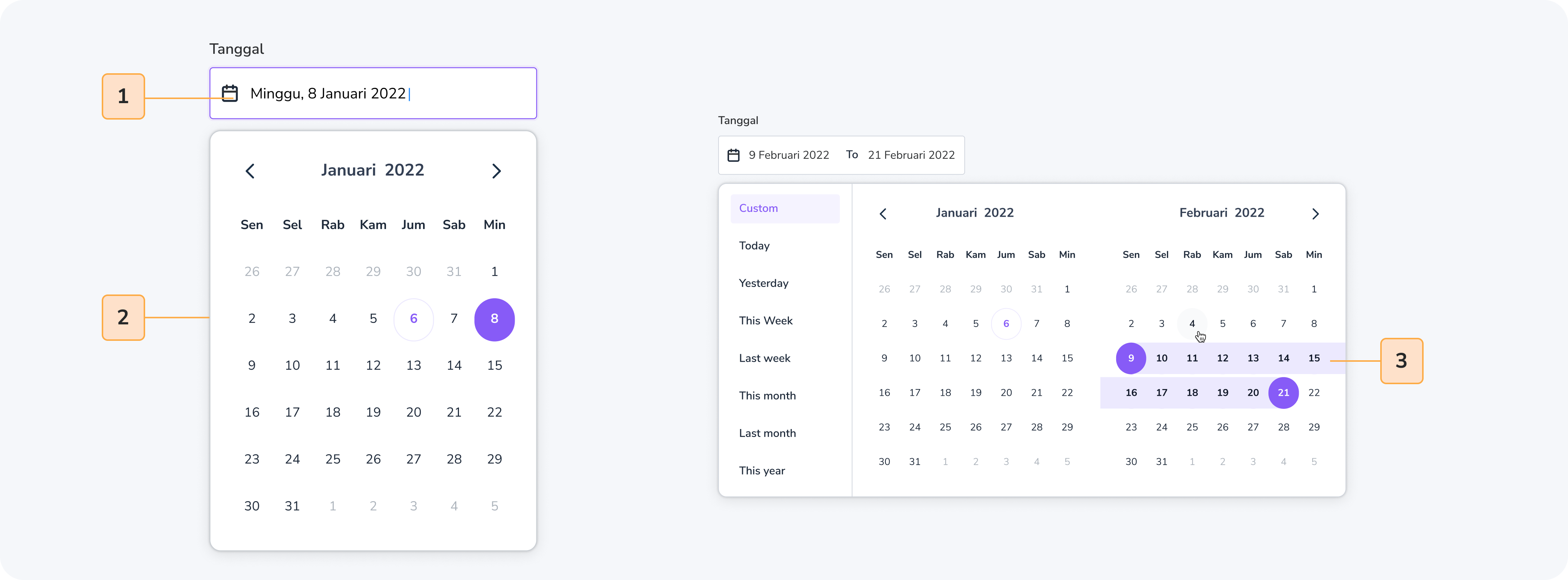
- Calendar: a visual representation of the days in a month or a week.
- Month/Year Selector: allows the user to select a month and a year for the calendar.
- Date Selection: allows the user to select a single date or a range of dates.
- Apply Button: allows the user to apply their selected date or date range. (Optional)
Usage
The Date Picker and Date Range components are used in applications that require date-based interactions. They can be used in a variety of contexts, including:
- Booking systems: for selecting arrival and departure dates.
- Scheduling applications: for selecting dates and times of appointments or events.
- Data analysis tools: for selecting specific dates or date ranges to analyze data.
When to use
- Use when the user needs to select a single date or a range of dates.
- Use when the context requires a date-based interaction.
- Use when the application requires a calendar view to display and select dates.
When not to use
- Do not use when the user does not need to interact with dates.
- Do not use when the application does not require a calendar view.
Accessibility
Accessibility is an important consideration for any design system component. Here are some accessibility guidelines for the Date Picker and Date Range components:
- Provide clear labels and instructions for each field: Ensure that users can easily understand what each field is for, and provide clear instructions for how to use the component.
- Ensure keyboard accessibility: Ensure that users can navigate and interact with the component using only a keyboard. Use tabindex and aria attributes to enhance keyboard accessibility.
- Provide visual cues: Provide visual cues such as highlighting the selected date or date range, and using contrasting colors to help users with low vision.
- Test with assistive technologies: Test the component with screen readers and other assistive technologies to ensure that it is fully accessible.
- Provide alternative input methods: Consider providing alternative input methods such as voice input or a touch screen for users who may have difficulty using a keyboard or mouse.
By following these accessibility guidelines, you can ensure that the Date Picker and Date Range components are accessible to all users, including those with disabilities.

Do
Highlight the selected date or date range.

Don't
Use color alone to indicate the selected date or date range.
Content
When creating Date Picker and Date Range include :
- Calendar view: displays the days in a month or week.
- Month/Year selector: allows the user to select a month and a year for the calendar.
- Date Selection: allows the user to select a single date or a range of dates.
- Apply button: allows the user to apply their selected date or date range.

Do
Use a clear and concise design for the calendar view.

Don't
Overcomplicate the design with unnecessary features.