Pattern
Login & Register
Register and auth users before access the system

Introduction
Our take on login and register pattern is to provide a clear context on every action our users need to do, so they won’t spend too much time onboarding themselves into our ecosystem. This pattern is categorized based on its visual component.
Along with the development of technology, users can log in in various ways. Starting from the most common, enter your username and password, up to using mail, cell phone numbers, and social media that have been integrated into the system.
Data Protection (UU PDP) Compliance
In accordance with the Personal Data Protection Act (UU PDP) in Indonesia, our login and registration processes are designed to ensure the highest standards of data security and user privacy. We are committed to complying with all regulations set forth by the UU PDP, ensuring that personal data is handled with the utmost care and confidentiality.
Our system employs robust security measures to protect user data during registration and login. This includes encrypted storage of passwords, secure communication channels, and regular audits to maintain compliance with data protection laws. By adhering to these standards, we provide our users with a safe and secure online experience.
Forms
Title
Here are the rules in crafting copy for title in login and registration journey:
Use Title Case
It should inform about what happen on this page while also give context to users. For example:


- Use a short, straightforward one-line sentence, due to limited space for title. For example:


- Refrain from using gimmicky sentences since they might hinder the user’s promptness to follow the flow, especially if you craft copywriting for B2B or B2G products. For example:


- If it requires experience in multiple languages, try writing the title in the same length
Body
The purpose of body copy in product screen, mainly is to provide additional context, information or instruction about what user can perform. It also create user experience as a whole along with the UX and UI design. Besides using information architecture to highlight which body copy is more important than the others, UX writer can also use typography.
Here are the rules in crafting copy for body in login and registration journey:
To prevent unnecessary word that can tamper with space and user cognitive processing, try to plan what information will you deliver in body copy
Use the Sentence case
Do it in a short, concise way. Max. 2-3 lines
Refrain from including promotional messages in this section. You may write that on the onboarding pattern instead
Form
Form is used to gather data, which in login and registration journey is very important
For the title, use Title Case. Other than that (e.g., error message, placeholder text, etc.), use the Sentence case
The title should clearly state what information the user needs to input and whether it’s required or optional
Give placeholder text a proper yet concise direction on how to fill that column with an example
Depends on the tone of voice, you can appease user using “Silakan, Maaf etc.” instead of direct instruction such as “Masukkan”

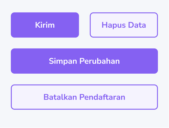
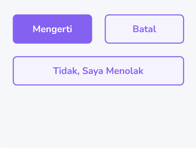
Call to Action (CTA)
Requirement or Acceptance Criteria:
All CTAs/button copies should use Title Case.
Limit the copy to a maximum length of 3 words.
Always use an active, plain word
Always use an active, plain word
The wording for cancelingcancelling action may use 2 words to prevent ambiguity of an action
Dialog
Selection Dialog
Clearly explain the options available for the user and explicitly inform them that they only need to choose one.

Success Dialog
Give more context to the description and ease the user by informing them what’s next

OTP Entry Dialog
Requirement or Acceptance Criteria:
- We can use a countdown timer as part of the copy if needed.
Ensure it’s showing the time left before the user can redo or reselect their action.
Remember to use HH:MM:SS time format.
- Help text should clearly state what kind of support the user could get


Error State
Use a short, straightforward one-line sentence that does not exceed the length of the corresponding form
An error message should contain the reason that caused that fault and the solution
If there’s not enough space to include both reason and solution, prioritize presenting the solution