Components
View State
View that displays different content based on its state.

Component Status Details
Status component contains a list of checks and completeness that has been tested and owned by each component
 We don't use color as the only visual tool to convey information. The component’s structure and properties include relevant options such as variant, style, size, orientation, optional iconography, decorations, selection, error state, etc. The title is the component name that uses the frame base component template. The base component name contains: .Base & "Component Name" if there is more than one. All component properties use the Legion foundation. We can change all the parts that are connected to the component base. The inside of the base component remains connected to the master component. All variant options are not damaged when we change from one to another. Overriding changes to components will not reset other variants. Component's already has component specs documentation.
Usage
Views are responsible for managing their own state. Android View displays different content based on its state. View state in Legion is implemented based on base components forking from Kennyc1012/MultiStateView with some modification and some improvement.
Legion provides 4 different states, where we can customize activities to each layout state.
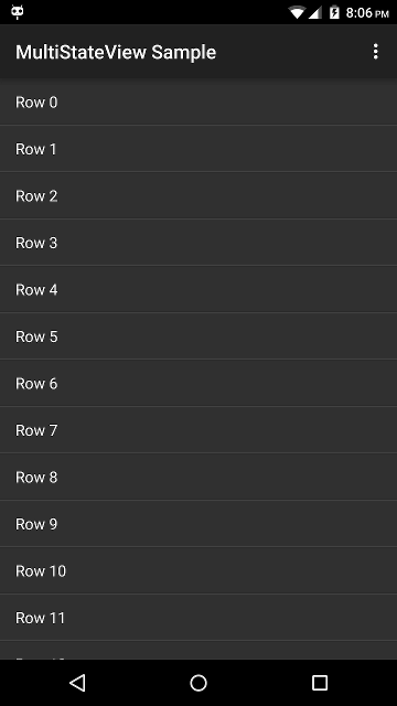
Default Content
This is default state provided by Legion.
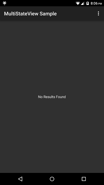
Empty
This is state that we can use when we have nothing to show in view.
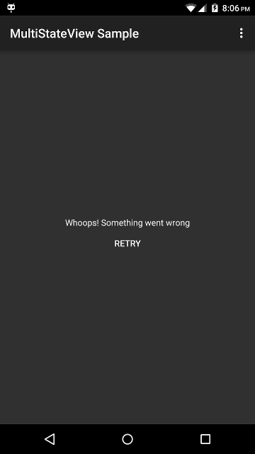
Error
This is state that we can use when we have an error activity in view.
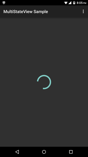
Loading
This is state that we can use when we still waiting for an activity in view.
How to use
Static usage in XML
<com.telkom.legion.component.viewstate.LgnViewStateandroid:id="@+id/msvSample"android:layout_width="match_parent"android:layout_height="250dp"app:loadingView="@layout/layout_sample_one"app:errorView="@layout/layout_sample_two"app:emptyView="@layout/layout_sample_three"app:viewState="content"><FrameLayout
Change State
...with(binding) {lifecycleScope.launch { //For sample we use coroutine delay for automatic change state//Change to Content ViewmsvSample.viewState = ViewState.CONTENT// Or Use Extension FunctionmsvSample.showDefaultLayout()delay(1000)ewState.LOADING))) {
Modify Layout In State
...with(binding) {//For sample we use state loading with layout : layout_sample_one.xmlwith(LayoutSampleOneBinding.bind(msvSample.getView(ViewState.LOADING))) {//Do Whatever you want with layout}}...
Attributes
| Attribute Name | Xml Attrs | Related method(s) | Description |
|---|---|---|---|
| View State | app:viewState | viewState | To set View State in Layout |
| Loading View | app:loadingView | N/A | To set Loading View Layout |
| Empty View | app:emptyView | N/A | To set Empty View Layout |
| Error View | app:errorView | N/A | To set Error View Layout |