Components
Sidebar
Sidebars are a form of navigation. They provide access to primary content

Anatomy
A sidebar is a component which orients a panel relative to content and displays additional information or navigation options alongside the main content of a page. It was originally built to house jump links so that page content could be oriented relative to the jump links and a commonly used design pattern in web and mobile applications.

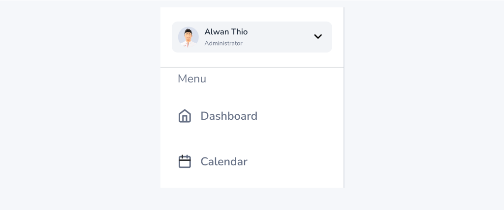
- Sidebar container: This is the outermost container for the sidebar, which holds all the other elements of the sidebar.
- Sidebar header: This element usually contains a title or a logo that identifies the sidebar.
- Sidebar menu: This is the main navigation menu of the sidebar that contains links to various sections of the application or website.
- Sidebar profile: This element displays information about the user, such as their profile picture and name.
Usage
Sidebar is a navigation menu to provide access to destinations and app functionality, such as switching accounts. They can either be permanently on-screen or controlled by a navigation menu icon . The Sidebar component is commonly used in web and mobile applications to provide additional navigation options or to display contextual information related to the main content of a page. It can be used as a standalone element or in combination with other components such as a top navigation bar or a footer.
Common places buttons appear : Mobile app homepage , website homepage and other pages when needed etc.
When to use
- You have long content that you want to keep out of sight at first.
- To keep content like structured navigation or screen-specific help accessible.
- To provide users with easy access to account information or settings.
- To help users navigate through a large amount of content, such as in an E-commerce or news website.
- To provide users with quick access to support resources or frequently asked questions.
When not to use
- To force users to complete an action before continuing.
- For small content or few options closer to the original context.
- For small bits of information focused on a single action.
- When the additional information or navigation options are not relevant or necessary for the user.
- When the Sidebar component would cause visual clutter or distract from the main content of a page.
- When the Sidebar component would negatively impact the user experience on smaller screens or devices.
Accessibility
A sidebar is a component which orients a panel relative to content. It was originally built to house jump links so that page content could be oriented relative to the jump links. Screen reader users should be able to navigate to the sidebar and all the contents of the sidebar should be read by the screen reader. Here are some considerations for ensuring accessibility in the Sidebar component:
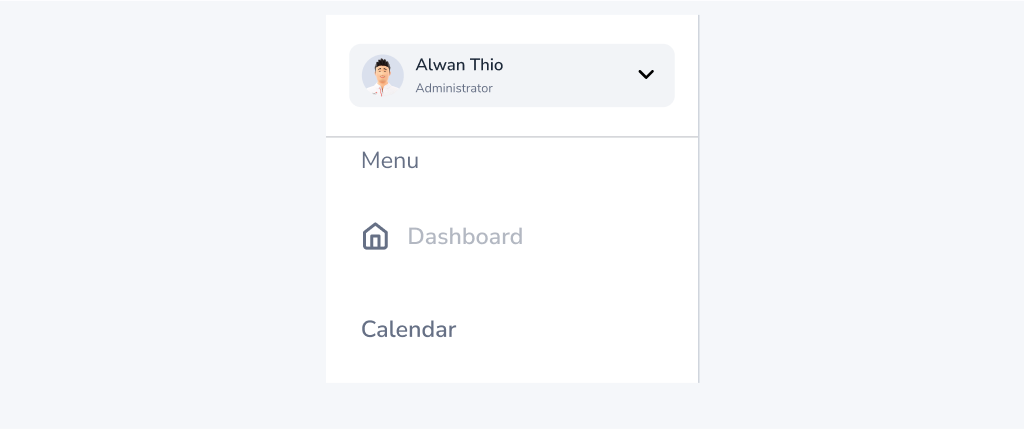
- Keyboard Navigation: Ensure that users can navigate the Sidebar using only a keyboard. All interactive elements, including buttons and links, should be accessible through keyboard shortcuts.
- Screen Readers: The Sidebar should be screen reader compatible, with all elements labeled correctly and in a logical order. ARIA attributes should be used to provide additional information to screen reader users.
- Color Contrast: Ensure that the Sidebar has sufficient color contrast between text and background. This will make it easier for users with visual impairments to read the content.
- Resize and Zoom: The Sidebar should be resizable and zoomable to accommodate users who need to increase the size of the content.
- Focus Indicators: Ensure that all interactive elements in the Sidebar have clear focus indicators. This will help users with visual impairments to navigate the Sidebar.
Do
Use a consistent design and layout for the Sidebar component throughout the application.
Don't
Use an inconsistent design and layout for the Sidebar component throughout the application.
Content
When creating Sidebar content of the Sidebar component will vary depending on the specific use case, but it typically includes:
- Navigation links to other sections of the application or related content.
- Contextual information related to the main content of a page, such as related articles or products.
- Account information or settings.
- Support resources or frequently asked questions. :
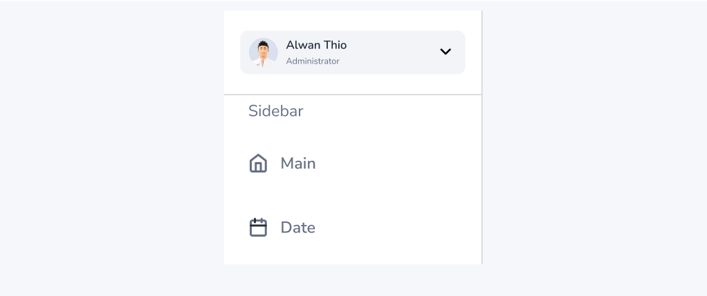
- Keep all labels similar in length, context, and type. If using nouns to title pages and links, use nouns in the navigation.
- Be specific, tell users exactly where they are going and what they can expect.
- Use sentence case in navigation links.
- Try to keep navigation link labels under 20 characters to avoid text wrapping menu items must be short enough to scan, but long enough to be clear.
Do
Use clear and concise labels for navigation links or other content in the Sidebar.
Don't
Use an unclear and verbose lables for navigation links or other content in the Sidebar.