Component
Pagination
Pagination is a UI component that divides content into multiple pages, allowing users to navigate through a large dataset or list of items.

Anatomy
Pagination component is a user interface element commonly used in web and application design to break down long lists or content into multiple pages.
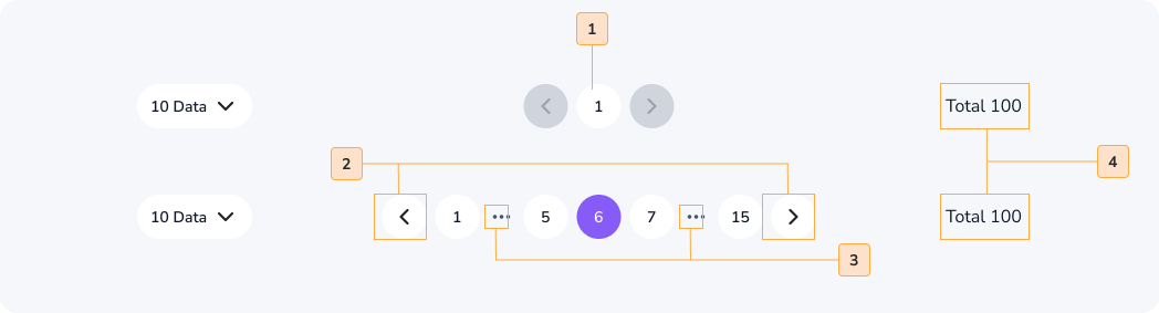
- Page Numbers: Numeric links that represent individual pages.
- Navigation Buttons: Controls for moving to the previous or next page.
- Ellipsis(Optional): ellipsis (…) to indicate additional, unlisted page numbers.
- Page Count(Optional): An optional display of the total number of pages.
Usage
The Pagination component is used in web and application design to:
- Divide Content: Split long content or data into manageable pages, improving readability and usability.
- Navigate Data: Allow users to move between different sections or pages of content, such as search results or product listings.
- Enhance User Experience: Provide an organized and efficient way for users to access information without overwhelming them.
Common places pagination appear : Mobile app homepage , website homepage and other pages when needed etc.
When to use
- You have content that extends beyond a single screen or viewable area.
- You want to break content into smaller, more digestible sections.
- Users need to navigate sequentially through multiple pages of content.
- Improving navigation and user experience is a priority
When not to use
- Your content or data is short and can be presented on a single page.
- Pagination would complicate the user interface unnecessarily.
- Other navigation methods, like infinite scrolling, are more suitable for your design.
Accessibility
Pagination components should be accessible to all users, including those with disabilities. To ensure accessibility, follow these guidelines:
- Make sure that all elements of the pagination component are keyboard accessible.
- Use clear and concise link text.
- Add an aria-label attribute to the pagination component to provide a descriptive label for screen reader users.
- Use the aria-current=“page” attribute to indicate the current page in the pagination component to screen reader users.

Do
Make sure that the current page number is highlighted. So the users know and can navigate easily.

Don't
Didn’t highlighted the current page number, so it can make a confusion for the users.
Content
When implementing pagination content, follow these guidelines:
- Keep page numbers and labels concise and informative.
- Display the current page number and indicate the total number of pages if relevant.
- Ensure that users can easily identify the first and last pages for efficient navigation.
Do
Provide previous and next buttons. So users can easily navigate through out all the pages of the website.
Don't
Didn’t Provide previous and next buttons. So users can’t navigate through out all the pages of the website.