Components
Avatar
A graphical representation of an object or entity

Status component contains a list of checks and completeness that has been tested and owned by each component
 We don't use color as the only visual tool to convey information. The component’s structure and properties include relevant options such as variant, style, size, orientation, optional iconography, decorations, selection, error state, etc. The title is the component name that uses the frame base component template. The base component name contains: .Base & "Component Name" if there is more than one. All component properties use the Legion foundation. We can change all the parts that are connected to the component base. The inside of the base component remains connected to the master component. All variant options are not damaged when we change from one to another. Overriding changes to components will not reset other variants. Component's already has component specs documentation.
Usage
Avatar are used to defines graphical representation of a user or the user’s character or persona
Use Legion avatar styles to modify avatar with lots of attributes that make you easier
Available themes: ThemeAGR, ThemeMyTEnS, ThemeIHS & ThemeEazy
Variant
Legion iOS Have 3 Variant of Avatar :
Avatar Image

A. Avatar Image Local
LGNAvatarImage(imageNamed: "SomeAssetName",).setBadgeOn(isOn: true)
B. Avatar Image System
LGNAvatarImage(systemName: "person.3.fill",).setBadgeOn(isOn: true)
C. Avatar Image Async
LGNAvatarImage(urlString: "https://i.ibb.co/1btpjhH/persegipanjangvertical.jpg",).setBadgeOn(isOn: true).setPlaceholder(isProgressViewOn: true)
Avatar Icon

A. Avatar Icon Local
LGNAvatarIcon(imageNamed: "SomeAssetName",).setBadgeOn(isOn: true)
B. Avatar Icon System
LGNAvatarIcon(systemName: "house").setBadgeOn(isOn: true)
C. Avatar Icon Async
LGNAvatarIcon(urlString: "https://i.ibb.co/yQPCHqz/houseicon.png",).setBadgeOn(isOn: true).setPlaceholder(isProgressViewOn: true)
Avatar Initial

Avatar Initial should add label: "value" where value consist the avatar initial
LGNAvatarInitials(label: "Telkom Indonesia",).setBadgeOn(isOn: true)
Attribute
Legion Have 3 Attributes for Costumize Avatar :
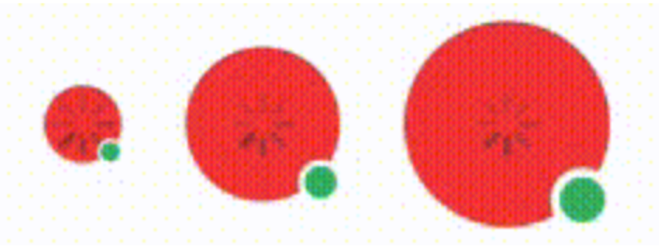
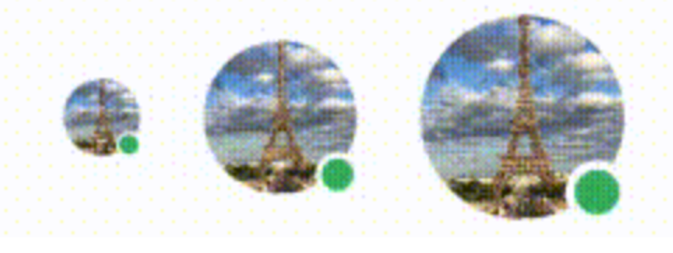
Size
This size attribute for user to choose the size of the avatar.
Choose type avatar LGNAvatarImage , LGNAvatarIcon or LGNAvatarInitial , add sources imageNamed: "Link" , systemName: "Link" or urlString: "Link" where Link consist the value of the image. And add size: .sizeAvatar where .sizeAvatar consist .xxsmall, .xsmall, .small, .medium or .large
This code sample demonstrates how to modify the size of the avatar :
LGNAvatarImage
Local Image
A. Avatar Image Local xxsmall
LGNAvatarImage(imageNamed: "SomeAssetName",size: .xxsmall).setBadgeOn(isOn: true)
B. Avatar Image Local xsmall
LGNAvatarImage(imageNamed: "SomeAssetName",size: .xsmall).setBadgeOn(isOn: true)
C. Avatar Image Local small
LGNAvatarImage(imageNamed: "SomeAssetName",size: .small).setBadgeOn(isOn: true)
D. Avatar Image Local medium
LGNAvatarImage(imageNamed: "SomeAssetName",size: .medium).setBadgeOn(isOn: true)
E. Avatar Image Local large
LGNAvatarImage(imageNamed: "SomeAssetName",size: .large).setBadgeOn(isOn: true)
System Image
A. Avatar Image System xxsmall
LGNAvatarImage(systemName: "person",size: .xxsmall).setBadgeOn(isOn: true)
B. Avatar Image System xsmall
LGNAvatarImage(systemName: "person",size: .xsmall).setBadgeOn(isOn: true)
C. Avatar Image System small
LGNAvatarImage(systemName: "person",size: .small).setBadgeOn(isOn: true)
D. Avatar Image System medium
LGNAvatarImage(systemName: "person",size: .medium).setBadgeOn(isOn: true)
E. Avatar Image System large
LGNAvatarImage(systemName: "person",size: .large).setBadgeOn(isOn: true)
Image Async
A. Avatar Image Async xxsmall
LGNAvatarImage(urlString: "https:someurl.co/image.jpg",size: .xxsmall).setBadgeOn(isOn: true).setPlaceholder(isProgressViewOn: true)
B. Avatar Image Async xsmall
LGNAvatarImage(urlString: "https:someurl.co/image.jpg",size: .xsmall).setBadgeOn(isOn: true).setPlaceholder(isProgressViewOn: true)
C. Avatar Image Async small
LGNAvatarImage(urlString: "https:someurl.co/image.jpg",size: .small).setBadgeOn(isOn: true).setPlaceholder(isProgressViewOn: true)
D. Avatar Image Async medium
LGNAvatarImage(urlString: "https:someurl.co/image.jpg",size: .medium).setBadgeOn(isOn: true).setPlaceholder(isProgressViewOn: true)
E. Avatar Image Async large
LGNAvatarImage(urlString: "https:someurl.co/image.jpg",size: .large).setBadgeOn(isOn: true).setPlaceholder(isProgressViewOn: true)
LGNAvatarIcon
Local Image
A. Avatar Icon Local xxsmall
LGNAvatarIcon(imageNamed: "SomeAssetName",size: .xxsmall).setBadgeOn(isOn: true)
B. Avatar Icon Local xsmall
LGNAvatarIcon(imageNamed: "SomeAssetName",size: .xsmall).setBadgeOn(isOn: true)
C. Avatar Icon Local small
LGNAvatarIcon(imageNamed: "SomeAssetName",size: .small).setBadgeOn(isOn: true)
D. Avatar Icon Local medium
LGNAvatarIcon(imageNamed: "SomeAssetName",size: .medium).setBadgeOn(isOn: true)
E. Avatar Icon Local large
LGNAvatarIcon(imageNamed: "SomeAssetName",size: .large).setBadgeOn(isOn: true)
System Image
A. Avatar Icon System xxsmall
LGNAvatarIcon(systemName: "house",size: .xxsmall).setBadgeOn(isOn: true)
B. Avatar Icon System xsmall
LGNAvatarIcon(systemName: "house",size: .xsmall).setBadgeOn(isOn: true)
C. Avatar Icon System small
LGNAvatarIcon(systemName: "house",size: .small).setBadgeOn(isOn: true)
D. Avatar Icon System medium
LGNAvatarIcon(systemName: "house",size: .medium).setBadgeOn(isOn: true)
D. Avatar Icon System large
LGNAvatarIcon(systemName: "house",size: .large).setBadgeOn(isOn: true)
LGNAvatarIcon
A. Avatar Initial xxsmall
LGNAvatarInitials(label: "Telkom Indonesia",size: .xxsmall).setBadgeOn(isOn: true)
B. Avatar Initial xsmall
LGNAvatarInitials(label: "Telkom Indonesia",size: .xsmall).setBadgeOn(isOn: true)
C. Avatar Initial small
LGNAvatarInitials(label: "Telkom Indonesia",size: .small).setBadgeOn(isOn: true)
D. Avatar Initial medium
LGNAvatarInitials(label: "Telkom Indonesia",size: .medium).setBadgeOn(isOn: true)
E. Avatar Initial large
LGNAvatarInitials(label: "Telkom Indonesia",size: .large).setBadgeOn(isOn: true)
Show Progress
This label attribute to customize show progress async from url for avatar.
add sources imageNamed: "Link" , systemName: "Link" or urlString: "Link" where Link consist the value of the image. And add size: .sizeAvatar where .sizeAvatar consist .xxsmall, .xsmall, .small, .medium or .large finish it with .setPlaceholder(isProgressViewOn: true) or .setPlaceholder(isProgressViewOn: false)
This code sample demonstrates how to modify the show progress of the async avatar :
A. Medium Show Progress
LGNAvatarIcon(urlString: "https:someurl.co/image.png",size: .medium).setBadgeOn(isOn: true).setPlaceholder(isProgressViewOn: true)
B. Medium Not Show Progress
LGNAvatarIcon(urlString: "https:someurl.co/image.png",size: .medium).setBadgeOn(isOn: true).setPlaceholder(isProgressViewOn: false)
Properties
LGNAvatarImage
| Properties | Description | Default Value |
|---|---|---|
| imageNamed | The name of the local asset that you want to use. | required or no default value |
| size | The size of the avatar, there are three size: .xxsmall, .xsmall, .small, .medium, .large | required or no default value |
| backgroundColor | The color of the avatar background. | Color.LGNTheme.tertiary100 |
| Properties | Description | Default Value |
|---|---|---|
| systemName | The name of the system name from SF Symbols that you want to use. (https://developer.apple.com/design/resources/#sf-symbols) | required or no default value |
| size | The size of the avatar, there are three size: .xxsmall, .xsmall, .small, .medium, .large | required or no default value |
| backgroundColor | The color of the avatar background. | Color.LGNTheme.tertiary100 |
| Properties | Description | Default Value |
|---|---|---|
| urlString | The url asset that you want to use. We recommend you to use .jpg, .jpeg, and .png format. | required or no default value |
| size | The size of the avatar, there are three size: .xxsmall, .xsmall, .small, .medium, .large | required or no default value |
| backgroundColor | The color of the avatar background. | Color.LGNTheme.tertiary100 |
LGNAvatarIcon
| Properties | Description | Default Value |
|---|---|---|
| imageNamed | The name of the local asset that you want to use. | required or no default value |
| size | The size of the avatar, there are three size: .xxsmall, .xsmall, .small, .medium, .large | required or no default value |
| iconColor | The color of the icon. | Color.white |
| backgroundColor | The color of the avatar background. | Color.LGNTheme.tertiary500 |
| Properties | Description | Default Value |
|---|---|---|
| systemName | The name of the system name from SF Symbols that you want to use. (https://developer.apple.com/design/resources/#sf-symbols ) | required or no default value |
| size | The size of the avatar, there are three size: .xxsmall, .xsmall, .small, .medium, .large | required or no default value |
| iconColor | The color of the icon. | Color.white |
| backgroundColor | The color of the avatar background. | Color.LGNTheme.tertiary500 |
| Properties | Description | Default Value |
|---|---|---|
| urlString | The url asset that you want to use. We recommend you to use .jpg, .jpeg, and .png format. | required or no default value |
| size | The size of the avatar, there are three size: .xxsmall, .xsmall, .small, .medium, .large | required or no default value |
| iconColor | The color of the icon. | Color.white |
| backgroundColor | The color of the avatar background. | Color.LGNTheme.tertiary500 |
LGNAvatarInitials
| Properties | Description | Default Value |
|---|---|---|
| label | The long text that you want to take the initials of to appear on the avatar. | required or no default value |
| fontFamily | The font family for the label. | "" |
| textColor | The color of the text string. | Color.white |
| backgroundColor | The color of the avatar background. | Color.LGNTheme.primary500 |
Example Project
LGNAvatarIcon(urlString: "https://picsum.photos/100", size: .small, iconColor: .blue, backgroundColor: .red)LGNAvatarIcon(imageNamed: "foo", size: .small, backgroundColor: .gray)LGNAvatarIcon(systemName: "heart", size: .small, backgroundColor: .clear).setPlaceholder(isProgressViewOn: true, backgroundColor: .clear).setPlaceholder(systemName: "xmark", isProgressViewOn: true, backgroundColor: .clear).setPlaceholder(imageNamed: "asset-image", isProgressViewOn: true, backgroundColor: .clear).setPlaceholder(label: "loading..", isProgressViewOn: true, fontFamily: "", textColor: .white, backgroundColor: .clear).aspectRatio(contentMode: .fill).setBackgroundColor(color: .red)