Components
Badge
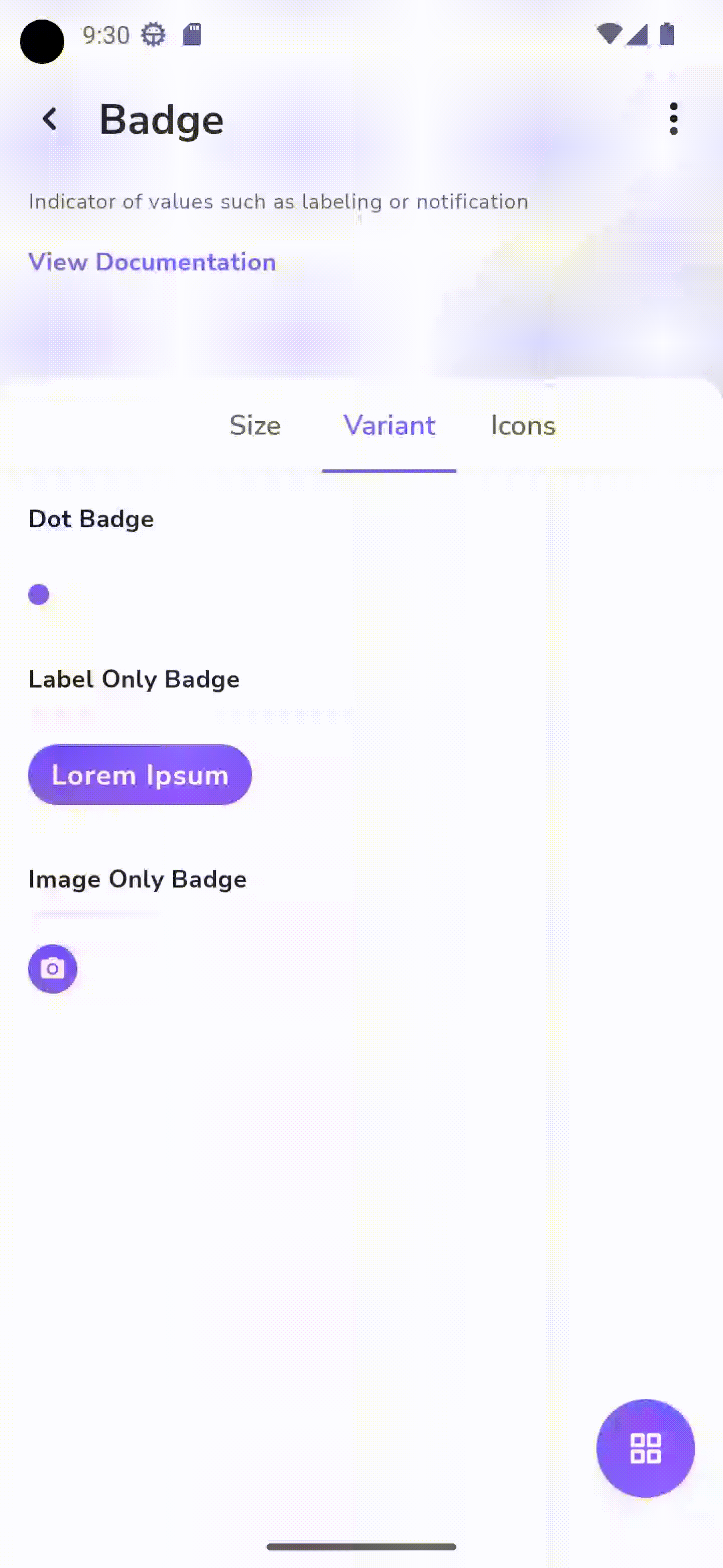
Indicator of values such as labeling or notification

Status component contains a list of checks and completeness that has been tested and owned by each component
 We don't use color as the only visual tool to convey information. The component’s structure and properties include relevant options such as variant, style, size, orientation, optional iconography, decorations, selection, error state, etc. The title is the component name that uses the frame base component template. The base component name contains: .Base & "Component Name" if there is more than one. All component properties use the Legion foundation. We can change all the parts that are connected to the component base. The inside of the base component remains connected to the master component. All variant options are not damaged when we change from one to another. Overriding changes to components will not reset other variants. Component's already has component specs documentation.
Badge are small status descriptors for ui elements. A badge consists of a small circle, usually containing a number or other short character, that appears near other objects. Badges should always be applied to block level elements.
Usage
The following is the format for using Badge “LgnBadge{Size}” .
<com.telkom.legion.component.badge.LgnBadgeSmallandroid:layout_width="wrap_content"android:layout_height="wrap_content"android:layout_marginTop="@dimen/dimen_16dp"android:layout_marginStart="@dimen/dimen_16dp"android:label="@string/foo"/>
<com.telkom.legion.component.badge.LgnBadgeLargeandroid:layout_width="wrap_content"android:layout_height="wrap_content"android:layout_marginTop="@dimen/dimen_16dp"android:layout_marginStart="@dimen/dimen_16dp"android:label="Lorem Ipsum"/><div class="divi" />
Variants
Size
Badges has two sizes, Large and Small .
Appearance
There are 4 appearance that you can use for Badge.
Dot
Dot is basic usage of Badge .
<com.telkom.legion.component.badge.LgnBadgeLargeandroid:layout_width="wrap_content"android:layout_height="wrap_content"android:layout_marginTop="@dimen/dimen_16dp"android:layout_marginStart="@dimen/dimen_16dp"/>
Label
You can give label to your Bagde by adding android:label attributes on the xml files.
<com.telkom.legion.component.badge.LgnBadgeLargeandroid:layout_width="wrap_content"android:layout_height="wrap_content"android:label="@string/foo"android:layout_marginTop="@dimen/dimen_16dp"android:layout_marginStart="@dimen/dimen_16dp"/>
Image
You can give Image to your Bagde by adding app:src attributes on the xml files.
<com.telkom.legion.component.badge.LgnBadgeLargeandroid:layout_width="wrap_content"android:layout_height="wrap_content"app:src="@drawable/ic_camera_components"android:layout_marginTop="@dimen/dimen_16dp"android:layout_marginStart="@dimen/dimen_16dp"/>
Icon
You can give Icon on the left of the badges by adding app:startIconDrawable attributes on the xml files, and app:endIconDrawable if you want to give the icon on the right side.
You can also combine the attributes if you want to customize Icon on the both side of the Badge.
<com.telkom.legion.component.badge.LgnBadgeLargeandroid:layout_width="wrap_content"android:layout_height="wrap_content"android:layout_marginTop="@dimen/dimen_16dp"android:layout_marginStart="@dimen/dimen_16dp"app:startIconDrawable="@drawable/ic_camera_components"app:endIconDrawable="@drawable/ic_camera_components"android:label="@string/foo"/>
Attributes
| Attribute Name | Xml Attrs | Related method(s) | Description |
|---|---|---|---|
| Label Badge | android:label | .label | To change label on badge |
| Left Icon Badge | app:startIconDrawable | .startDrawableIcon | To change left icon on badge |
| Right Icon Badge | app:endIconDrawable | .endDrawableIcon | To change right icon on badge |
Example