Components
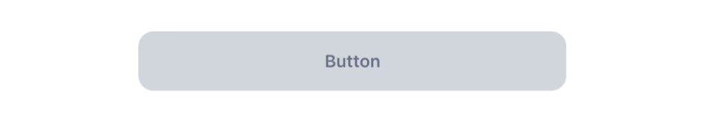
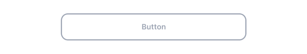
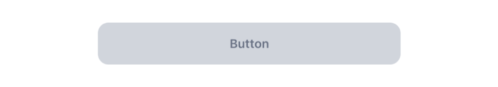
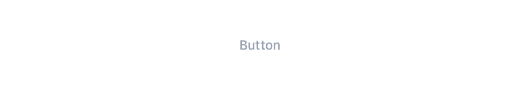
Button
Used to initiate an action or trigger the users

Status component contains a list of checks and completeness that has been tested and owned by each component
 We don't use color as the only visual tool to convey information. The component’s structure and properties include relevant options such as variant, style, size, orientation, optional iconography, decorations, selection, error state, etc. The title is the component name that uses the frame base component template. The base component name contains: .Base & "Component Name" if there is more than one. All component properties use the Legion foundation. We can change all the parts that are connected to the component base. The inside of the base component remains connected to the master component. All variant options are not damaged when we change from one to another. Overriding changes to components will not reset other variants. Component's already has component specs documentation.
Usage
Buttons are used to initiate an action or trigger the user to open a link.
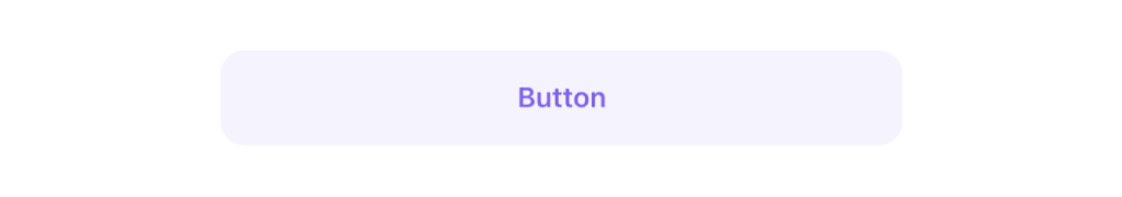
Use Legion Button styles for actions in forms, dialogs, and more with support lots type and attribute for costumize. Legion Button have 4 variants component: Solid, Outline, Soft, Transparent
Usage With Theme
Available themes: ThemeAGR, ThemeMyTEnS, ThemeIHS & ThemeEazy
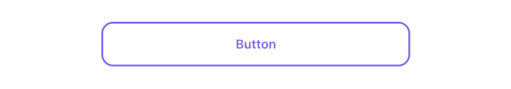
Solid
LGNSolidButton(title: "Button") {// Action Handler}
Outline
LGNOutlineButton(title: "Button") {// Action Handler}
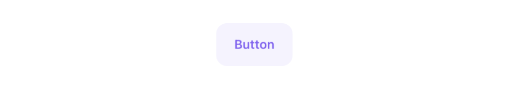
Soft
LGNSoftButton(title: "Button") {// Action Handler}
Tranparent
LGNTransparentButton(title: "Button") {// Action Handler}
Usage Without Theme
Solid
SolidBtn(title: "Button") {// Action Handler}
Outline
OutlineBtn(title: "Button") {// Action Handler}
Soft
SoftBtn(title: "Button") {// Action Handler}
Transparent
TransparentBtn(title: "Button") {// Action Handler}
Solid
Solid Responsiveness
This responsive button or boolean attribute for user to choose the button responsively to the screen / layout or not.
Responsive
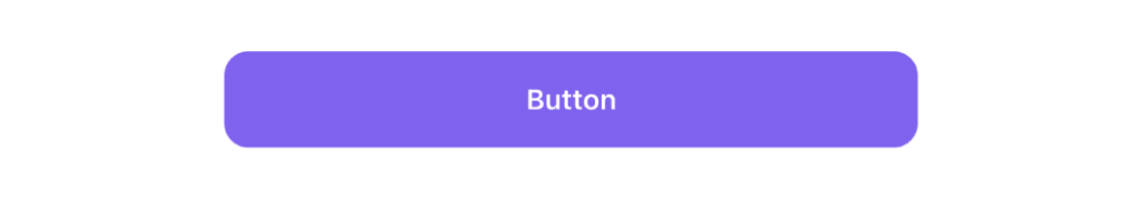
LGNSolidButton(title: "Button").variant(size: .medium, responsive: true)
Not Responsive
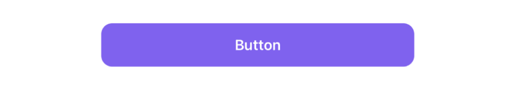
LGNSolidButton(title: "Button").variant(size: .medium, responsive: false)
Solid Size
This size text button attribute for user to choose size text inside the button.
Large
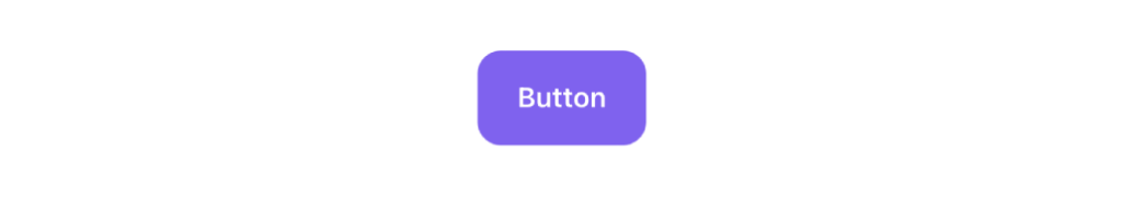
LGNSolidButton(title: "Button").variant(size: .large, responsive: true)
Medium
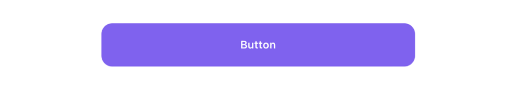
LGNSolidButton(title: "Button").variant(size: .medium, responsive: true)
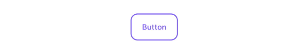
Small
LGNSolidButton(title: "Button").variant(size: .small, responsive: true)
Solid Icon
This icon attribute for user to choose the icon position inside the button.
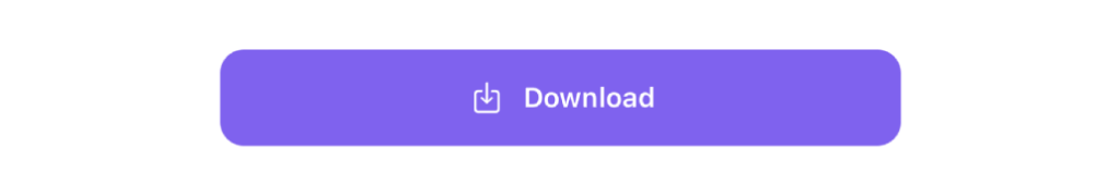
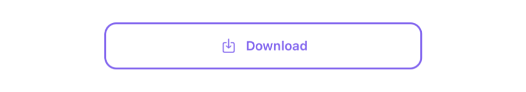
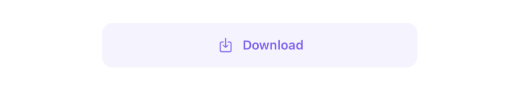
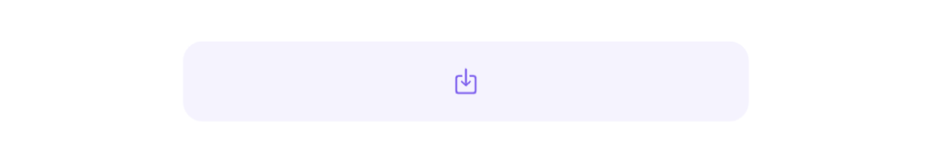
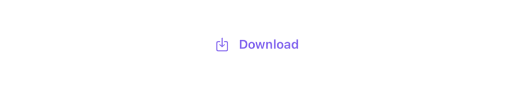
Left Icon
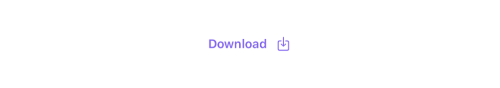
LGNSolidButton(title: "Button",leftImage: Image(systemName: "square.and.arrow.down"))
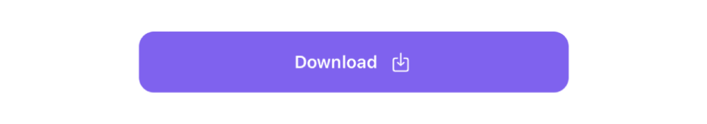
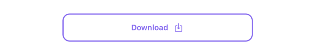
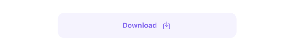
Right Icon
LGNSolidButton(title: "Button",rightImage: Image(systemName: "square.and.arrow.down"))
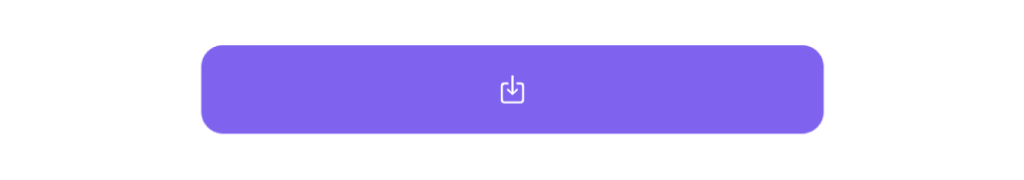
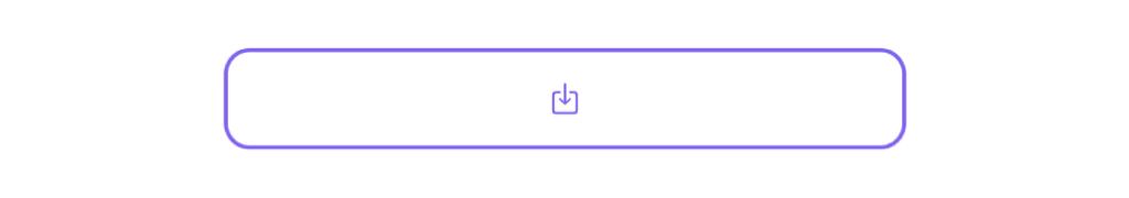
Icon Only
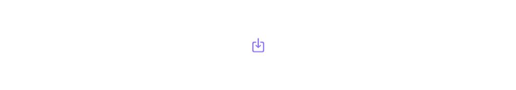
LGNSolidButton(title: "",centerImage: Image(systemName: "square.and.arrow.down"))
Solid Disabled
This code sample demonstrates how to modify disable of the button :
LGNSolidButton(title: "Button",).disableInteraction(true)
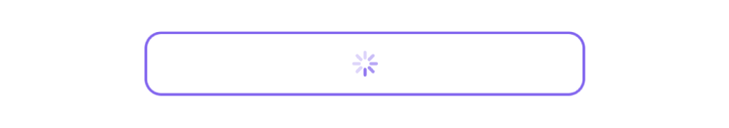
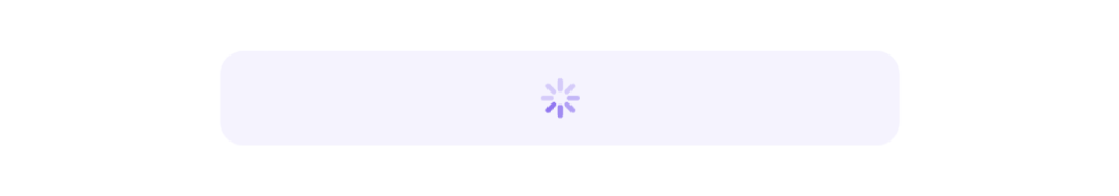
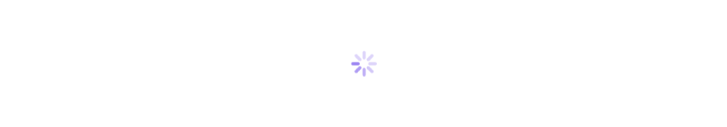
Solid Show Activity
This code sample demonstrates how to modify show activity of the button :
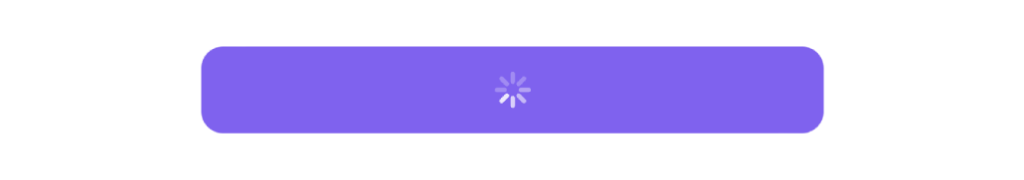
LGNSolidButton(title: "Button",).showProgressView(true)
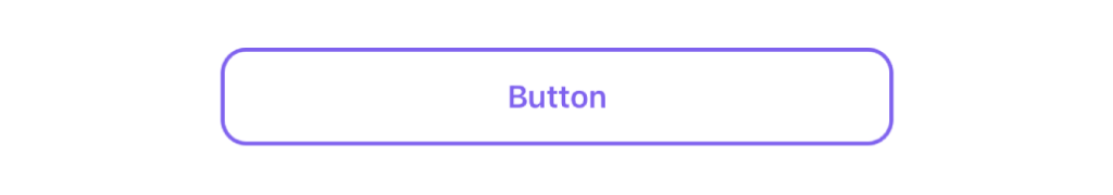
Outline
Outline Responsiveness
This responsive button or boolean attribute for user to choose the button responsively to the screen / layout or not.
Responsive
LGNOutlineButton(title: "Button").variant(size: .medium, responsive: true)
Not Responsive
LGNOutlineButton(title: "Button").variant(size: .medium, responsive: false)
Outline Size
This size text button attribute for user to choose size text inside the button.
Large
LGNOutlineButton(title: "Button").variant(size: .large, responsive: true)
Medium
LGNOutlineButton(title: "Button").variant(size: .medium, responsive: true)
Small
LGNOutlineButton(title: "Button").variant(size: .small, responsive: true)
Outline Icon
This icon attribute for user to choose the icon position inside the button.
Left Icon
LGNOutlineButton(title: "Button",leftImage: Image(systemName: "square.and.arrow.down"))
Right Icon
LGNOutlineButton(title: "Button",rightImage: Image(systemName: "square.and.arrow.down"))
Icon Only
LGNOutlineButton(title: "",centerImage: Image(systemName: "square.and.arrow.down"))
Outline Disabled
This code sample demonstrates how to modify disable of the button :
LGNOutlineButton(title: "Button",).disableInteraction(true)
Outline Show Activity
This code sample demonstrates how to modify show activity of the button :
LGNOutlineButton(title: "Button",).showProgressView(true)
Soft
Soft Responsiveness
This responsive button or boolean attribute for user to choose the button responsively to the screen / layout or not.
Responsive
LGNSoftButton(title: "Button").variant(size: .medium, responsive: true)
Not Responsive
LGNSoftButton(title: "Button").variant(size: .medium, responsive: false)
Soft Size
This size text button attribute for user to choose size text inside the button.
Large
LGNSoftButton(title: "Button").variant(size: .large, responsive: true)
Medium
LGNSoftButton(title: "Button").variant(size: .medium, responsive: true)
Small
LGNSoftButton(title: "Button").variant(size: .small, responsive: true)
Soft Icon
This icon attribute for user to choose the icon position inside the button.
Left Icon
LGNSoftButton(title: "Button",leftImage: Image(systemName: "square.and.arrow.down"))
Right Icon
LGNSoftButton(title: "Button",rightImage: Image(systemName: "square.and.arrow.down"))
Icon Only
LGNSoftButton(title: "",centerImage: Image(systemName: "square.and.arrow.down"))
Soft Disabled
This code sample demonstrates how to modify disable of the button :
LGNSoftButton(title: "Button",).disableInteraction(true)
Soft Show Activity
This code sample demonstrates how to modify show activity of the button :
LGNSoftButton(title: "Button",).showProgressView(true)
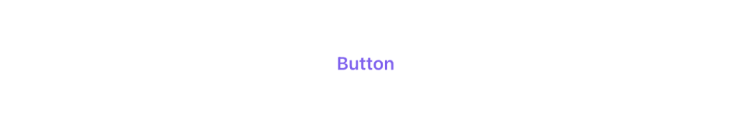
Transparent
Transparent Responsiveness
This responsive button or boolean attribute for user to choose the button responsively to the screen / layout or not.
Responsive
LGNTransparentButton(title: "Button").variant(size: .medium, responsive: true)
Not Responsive
LGNTransparentButton(title: "Button").variant(size: .medium, responsive: false)
Transparent Size
This size text button attribute for user to choose size text inside the button.
Large
LGNTransparentButton(title: "Button").variant(size: .large, responsive: true)
Medium
LGNTransparentButton(title: "Button").variant(size: .medium, responsive: true)
Small
LGNTransparentButton(title: "Button").variant(size: .small, responsive: true)
Transparent Icon
This icon attribute for user to choose the icon position inside the button.
Left Icon
LGNTransparentButton(title: "Button",leftImage: Image(systemName: "square.and.arrow.down"))
Right Icon
LGNTransparentButton(title: "Button",rightImage: Image(systemName: "square.and.arrow.down"))
Icon Only
LGNTransparentButton(title: "",centerImage: Image(systemName: "square.and.arrow.down"))
Transparent Disabled
This code sample demonstrates how to modify disable of the button :
LGNTransparentButton(title: "Button",).disableInteraction(true)
Transparent Show Activity
This code sample demonstrates how to modify show activity of the button :
LGNTransparentButton(title: "Button",).showProgressView(true)
Properties
| Properties | Description | Default Value |
|---|---|---|
| action | The action to perform when the user triggers the button. | {} |
| title | The title for the button’s title, that describes the purpose of the button’s action. | - |
| leftImage | Put the image in the left position in the button. | nil |
| rightImage | Put the image in the right position in the button. | nil |
| centerImage | Put the image in the center position of the button. | nil |
| largeTextFont | Change the font on the title button is in large size. | bodyLargeSemibold |
| mediumTextFont | Change the font on the title button is in medium size. | bodySmallSemibold |
| smallTextFont | Change the font on the title button is in small size. | captionLargeSemibold |
| tintBtnColor | To change the tint color of button. | depending on the variant |
| tintPressedBtnColor | Change the tint color on the button when pressed state. | depending on the theme |
| defaultBtnColor | To change the tint color of button. | depending on the variant |
| pressedBtnColor | Change the background color of the button when the button is in pressed state. | depending on the variant |
| cornerRadius | Change corner radius value. | 12 |
List of viewModifier
| viewModifier | Description | Parameters |
|---|---|---|
| variant | Button can be modified the size (large, medium, or small) of the title label and also responsive or not. | size and responsive |
| disableInteraction | A view that controls whether users can interact with this view. | disabled |
| showProgressView | Adds a condition if there is interaction from the user and want to change the button to a loading state. | isShow |