Components
Modal
Modal is used to display the content that appears inside a form
Component Status Details
Status component contains a list of checks and completeness that has been tested and owned by each component
 We don't use color as the only visual tool to convey information.
 The component’s structure and properties include relevant options such as variant, style, size, orientation, optional iconography, decorations, selection, error state, etc.
 The title is the component name that uses the frame base component template.
 The base component name contains: .Base & "Component Name" if there is more than one.
 All component properties use the Legion foundation.
 We can change all the parts that are connected to the component base.
 The inside of the base component remains connected to the master component.
 All variant options are not damaged when we change from one to another.
 Overriding changes to components will not reset other variants.
 Component's already has component specs documentation.
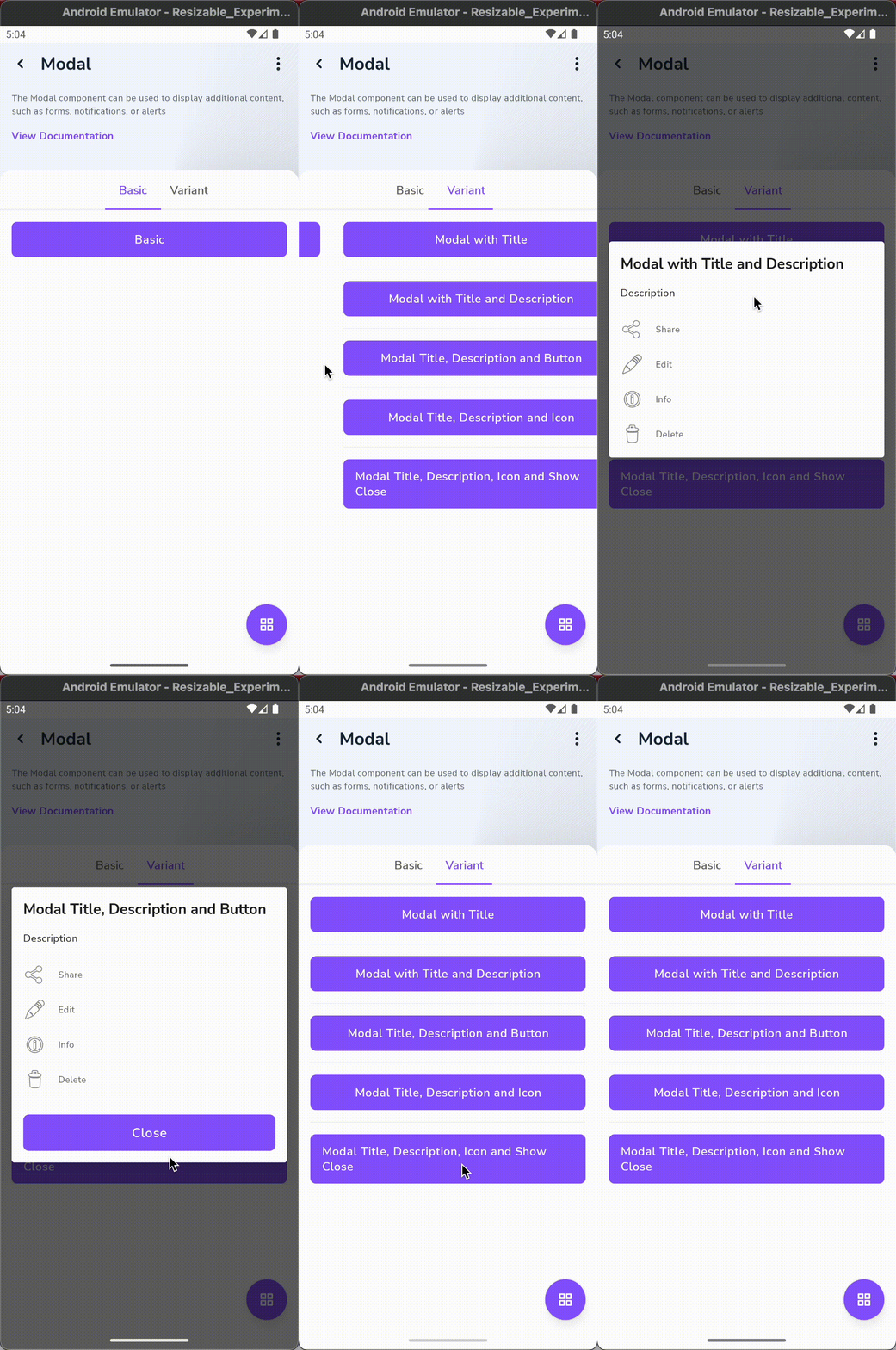
The Modal component is a dialog window that is displayed on top of the main content. It is used to display content that is not essential to the main interaction flow but requires the user’s attention.

Variants
Legion has 4 variants of modals :
- Modal With Title
- Modal with Description
- Modal With Button
- Modal With Show Close
Usage
Basic
...btnAction.setOnClickListener {LgnModal.setup(requireContext()) {...orientation = LgnModal.Orientation.VERTICALheader = LgnModal.HeaderView.NonesetContent<LayoutModalBinding> {...}
Modal With Title
...btnAction.setOnClickListener {LgnModal.setup(requireContext()) {...orientation = LgnModal.Orientation.VERTICALheader = LgnModal.HeaderView.Default(title = "title")setContent<LayoutModalBinding> {...}
Modal With Description
...btnAction.setOnClickListener {LgnModal.setup(requireContext()) {...orientation = LgnModal.Orientation.VERTICALheader = LgnModal.HeaderView.Default(description = "description")setContent<LayoutModalBinding> {...}
Modal With Button
...btnAction.setOnClickListener {LgnModal.setup(requireContext()) {...orientation = LgnModal.Orientation.VERTICALheader = LgnModal.HeaderView.Default(title = "title")setContent<LayoutModalBinding> {...}
Modal With Show Close
...btnAction.setOnClickListener {LgnModal.setup(requireContext()) {...orientation = LgnModal.Orientation.VERTICALheader = LgnModal.HeaderView.Default(showClose = true)setContent<LayoutModalBinding> {...}
Attributes
| Attribute Name | Xml Attrs | Related method(s) | Description |
|---|---|---|---|
| Header View | N/A | header | Set view type for header |
| Orientation Button | N/A | orientation | Set footer button orientation |
| Content View | N/A | setContent<T : ViewBinding> | Configure content views, can modify your views at provided lambda |
| Add button | N/A | addButton | Add Button on Footer Bottom Sheet with Builder Pattern, and maximum users can add button. is 3 button, and when more than 3 will throw [IndexOutOfBoundsException] |
| Dismiss | N/A | dismiss | Dismiss Modal |
| Dismiss Listener | N/A | setModalListener | Receive listener on modal dismissed |