Components
Slider
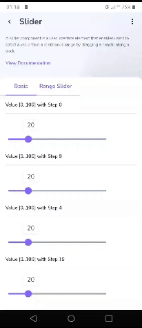
A slider component is a user interface element that enables users to select a value from a continuous range by dragging a handle along a track.

Component Status Details
Status component contains a list of checks and completeness that has been tested and owned by each component
 We don't use color as the only visual tool to convey information. The component’s structure and properties include relevant options such as variant, style, size, orientation, optional iconography, decorations, selection, error state, etc. The title is the component name that uses the frame base component template. The base component name contains: .Base & "Component Name" if there is more than one. All component properties use the Legion foundation. We can change all the parts that are connected to the component base. The inside of the base component remains connected to the master component. All variant options are not damaged when we change from one to another. Overriding changes to components will not reset other variants. Component's already has component specs documentation.
Usage
A slider component is a user interface element that enables users to select a value from a continuous range by dragging a handle along a track.
Example
Slider with Value
With Step 0
val sliderPosition = remember { mutableStateOf(20f) }val min = 0fval max = 100fLgnSlider(modifier = Modifier.width(300.dp),value = sliderPosition.value,valueRange = min..max,
With Step 9
val sliderPosition = remember { mutableStateOf(20f) }val min = 0fval max = 100fLgnSlider(modifier = Modifier.width(300.dp),value = sliderPosition.value,valueRange = min..max,
With Step 4
val sliderPosition = remember { mutableStateOf(20f) }val min = 0fval max = 100fLgnSlider(modifier = Modifier.width(300.dp),value = sliderPosition.value,valueRange = min..max,
With Step 19
val sliderPosition = remember { mutableStateOf(20f) }val min = 0fval max = 100fLgnSlider(modifier = Modifier.width(300.dp),value = sliderPosition.value,valueRange = min..max,
Disabled
val sliderPosition = remember { mutableStateOf(20f) }val min = 0fval max = 100fLgnSlider(modifier = Modifier.width(300.dp),value = sliderPosition.value,valueRange = min..max,
Range Slider
var sliderPosition by remember { mutableStateOf(0f..100f) }LgnRangeSlider(modifier = Modifier.width(300.dp),value = sliderPosition,steps = 9,valueRange = 0f..100f,onValueChange = {sliderPosition = it
Attributes
| Parameters | Type | Description |
|---|---|---|
| value | Float | Current value of the slider |
| onValueChange | Function | Callback in which value should be updated |
| valueRange | Float | Range of values that this slider can take |
| steps | Float | if greater than 0, specifies the amount of discrete allowable values, evenly distributed across the whole value range. |
| enabled | boolean | Controls the enabled state of this slider |
| onValueChangeFinished | Function | Called when value change has ended |
| colors | LgnSliderColors | [LgnSliderColors] that will be used to resolve the colors used for this slider in different states. See [LgnSliderDefaults.colors] |
| Interaction | MutableInteractionSource | [MutableInteractionSource] representing the stream of [Interaction]s for this slider |
| modifier | Modifier | Modifiers for the Range Slider layout |