Components
Snackbar
Snackbar displays informative text

Status component contains a list of checks and completeness that has been tested and owned by each component
 We don't use color as the only visual tool to convey information. The component’s structure and properties include relevant options such as variant, style, size, orientation, optional iconography, decorations, selection, error state, etc. The title is the component name that uses the frame base component template. The base component name contains: .Base & "Component Name" if there is more than one. All component properties use the Legion foundation. We can change all the parts that are connected to the component base. The inside of the base component remains connected to the master component. All variant options are not damaged when we change from one to another. Overriding changes to components will not reset other variants. Component's already has component specs documentation.
Usage
Snackbars notify users of processes that have been or will be performed by the app. They appear temporarily, towards the bottom of the screen. They must not interfere with the user experience, and they do not require user input to disappear. Snackbars are often used as tooltips/popups to show a message at the bottom of the screen.
Use Legion snackbar styles to modify snackbar with lots of attributes that make you easier.
Usage Default LegionUI
struct ContentView: View {var body: some View {YourOutmostView {//your screen content}.snackbar(isShowing: .constant(true))}}extension View {
Usage Theme
Import the theme you prefer: ThemeAGR, ThemeMyTEnS, ThemeIHS & ThemeEazy
struct ContentView: View {var body: some View {YourOutmostView {//your screen content}.snackbar(isShowing: .constant(true))}}extension View {
Apparances of Snackbar :
- Size : Medium, or small size
- style : Solid, or soft
- Variant: Default, tertiary, warning, error, information, or success
- Left content : Trailing avatar, Trailing icon, or no left content
- Title : Title only, or title with description (subtitle)
- Right content : Text button or icon button. Text and icon are customizable
Customize the colors, in order to adapt with your app color token Text Color & Background Color
Sizes
This code sample demonstrates how to modify the style the snackbar using ThemeLGN :
Medium
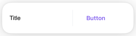
LGNSnackbar(isShowing: isShowing,parent: { self },size: .medium,style: .solid,variant: .default,title: "Title",trailingButtonText: "Button")
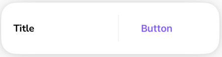
Small

LGNSnackbar(isShowing: isShowing,parent: { self },size: .small,style: .solid,variant: .default,title: "Title",trailingButtonText: "Button")
Styles
This code sample demonstrates how to modify the style the snackbar using ThemeLGN :
Solid Default
LGNSnackbar(isShowing: isShowing,parent: { self },style: .solid,variant: .default,title: "Title",trailingButtonText: "Button")
Soft Default
LGNSnackbar(isShowing: isShowing,parent: { self },style: .soft,variant: .default,title: "Title")
Variants
This code sample demonstrates how to modify the variant of Solid Style the snackbar using ThemeLGN. You can also change the variant to Soft Style if you wish.
Tertiary

LGNSnackbar(isShowing: isShowing,parent: { self },style: .solid,variant: .tertiary,title: "Title",subtitle: "Snackbar message..",trailingButtonText: "Button")
Warning
LGNSnackbar(isShowing: isShowing,parent: { self },style: .solid,variant: .warning,title: "Title",leadingIcon: Image(systemName: "arrow.up.circle"),trailingButtonText: "Button")
Information
LGNSnackbar(isShowing: isShowing,parent: { self },style: .solid,variant: .information,title: "Title",leadingAvatarUrl: "https://yourdomain.com/your-image.png",trailingButtonText: "Button")
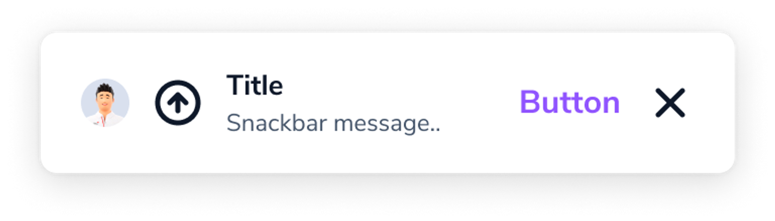
Error
LGNSnackbar(isShowing: isShowing,parent: { self },style: .solid,variant: .error,title: "Title",subtitle: "Snackbar message..",leadingIcon: Image(systemName: "arrow.up.circle"),trailingButtonText: "Button"
Success
LGNSnackbar(isShowing: isShowing,parent: { self },style: .solid,variant: .success,title: "Title",subtitle: "Snackbar message..",leadingAvatarUrl: "https://yourdomain.com/your-image.png",trailingButtonText: "Button"
Properties
| Properties | Description | Default Value |
|---|---|---|
| isShowing | the binding that decides the appropriate drawing in the body. | |
| size | the size of the snackbar. .medium, or .small | .medium |
| style | the style of the snackbar. .solid, or .soft | .solid |
| variant | the variant of the snackbar. .default, .tertiary , .warning, .information, .error, or .success | .default |
| parent | parent view to which this snackbar shall be attached | - |
| position | place on the screen where the snackbarr should appear. .top, .center, or .bottom | .bottom |
| title | the main text you want to display on snackbar | - |
| titleFontFamily | fontFamily of your title | "" |
| titleColor | text color of your title | Color.LGNTheme.tertiary900 |
| subtitle | the describtion or subtitle text you want to display on snackbar | "" |
| subtitleFontFamily | fontFamily of your subtitle | "" |
| subtitleColor | text color of your subtitle | Color.LGNTheme.tertiary600 |
| backgroundColor | your snackbar background color | .white |
| leadingIcon | the icon you want to display on the left hand side of your snackbar text | nil |
| leadingIconTint | your leadingIcon color tint | .black |
| leadingAvatarUrl | when you want to display avatar instead of icon on the left, fill this with image url | "" |
| trailingButtonText | text string to display on the action button of your snackbar’s right hand side | "" |
| trailingButtonTextTint | your trailingButtonText tint color | Color.LGNTheme.primary500 |
| trailingButtonIcon | when you have no text to display as a trailing button, this icon image will be used instead | Image(systemName: "xmark") |
| trailingButtonIconTint | your trailingButtonIcon tint color | .black |
| trailingButtonAction | additional action to trigger when user taps on the trailing action button | { } |
Example Project
LGNSnackbar(isShowing: isShowing,parent: { self },style: .solid,variant: .default,position: .bottom,title: "Title",titleFontFamily: "Montserrat-Bold",titleColor: Color.LGNTheme.tertiary900,
Important Notes
- Left content can only display either avatar or icon. If you put on both values, only avatar will be displayed
- Right content can only display one button i.e. text button, or icon button. If you put on both, only text button will appear
- If you do not specify right content, it will always display right icon button with the default
xmarkicon.