Components
Snackbar
Snackbar displays informative text

Status component contains a list of checks and completeness that has been tested and owned by each component
 We don't use color as the only visual tool to convey information. The component’s structure and properties include relevant options such as variant, style, size, orientation, optional iconography, decorations, selection, error state, etc. The title is the component name that uses the frame base component template. The base component name contains: .Base & "Component Name" if there is more than one. All component properties use the Legion foundation. We can change all the parts that are connected to the component base. The inside of the base component remains connected to the master component. All variant options are not damaged when we change from one to another. Overriding changes to components will not reset other variants. Component's already has component specs documentation.
Snackbars are UI elements that notify users about background processes or events within the app. They typically appear temporarily on the screen, with customizable duration and position (top, center, or bottom), ensuring they don’t interrupt the user experience. Snackbars do not require user interaction to dismiss and are commonly used to display brief messages, such as tooltips or popups, at the bottom of the screen.
Usage
To use the Legion iOS UIKit theme, you need to import one of the available themes. Currently, the following themes are supported: ThemeAGR, ThemeEazy, ThemeIHS, ThemeLGN, and ThemeMyTEnS.
import ThemeLGN
Sizes
Legion offers two sizes of SnackBar:
Medium
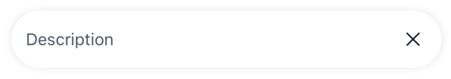
let snackBar = LGNSnackBarUIKit(size: .medium, // Optional (default)description: "Description")
Small
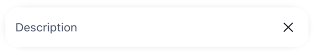
let snackBar = LGNSnackBarUIKit(size: .small,description: "Description")
Variant
Default
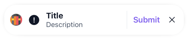
let snackBar = LGNSnackBarUIKit(variant: .default,title: "Title",description: "Description",leftIcon: UIImage(systemName: "exclamationmark.circle.fill"),avatar: (.imageURL(URL(string: "https://cdn-icons-png.flaticon.com/512/1946/1946431.png")!)),withDivider: true,actionButtonTitle: "Submit")
Tertiary
let snackBar = LGNSnackBarUIKit(variant: .tertiary,title: "Title",description: "Description",leftIcon: UIImage(systemName: "exclamationmark.circle.fill"),avatar: (.imageURL(URL(string: "https://cdn-icons-png.flaticon.com/512/1946/1946431.png")!)),withDivider: true,actionButtonTitle: "Submit")
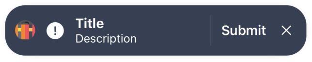
Warning
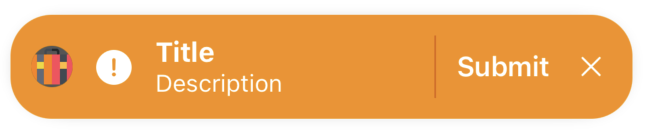
let snackBar = LGNSnackBarUIKit(variant: .warning,title: "Title",description: "Description",leftIcon: UIImage(systemName: "exclamationmark.circle.fill"),avatar: (.imageURL(URL(string: "https://cdn-icons-png.flaticon.com/512/1946/1946431.png")!)),withDivider: true,actionButtonTitle: "Submit")
Error
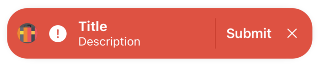
let snackBar = LGNSnackBarUIKit(variant: .error,title: "Title",description: "Description",leftIcon: UIImage(systemName: "exclamationmark.circle.fill"),avatar: (.imageURL(URL(string: "https://cdn-icons-png.flaticon.com/512/1946/1946431.png")!)),withDivider: true,actionButtonTitle: "Submit")
Information
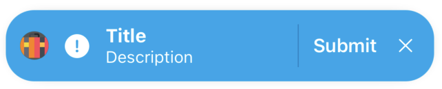
let snackBar = LGNSnackBarUIKit(variant: .information,title: "Title",description: "Description",leftIcon: UIImage(systemName: "exclamationmark.circle.fill"),avatar: (.imageURL(URL(string: "https://cdn-icons-png.flaticon.com/512/1946/1946431.png")!)),withDivider: true,actionButtonTitle: "Submit")
Success
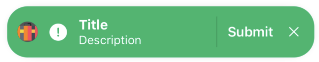
let snackBar = LGNSnackBarUIKit(variant: .success,title: "Title",description: "Description",leftIcon: UIImage(systemName: "exclamationmark.circle.fill"),avatar: (.imageURL(URL(string: "https://cdn-icons-png.flaticon.com/512/1946/1946431.png")!)),withDivider: true,actionButtonTitle: "Submit")
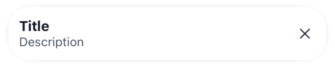
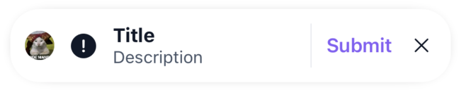
Title
You can optionally add a title to the SnackBar.
let snackBar = LGNSnackBarUIKit(title: "Title",description: "Description",)
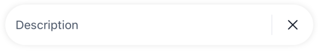
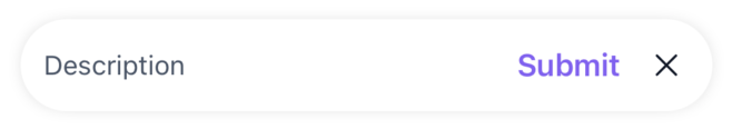
Description (Required)
The description is a required field and displays the main message in the SnackBar.
let snackBar = LGNSnackBarUIKit(description: "Description")
Left Icon
Optionally add a left icon to the SnackBar for visual context.
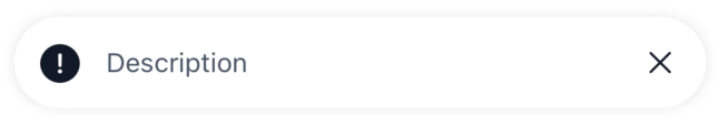
let snackBar = LGNSnackBarUIKit(description: "Description",leftIcon: UIImage(systemName: "exclamationmark.circle.fill"))
Avatar
You can display an avatar in the SnackBar using an image URL, a UIImage, or string initials.
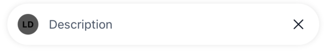
let avatarURL = .imageURL(URL(string: "https://cdn-icons-png.flaticon.com/512/1946/1946431.png")!)let avatarUIImage = (.image(UIImage(systemName: "xmark") ?? UIImage()))let avatarInitials = (.initials("Legion Design System"))let snackBar = LGNSnackBarUIKit(description: "Description",avatar: avatarInitials)
Divider
Optionally add a divider between the left icon/avatar/title/description and the action button/close button.
let snackBar = LGNSnackBarUIKit(description: "Description",withDivider: true)
Action Button
Add an optional action button with a title.
let snackBar = LGNSnackBarUIKit(description: "Description",actionButtonTitle: "Submit")
Close Button (Default is True)
You can choose whether to include a close button (dismiss control). By default, this is set to true.
let snackBar = LGNSnackBarUIKit(description: "Description",withCloseButton: false)
Full Configuration Example
Here’s an example of a fully-configured SnackBar:
let snackBar = LGNSnackBarUIKit(size: .medium,title: "Title",description: "Description",leftIcon: UIImage(systemName: "exclamationmark.circle.fill"),avatar: (.initial(initial: "Legion Design System")),withDivider: true,actionButtonTitle: "Submit",withCloseButton: true,
Tracking the Action or Dismissal
You can track the action button tap and the dismissal of the SnackBar.
let snackBar = LGNSnackBarUIKit(description: "Description",onTapAction: {print("Action button tapped")},onDismissed: {print("SnackBar dismissed")})
Custom
Customize the position, padding, and duration when displaying the SnackBar.
let snackBar = LGNSnackBarUIKit(description: "Description")snackBar.show(in: self.view,position: .bottom, // Set the position (top, center, bottom)leadingPadding: 21, // Set padding from the lefttrailingPadding: 21, // Set padding from the right
Properties
| Property | Description | Default Value |
|---|---|---|
| actionButtonTitle | The title of the action button that appears in the SnackBar. | nil |
| avatar | The avatar type to display in the SnackBar. Can be a URL, UIImage, or initials. | nil |
| description | The main content to display in the SnackBar. This is a required field. | (Required) |
| duration | Duration for which the SnackBar will be shown, in seconds. Set to nil for an indefinite duration. | 3.0 |
| leftIcon | An optional image to display on the left side of the SnackBar. | nil |
| onTapAction | Closure to execute when the action button is tapped. | nil |
| onDismissed | Closure to execute when the SnackBar is dismissed (either automatically or manually). | nil |
| position | The position of the SnackBar on the screen. Options include .top, .center, or .bottom. | .bottom |
| show(in:position:padding:duration:) | A method that displays the SnackBar in the specified parent view with custom position, padding, and duration. | (Method) |
| size | The size of the SnackBar. Choose between .medium or .small. | .medium |
| title | The title text to display in the SnackBar (optional). | nil |
| withCloseButton | Determines whether the close button (dismiss control) is shown. | true |
| withDivider | Determines whether to display a divider between the content (icon/avatar/title/description) and the buttons. | false |