Components
Spinner
Option for your additional loading indicator

Component Status Details
Status component contains a list of checks and completeness that has been tested and owned by each component
 We don't use color as the only visual tool to convey information. The component’s structure and properties include relevant options such as variant, style, size, orientation, optional iconography, decorations, selection, error state, etc. The title is the component name that uses the frame base component template. The base component name contains: .Base & "Component Name" if there is more than one. All component properties use the Legion foundation. We can change all the parts that are connected to the component base. The inside of the base component remains connected to the master component. All variant options are not damaged when we change from one to another. Overriding changes to components will not reset other variants. Component's already has component specs documentation.
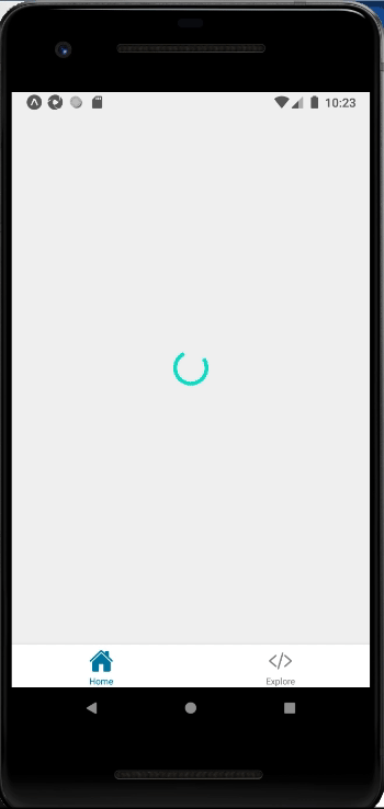
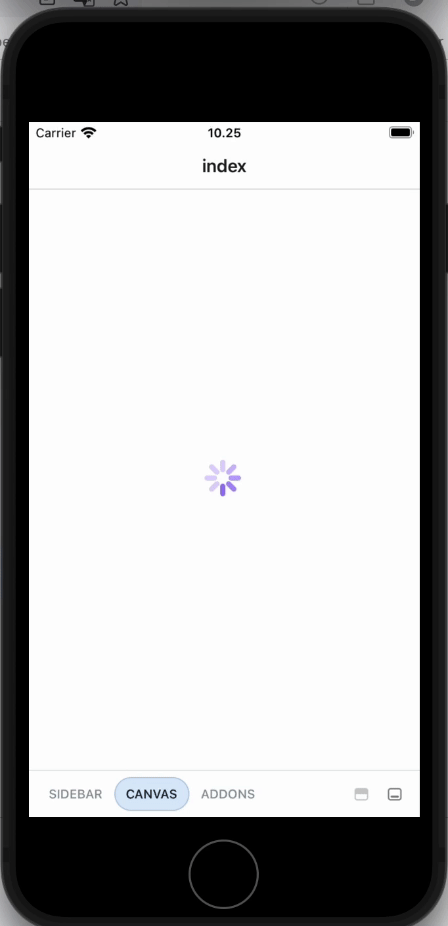
Spinner indicates a loading state or progress state of a page or section. Spinner extends react native original ActivityIndicator.
Usage
import { Spinner } from "@legion-crossplatform/ui";const Spinner = () => {return (<Spinner />)}
Android
iOS
Color
import { Spinner } from "@legion-crossplatform/ui";const Spinner = () => {return (<Spinner size="large" color="#000000" />)}
Props
| Parameters | Type | Description |
|---|---|---|
| color | string | Set color of Spinner |
| size | small | large | Set size of Spinner |