Components
Switch
Control that allows users to turn on or off item

Status component contains a list of checks and completeness that has been tested and owned by each component
 We don't use color as the only visual tool to convey information. The component’s structure and properties include relevant options such as variant, style, size, orientation, optional iconography, decorations, selection, error state, etc. The title is the component name that uses the frame base component template. The base component name contains: .Base & "Component Name" if there is more than one. All component properties use the Legion foundation. We can change all the parts that are connected to the component base. The inside of the base component remains connected to the master component. All variant options are not damaged when we change from one to another. Overriding changes to components will not reset other variants. Component's already has component specs documentation.
Usage
Switch are used for activating one of two predefined options
Use Legion switch to modify the responsive toggle buttons that supports default and small sizes, and an optional text label on its right side etc.
Usage Default LegionUI
Switch(initialValue: true)
Usage Theme
ThemeAGR, ThemeMyTEnS, ThemeIHS & ThemeEazy
LGNSwitch(initialValue: true)
Variant
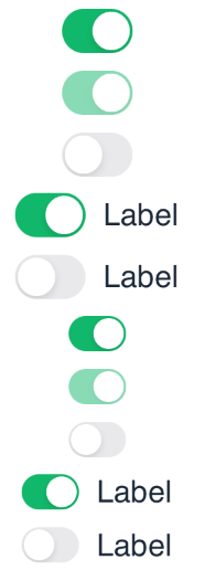
Legion Have 2 Variant of Switch :

Theme (ThemeAGR, ThemeMyTEnS, ThemeIHS & ThemeEazy)Switch(initialValue: true, onToggleChange: {value in print(value)} )
LGNSwitch(initialValue: true, onToggleChange: {value in print(value)} )

Theme (ThemeAGR, ThemeMyTEnS, ThemeIHS & ThemeEazy)Switch(initialValue: false, onToggleChange: {value in print(value)} )
LGNSwitch(initialValue: false, onToggleChange: {value in print(value)} )
Attribute
Legion Have 3 Attributes for Customize Switch :
Size

Theme (ThemeAGR, ThemeMyTEnS, ThemeIHS & ThemeEazy)Switch(initialValue: true, sizeType: LGNSwitch.SizeType.small, onToggleChange: {newValue in print(value)} ){" "}
LGNSwitch(initialValue: true, sizeType: LGNSwitch.SizeType.small, onToggleChange: {newValue in print(value)}{" "}){" "}

Theme (ThemeAGR, ThemeMyTEnS, ThemeIHS & ThemeEazy)Switch(initialValue: true, sizeType: LGNSwitch.SizeType.default, onToggleChange: {newValue in print(value)}{" "}){" "}
LGNSwitch(initialValue: true, sizeType: LGNSwitch.SizeType.default, onToggleChange: {newValue in print(value)}{" "}){" "}
Disable
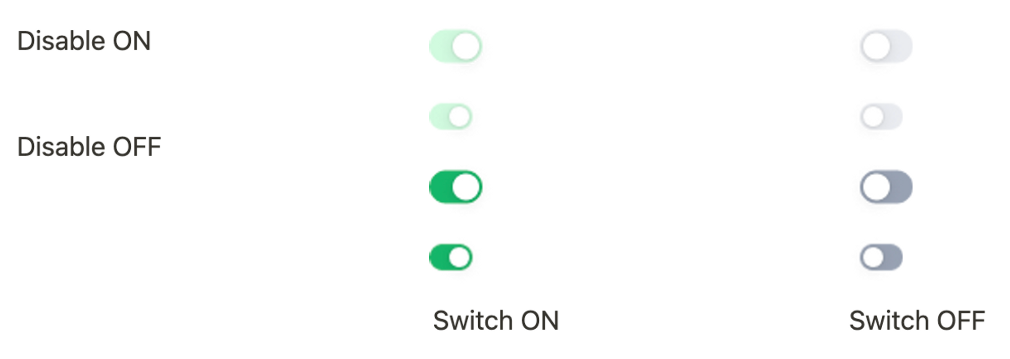
This code sample demonstrates how to modify disable of the switch :
Legion UI
Switch(initialValue: true,isDisabled: .constant(true))
ThemeAGR, ThemeMyTEnS, ThemeIHS & ThemeEazy
LGNSwitch(initialValue: true,isDisabled: .constant(true))
Label
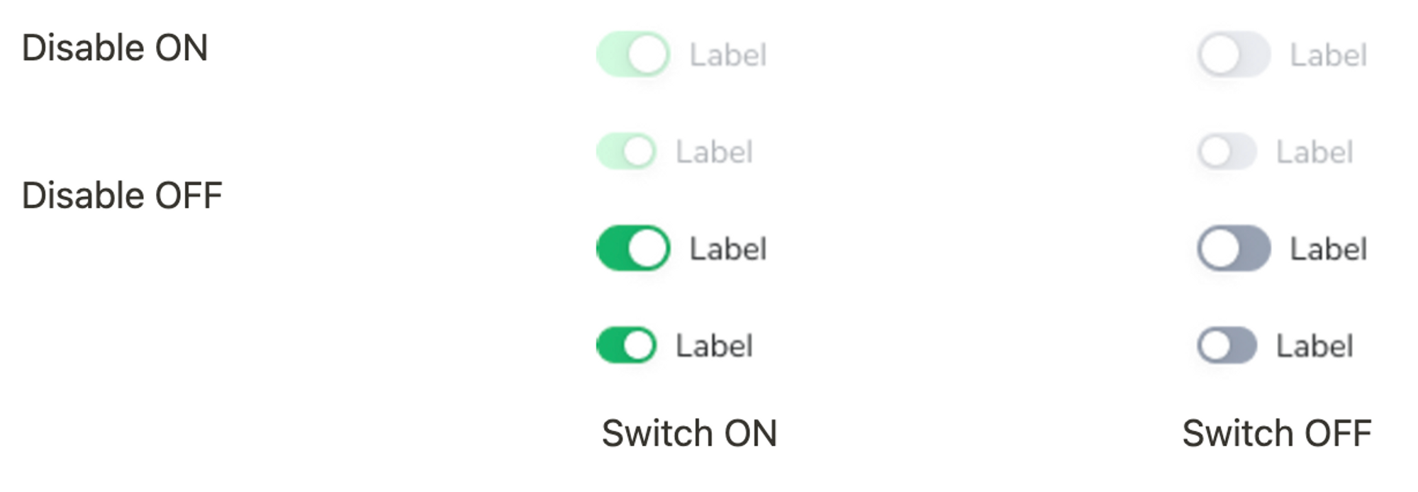
This code sample demonstrates how to modify label of the button :
Legion UI
LGNSwitch("Label", initialValue: true, isDisabled: .constant(true))
ThemeAGR, ThemeMyTEnS, ThemeIHS & ThemeEazy
LGNSwitch("Label",initialValue: true,isDisabled: .constant(true))
Properties
| Properties | Description | Default Value |
|---|---|---|
| text | The text that should appear on the right side of the swift | nil |
| initialValue | The initial state of the Switch. Whether it is turned on (true) or off (false) | required or no default value |
| sizeType | The size of the toggle Either .default or .small | .default |
| fontFamily | A string of font family name | Nurito-Sans |
| textForegroundColor | A color to be used for the text label on the right, when the view is not disabled | Color.LGNTheme.tertiary800 |
| textDisabledColor | A color to be used for the text label on the right, when the view is disabled | Color.LGNTheme.tertiary50 |
| isDisabled | A binding boolean to enable disable the component | .constant(false) |
| onToggleChange | The action to perform when user toggles the switch. | nil |
| Function Name | Description |
|---|---|
| setTintColor | The LGNSwitch can change the tint color of the switch |
| animateBeamEffectWhenToggleOn() | The LGNSwitch can be animated like beam effect when the toggle change from off to on |
| animateBounceWhenToggleOn() | The LGNSwitch can be animated like bouncing when the toggle change from off to on |
Example Project
LegionUI
Switch("Label",initialValue: true,sizeType: .default,fontFamily: "NunitoSans-Bold",textForegroundColor: Color.LGNTheme.tertiary800,textDisabledColor: Color.LGNTheme.tertiary500,isDisabled: .constant(false),onToggleChange: { value in
ThemeAGR, ThemeMyTEnS, ThemeIHS & ThemeEazy
Switch("Label",initialValue: true,sizeType: .default,fontFamily: "NunitoSans-Bold",textForegroundColor: Color.LGNTheme.tertiary800,textDisabledColor: Color.LGNTheme.tertiary500,isDisabled: .constant(false),onToggleChange: { value in