Components
Switch
Control that allows users to turn on or off item

Component Status Details
Status component contains a list of checks and completeness that has been tested and owned by each component
 We don't use color as the only visual tool to convey information. The component’s structure and properties include relevant options such as variant, style, size, orientation, optional iconography, decorations, selection, error state, etc. The title is the component name that uses the frame base component template. The base component name contains: .Base & "Component Name" if there is more than one. All component properties use the Legion foundation. We can change all the parts that are connected to the component base. The inside of the base component remains connected to the master component. All variant options are not damaged when we change from one to another. Overriding changes to components will not reset other variants. Component's already has component specs documentation.
A simple switch toggle, which supports large (default), medium and small sizes, and an optional text label on its right side.
Usage
To use the Legion iOS UIKit theme, you need to import one of the available themes. Currently, the following themes are supported: ThemeAGR, ThemeEazy, ThemeIHS, ThemeLGN, ThemeMyTEnS.
import ThemeLGN
Size
Large
Active: true, Disable: true, without Text Label

let lgnSwitch = LGNSwitch(active: true,disable: true,size: .lg)
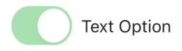
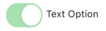
Active: true, Disable: true, with Text Label
let lgnSwitch = LGNSwitch(active: true,disable: true,size: .lg,textLabel: "Text Option")
Active: true, Disable: false, without Text Label

let lgnSwitch = LGNSwitch(active: true,disable: false,size: .lg)
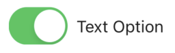
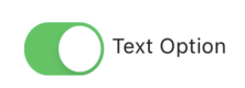
Active: true, Disable: false, with Text Label
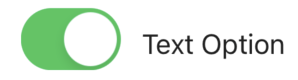
let lgnSwitch = LGNSwitch(active: true,disable: false,size: .lg,textLabel: "Text Option")
Active: false, Disable: true, without Text Label

let lgnSwitch = LGNSwitch(active: false,disable: true,size: .lg)
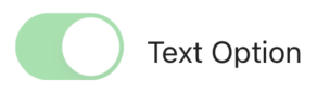
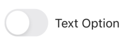
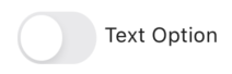
Active: false, Disable: true, with Text Label

let lgnSwitch = LGNSwitch(active: false,disable: true,size: .lg,textLabel: "Text Option")
Active: false, Disable: false, without Text Label

let lgnSwitch = LGNSwitch(active: false,disable: false,size: .lg)
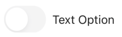
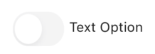
Active: false, Disable: false, with Text Label
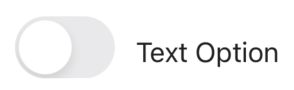
let lgnSwitch = LGNSwitch(active: false,disable: false,size: .lg,textLabel: "Text Option")
Medium
Active: true, Disable: true, with Text Label
let lgnSwitch = LGNSwitch(active: true,disable: true,size: .md,textLabel: "Text Option")
Active: true, Disable: false, with Text Label
let lgnSwitch = LGNSwitch(active: true,disable: false,size: .md,textLabel: "Text Option")
Active: false, Disable: true, with Text Label
let lgnSwitch = LGNSwitch(active: false,disable: true,size: .md,textLabel: "Text Option")
Active: false, Disable: false, with Text Label
let lgnSwitch = LGNSwitch(active: false,disable: false,size: .md,textLabel: "Text Option")
Small
Active: true, Disable: true, with Text Label
let lgnSwitch = LGNSwitch(active: true,disable: true,size: .sm,textLabel: "Text Option")
Active: true, Disable: false, with Text Label
let lgnSwitch = LGNSwitch(active: true,disable: false,size: .sm,textLabel: "Text Option")
Active: false, Disable: true, with Text Label
let lgnSwitch = LGNSwitch(active: false,disable: true,size: .sm,textLabel: "Text Option")
Active: false, Disable: false, with Text Label
let lgnSwitch = LGNSwitch(active: false,disable: false,size: .sm,textLabel: "Text Option")
Properties
| Property | Description | Default Value |
|---|---|---|
| active | Initial state of the switch. | true |
| disable | Determines if the switch is enabled. | true |
| disabledTextColor | Color of the text when disabled. | #212121 |
| disabledOffTintColor | Tint color when the switch is off and disabled. | Tertiary300 |
| disabledOnTintColor | Tint color when the switch is on but disabled. | Success100 |
| enabledTextColor | Color of the text when enabled. | #212121 |
| enabledOffTintColor | Tint color when the switch is off and enabled. | Tertiary400 |
| enabledOnTintColor | Tint color when the switch is on and enabled. | Success500 |
| fontProvider | Conforms to LGNSwitchFontProvider, providing fonts for the switch label based on SizeType. | nil |
| onToggleChange | Closure that gets called when the switch is toggled. | nil |
| size | Size of the switch, using the predefined SizeType | .lg |
| sizeProvider | Conforms to LGNSwitchSizeProvider, defining switch sizes based on SizeType. | nil |
| textLabel | Text displayed next to the switch. | "" |
Example onToggleChange
You can use the onToggleChange property to handle the switch toggle event:
let lgnSwitch = LGNSwitch(active: true,disable: false,size: .lg)lgnSwitch.onToggleChange = { [weak self] isOn inprint("Switch is now \(isOn ? "ON" : "OFF")")}