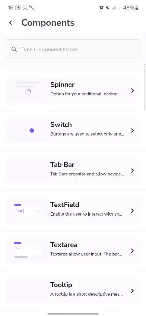
Components
Tooltip
Shows additional context on tap or hover.

Component Status Details
Status component contains a list of checks and completeness that has been tested and owned by each component
 We don't use color as the only visual tool to convey information. The component’s structure and properties include relevant options such as variant, style, size, orientation, optional iconography, decorations, selection, error state, etc. The title is the component name that uses the frame base component template. The base component name contains: .Base & "Component Name" if there is more than one. All component properties use the Legion foundation. We can change all the parts that are connected to the component base. The inside of the base component remains connected to the master component. All variant options are not damaged when we change from one to another. Overriding changes to components will not reset other variants. Component's already has component specs documentation.
A tooltip is a short descriptive message that appears near a view when the user long presses on the view or hovers over it. This tooltip is useful if your app uses icons to represent an action or information to save space in the layout.
Orientations and Animations
We have four orientations :
- Tooltip Orientation Start
- Tooltip Orientation Top
- Tooltip Orientation Bottom
- Tooltip Orientation End
and also have four animations in tooltip arrow :
- Tooltip Animation Heartbeat
- Tooltip Animation Rotate
- Tooltip Animation Shake
- Tooltip Animation Breath
Usage
To use the Tooltip component, you need to define the parameter in builder and create instance. After that call function show to display Tooltip in the screen.
Orientation
Start
LgnTooltip(requesterView = {Icon(imageVector = Icons.Default.Check,contentDescription = "",modifier = it)},tooltipContent = {
Top
LgnTooltip(requesterView = {Icon(imageVector = Icons.Default.Check,contentDescription = "",modifier = it)},tooltipContent = {
Bottom
LgnTooltip(requesterView = {Icon(imageVector = Icons.Default.Check,contentDescription = "",modifier = it)},tooltipContent = {
End
LgnTooltip(requesterView = {Icon(imageVector = Icons.Default.Check,contentDescription = "",modifier = it)},tooltipContent = {
Animation
Heartbeat
LgnTooltip(requesterView = {Icon(imageVector = Icons.Default.Check,contentDescription = "",modifier = it)},tooltipContent = {
Rotate
LgnTooltip(requesterView = {Icon(imageVector = Icons.Default.Check,contentDescription = "",modifier = it)},tooltipContent = {
Shake
LgnTooltip(requesterView = {Icon(imageVector = Icons.Default.Check,contentDescription = "",modifier = it)},tooltipContent = {
Breath
LgnTooltip(requesterView = {Icon(imageVector = Icons.Default.Check,contentDescription = "",modifier = it)},tooltipContent = {
Attributes
| Parameters | Types | Descriptions |
|---|---|---|
| requesterView | @Composable (Modifier) -> Unit | Set Content For Request Tooltip |
| tooltipContent | @Composable () -> Unit | Set Tooltip Content |
| animation | LgnTooltipAnimation | Set Type of Tooltip Animation |
| arrowOrientation | LgnTooltipOrientation | Set Tooltip Arrow Orientation |
| backgroundColor | Color | Set Tooltip Background Color |