Design
Guideline
How to use legion in design project

UI Kits Setup
Legion’s design library is organized into several projects. To begin your design journey, make sure you’ve been invited to the project file via the Request Form. Once invited, explore the available libraries assigned to you and select the right design library that fits your project needs.
Every great design starts with a solid foundation. Begin by linking your design foundation with the UI Kits to build a strong base for your product design. This ensures that all variables---such as color, typography, size, and margin---are connected to components seamlessly, forming the backbone of your product.
Before moving forward with more detailed design development, ensure that all the variables in your foundation are properly integrated into the components. This allows for easier adjustments as needed, ensuring the design stays flexible to match the evolving needs of your brand.
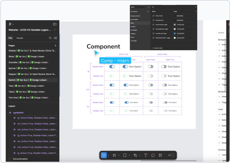
1. Checking foundation color sync with UI Kit
Once your foundation is connected, your next step is to align your design with your brand’s identity by adjusting the colors in the foundation based on a predefined color palette. Think of this as setting the mood for your design story. Colors play a crucial role in telling the story of your brand and should maintain consistency with the overall brand image and product goals. To ensure flexibility, using variables for this step is highly recommended.
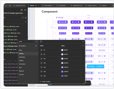 Before - Default UI Kit
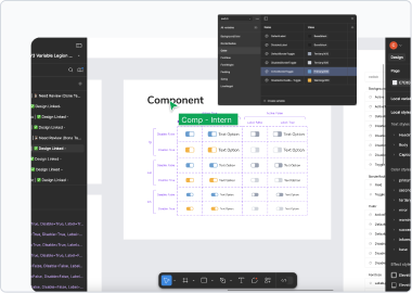
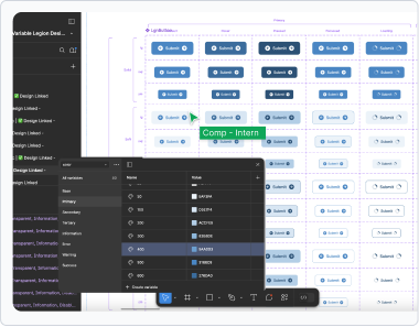 After - Customized UI Kit
2. Checking Typography sync with Foundation
With your colors set, it’s time to refine your typography. Typography is the voice of your brand, and adopting font styles defined for your brand or product reinforces this identity. Consistency in typography not only enhances the visual appeal but also strengthens the connection between the design and the brand’s personality. As with colors, using variables to handle typography adjustments will make the process smoother and more adaptable.
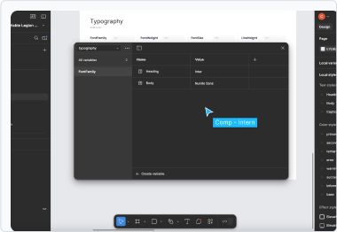 Before - Default UI Kit
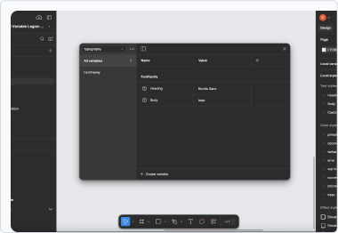 After - Customized UI Kit
3. Customizing visual UI with your brand style
Design doesn’t stop at colors and typography, padding, margins, and other properties are keyplayers in ensuring that your product design aligns perfectly with the UI Kits. By applying these properties, you complete the design’s story, ensuring everything comes together cohesively. AGain, be sure to use variables to handle these adjustments efficiently.
 Before - Default UI Kit
 After - Customized UI Kit
4. Final checking and Publish
Before your UI Kit becomes a library that can be published, perform a final check. Ensure that all elements—colors, typography, and other properties—are connected, aligned with your brand, and meet the necessary standards. This is the moment to make final adjustments and polish your design until it’s just right.
Once everything is aligned, you’re ready to publish the UI Kit as a library, making it accessible and reusable for future designs.
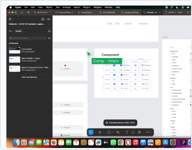
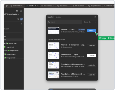 Step 1 - Select Library and click publish changes
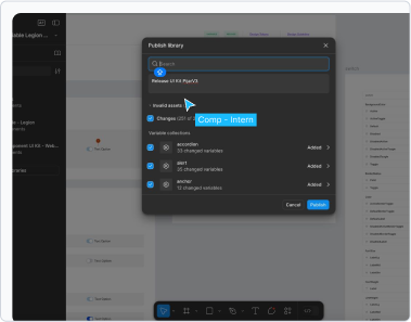 Step 2 - Enter description update or release notes
 Step 3 - Click publish button and wait the process
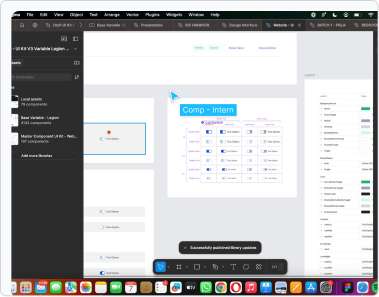 Step 4 - Complete Publishing or view the status
Connect to your component code
Legion UI Kit v3 has enabled us to integrate real-time style changing to component’s code with different theme style, you can follow these steps to integrate this to your UI Kit.
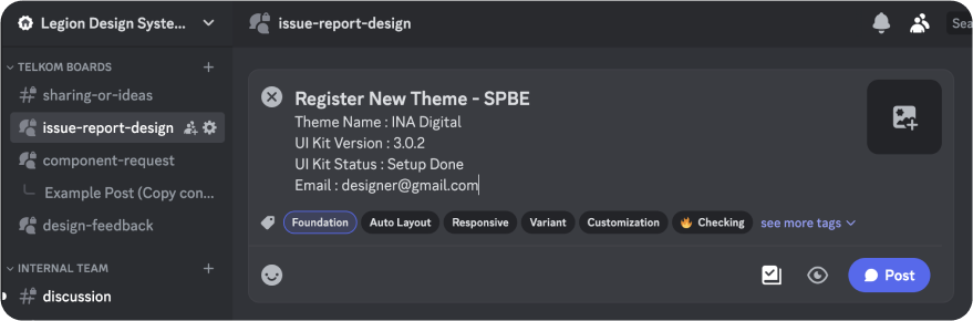
1. Request to register your theme style to the UI Kit
When you have finished setting up your UI Kit, you need to register the UI Kit product style/theme in Figma to the Legion team to be integrated into the component’s code in order to have a theme library that is already in sync with the design and can be used by developers to start the development process.
The first step that needs to be taken is: Submit a post on the Legion Discord server, write new topic under #issue-report-design text-channel, follow the request format as shown in the image below and apply Foundation tag. After that, wait within 24 hours for the Legion team to provide access to your requesting email address and add the registered theme to the Legion theme library.
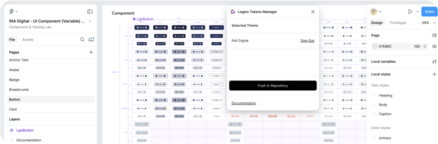
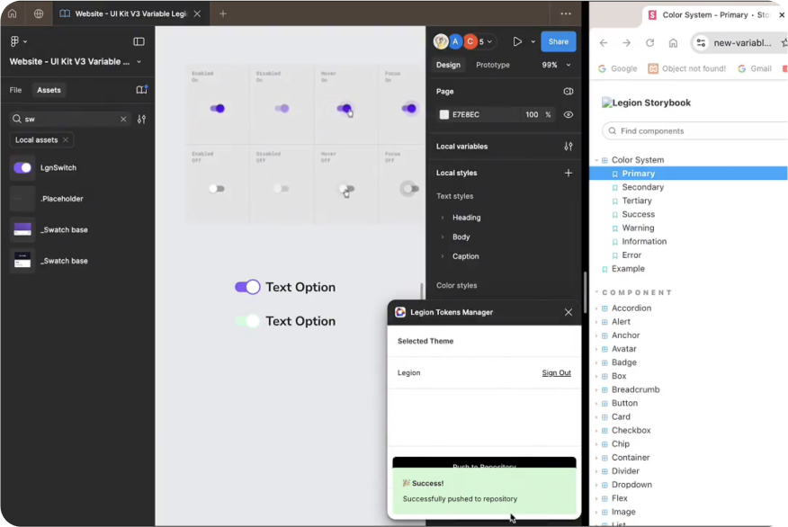
2. Open and login to Legion Tokens Manager (Figma Plugin)
After getting access from email, please reopen the UI Kit on Figma, then find and open the Legion Tokens Manager plugin then login by entering the Theme Code and access token given in t he email into the plugin, after successfully logging in then click the push to repository button to update the changes made to the UI Kit into the asset code, wait a few moment until the successful information appears. In case it failed, please close and push again or wait a few minutes then press the Push to Repository button again.
To see a preview or suitability of the UI Kit in Figma with the asset code that the develop will use, you can open Legion’s Storybook then on the top panel, select the theme you wish to preview and already registeredm, then please see the visuals or interactions of each component on the left panel of the Storybook or you can also see the variations or component variants via the control panel at the bottom of the Storybook panel.
3. Change visual UI from variable and push to plugin
Every time you make once or more changes or updates to the foundation and comopnents in the UI Kit through the Figma variable, you always need to update the asset code by doing the steps in section above, and don’t forget that after pushing, you also need to check its suitability in the Storybook to keep the asset code in sync in order to maintain pixel perfect suitability with development. A brief guide to the workflow in updating the appearance of the UI Kit can be seen in the video below.
Recommended Figma Plugins
Some recommended plugins to simplify your workflow, task, accessibility checking, and design quality:
- Legion Tokens Manager: A tool to manage design tokens like colors and fonts, ensuring consistency across projects.
- Color Shades: A tool to createa and adjust color shades for a consistent and harmonious design.
- Local Print: A feature to quickly print design assets for reviews or presentations.
- Adee Comprehensive Accessibility Tool: Test color contrast, simulate 8 color blind simulations, and test touch target sizes to ensure they meet the various device standards.
- Stark - Contrast & Accessibility Tools: Contrast Checker, Focus Order, Alt-Text Annotations, Vision Simulator, and more, all in one place.
- Ditto: Single source of truth for everyone touching copy, from writers to designers to engineers.