 See More Blocks
Pattern
Landing Page
A standalone web page to introduce the product to your potential customers
Introduction
Building the right landing page is important with the right structure for a great impression. By managing the right impression of your product you will get visitors in to the next funnel. This pattern consists of an explanation for building a structured landing page. This pattern also complies with the Personal Data Protection (UU PDP) in Indonesia, which includes the cookies allowance for better landing page performance.
Data Protection (UU PDP) Compliance
In accordance with the Personal Data Protection Act (UU PDP) in Indonesia, our login and registration processes are designed to ensure the highest standards of data security and user privacy. We are committed to complying with all regulations set forth by the UU PDP, ensuring that personal data is handled with the utmost care and confidentiality.
Landing Page Structure
Landing page structure is usually done by dividing the website into sections, this will help users to focus on the goal of each section, some other reason is to help with the development process, making it easier to adjust the style of the website, test and tweak, and help manage the results.
Header
The header should be the main point to explain the product or the website briefly. The header consists of a clear headline (introduce the problem or solution that you are solving) and gives a clear CTA (that stands out and presents the clear action that we want users to do, whether it is to register or to explore the website).
Using Imagery/hero images (static or video) can help provide a vocal point to promote the product or website, it should be directly related to the proposition but it shouldn’t dominate the page. This will help emphasize the importance of the call to action.
 See More Blocks
Feature
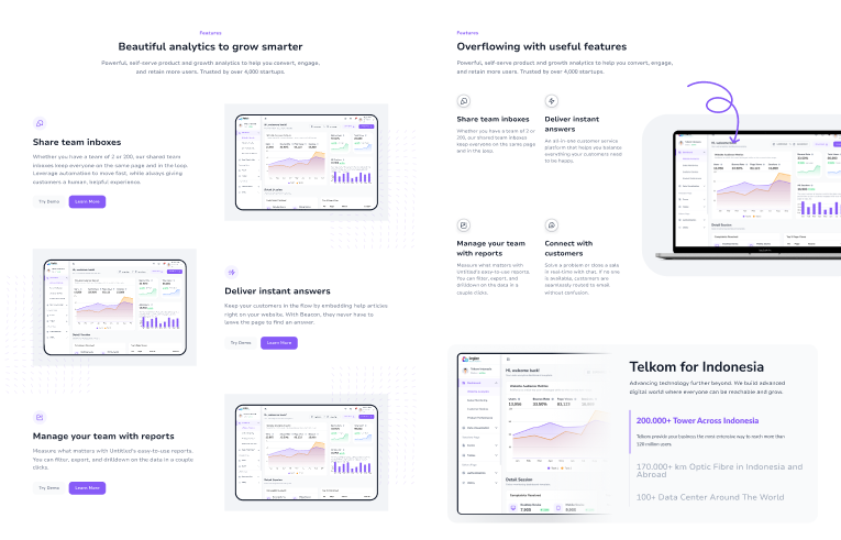
This section consists of an explanation of the benefit of the product that could be described using the combination of imagery and texts (sometimes even short video). 90% of people usually scan through the website, so using good imagery will help grab their attention and make sure they see the product as the solution that they need.
To provide a better explanation of the product, don’t only share about the feature, but provide more explanation of how the product can help solve the potential users’ problems. Focus on benefits that can eliminate their sress, simplify things, and increase their productivity.
 See More Blocks
Testimonials
Social proof is usually built in the form of testimonials, reviews, or trust seals, this is one of the ways to create interest and drive credibility to provide more conversions. Some of the social proof is Download counts (the number of people joining can help increase the interest of useres). Media mentions (lists of news logos where the product is featured, this will increase the trust and legibility of the product), and Testimonials (customers feedback are proven to help improve the conversion, make sure to use photo and official title of the customers to provide better credibility of their testimonies).
 See More Blocks
Final CTA (Call To Action)
This section is important to make sure to grab users’ attention as they are ready to conver to the next step. This section should point out the main actions that we want users to take on the website, such as signing up, purchasing a product, requesting a demo, or registering for the website.
CTA copy is essential to be clear on what customers should do, it can be as descriptive as possible (avoid using generic copy such as “Learn more” or “Find more”), emphasize the action such as “Read the ebook now” or “Reverse my copy today”. This copy will help create a more personalized and inviting copy.
 See More Blocks
Cookies Allowance
When creating a good landing page, we need to collect some users’ data and preferences to make the landing page more desired and match users’ needs. Cookies are one way to store users’ data while they browse the website. Providing the ability for customers to give consent is one of the priorities for their experience with cookies allowance.

Do
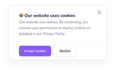
When providing cookies, it's best to give an option for the users to consent (either agree or reject) to the cookies.

Don't
Provide cookies just by using only 1 CTA (only agree), this will make users lose their ability to give consent.

Do
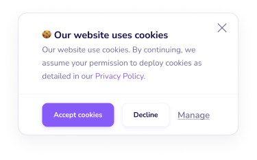
Provide cookies allowance with further settings for managing which cookies users want to allow.

Don't
Provide cookies allowance without further settings. Managing the cookies allowance is an important part of giving consent.