Components
Accordion
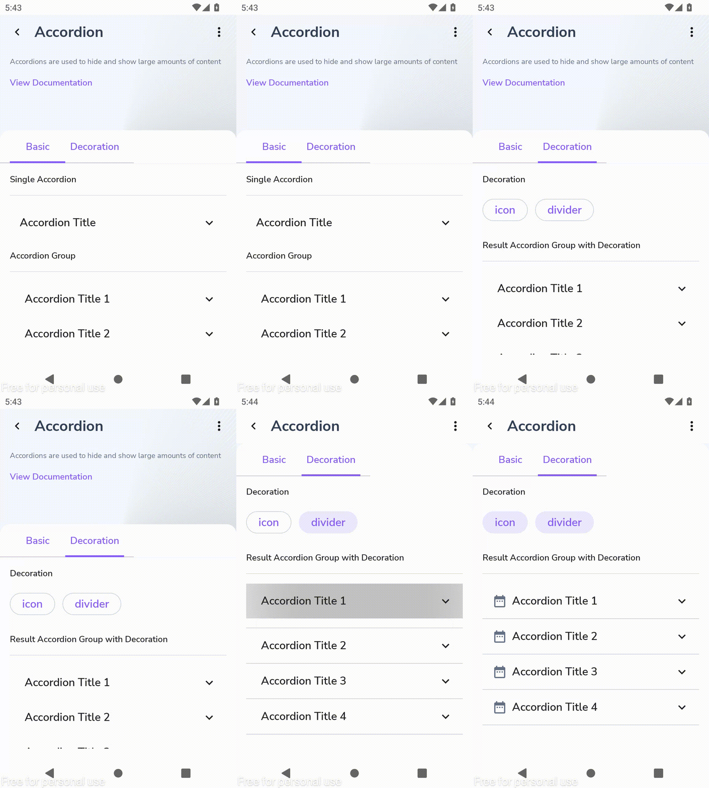
Accordions are used to hide and show large amounts of content
Component Status Details
Status component contains a list of checks and completeness that has been tested and owned by each component
 We don't use color as the only visual tool to convey information.
 The component’s structure and properties include relevant options such as variant, style, size, orientation, optional iconography, decorations, selection, error state, etc.
 The title is the component name that uses the frame base component template.
 The base component name contains: .Base & "Component Name" if there is more than one.
 All component properties use the Legion foundation.
 We can change all the parts that are connected to the component base.
 The inside of the base component remains connected to the master component.
 All variant options are not damaged when we change from one to another.
 Overriding changes to components will not reset other variants.
 Component's already has component specs documentation.
Usage
Accordion is a component that consists of a series of titles, and when you click on a specific title, the detailed description will be expanded. This will ensure that the user can focus on only one opened item at a time.
The following is the format for using Legion Accordion
Basic Accordion
var expanded by remember {mutableStateOf(false)}LgnAccordion(title = "Accordion Title",onClick = {expanded = !expanded},
Accordion with Icon
LegionAccordion(...icon = {Icon(imageVector = Icons.Default.AccountCircle, contentDescription = "")}...){AccordionItemContent()}
Variants
Accordion with Divider
LegionAccordion(...divider = true //default false...){AccordionItemContent()}
Attributes
| Parameters | Description | Default Value |
|---|---|---|
title | the text showing in accordion header | N/A |
onClick | will be called when accordion is clicked | N/A |
expanded | Control accordion layout to animate when to display content. | false |
modifier | the Modifier to be applied to this accordion | N/A |
colors | color that will be used to resolve the colors used for this accordion. | N/A |
divider | To display divider at accordion. | false |
icon | The icon to be displayed on the right of accordion. | null |
content | he content to be displayed on accordion | N/A |
Example
