Components
Accordion
Accordions are used to hide and show large amounts of content

Status component contains a list of checks and completeness that has been tested and owned by each component
 We don't use color as the only visual tool to convey information. The component’s structure and properties include relevant options such as variant, style, size, orientation, optional iconography, decorations, selection, error state, etc. The title is the component name that uses the frame base component template. The base component name contains: .Base & "Component Name" if there is more than one. All component properties use the Legion foundation. We can change all the parts that are connected to the component base. The inside of the base component remains connected to the master component. All variant options are not damaged when we change from one to another. Overriding changes to components will not reset other variants. Component's already has component specs documentation.
Usage
BaseLGNAccordion is used to toggle between hiding and showing large amount of content.
Use Accordion styles to modify accordion with lots of attributes that make you easier.
It’s recommended to apply constraints in your ViewController in order to make accordion well orderly.
You need to import your theme.
Legion iOS UIKit offers four themes: ThemeAGR, ThemeEazy, ThemeIHS, ThemeLGN, and ThemeMyTEnS.
import ThemeLGN
then create a LGNAccordion based on theme selected.
LGNAccordion(title: "Section 1", leadingIcon: image, contentView: createExampleContentView(with: contentView1))
Recommended Usage
In order to make your accordion content look clean and tidy you should apply constraint before adding it to LGNAccordion for example you can implement like code below.
let x = UILabel()x.text = "Hello"x.translatesAutoresizingMaskIntoConstraints = falselet image = UIImage(systemName: "shield.fill")let accordionView1 = BaseLGNAccordion(title: "Section 1", leadingIcon: image!, contentView: orderContentLayoutConstraint(with: contentView1))extension ViewController {
Leading Icon
Legion Have 2 Leading Icon of Accordion :
let label = UILabel() let accordionView1 = LGNAccordion(title:"Section2", contentView: label )
let image = UIImage(systemName: "shield.fill")! let label = UILabel()let accordionView1 = LGNAccordion(title: "Section 2", leadingIcon:image, contentView: label )
Bottom Line
You can add bottom line to accordion using HasBottomLine attribute.
| HasBottomLine | Image |
|---|---|
true | 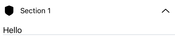 |
false | 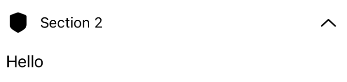 |
With Bottomline
let image = UIImage(systemName: "shield.fill")!let label = UILabel()label.text = "Hello"let accordionView1 = LGNAccordion(title: "Section 1", leadingIcon: image, hasBottomLine: true, contentView: label)
Without Bottomline
let image = UIImage(systemName: "shield.fill")!let label = UILabel()label.text = "Hello"let accordionView1 = LGNAccordion(title: "Section 2", leadingIcon: image, hasBottomLine: false, contentView: label)
Expanded
You can also set whether the accordion collapsed or not
| isInitiallyExpanded | Image |
|---|---|
true | |
false | |
Expanded/Collapsed
let image = UIImage(systemName: "shield.fill")!let label = UILabel()label.text = "Hello"let accordionView2 = LGNAccordion(title: "Section 2", leadingIcon: image, hasBottomLine: false, isInitiallyExpanded: true, contentView: label2)
Minimized
let image = UIImage(systemName: "shield.fill")!let label = UILabel()label.text = "Hello"let accordionView2 = LGNAccordion(title: "Section 2", leadingIcon: image, hasBottomLine: false, isInitiallyExpanded: false, contentView: label2)
Properties
| Properties | Description | Default value |
|---|---|---|
| contentView | Accordion’s content that will show only when it’s collapsed | no default value |
| hasBottomLine | Define accordion has bottomLine or not | false |
| isInitiallyExpanded | Attribute that represent if the accordion collapsed or not. | false |
| leadingIcon | Leading icon on accordion header | nil |
| title | Accordion’s title that shows even it’s not collapsed. | "" |