Components
Accordion
Accordions are used to hide and show large amounts of content

Component Status Details
Status component contains a list of checks and completeness that has been tested and owned by each component
 We don't use color as the only visual tool to convey information. The component’s structure and properties include relevant options such as variant, style, size, orientation, optional iconography, decorations, selection, error state, etc. The title is the component name that uses the frame base component template. The base component name contains: .Base & "Component Name" if there is more than one. All component properties use the Legion foundation. We can change all the parts that are connected to the component base. The inside of the base component remains connected to the master component. All variant options are not damaged when we change from one to another. Overriding changes to components will not reset other variants. Component's already has component specs documentation.
Usage
Accordion is used to toggle between hiding and showing large amount of content
Use Legion accordion styles to modify accordion with lots of attributes that make you easier.
Default LegionUI, ThemeLGN, ThemeAGR, ThemeMyTEnS, ThemeIHS & ThemeEazy
LGNAccordion("title") {Text("hello")}
Variant
Legion Have 2 Variants of Accordion :
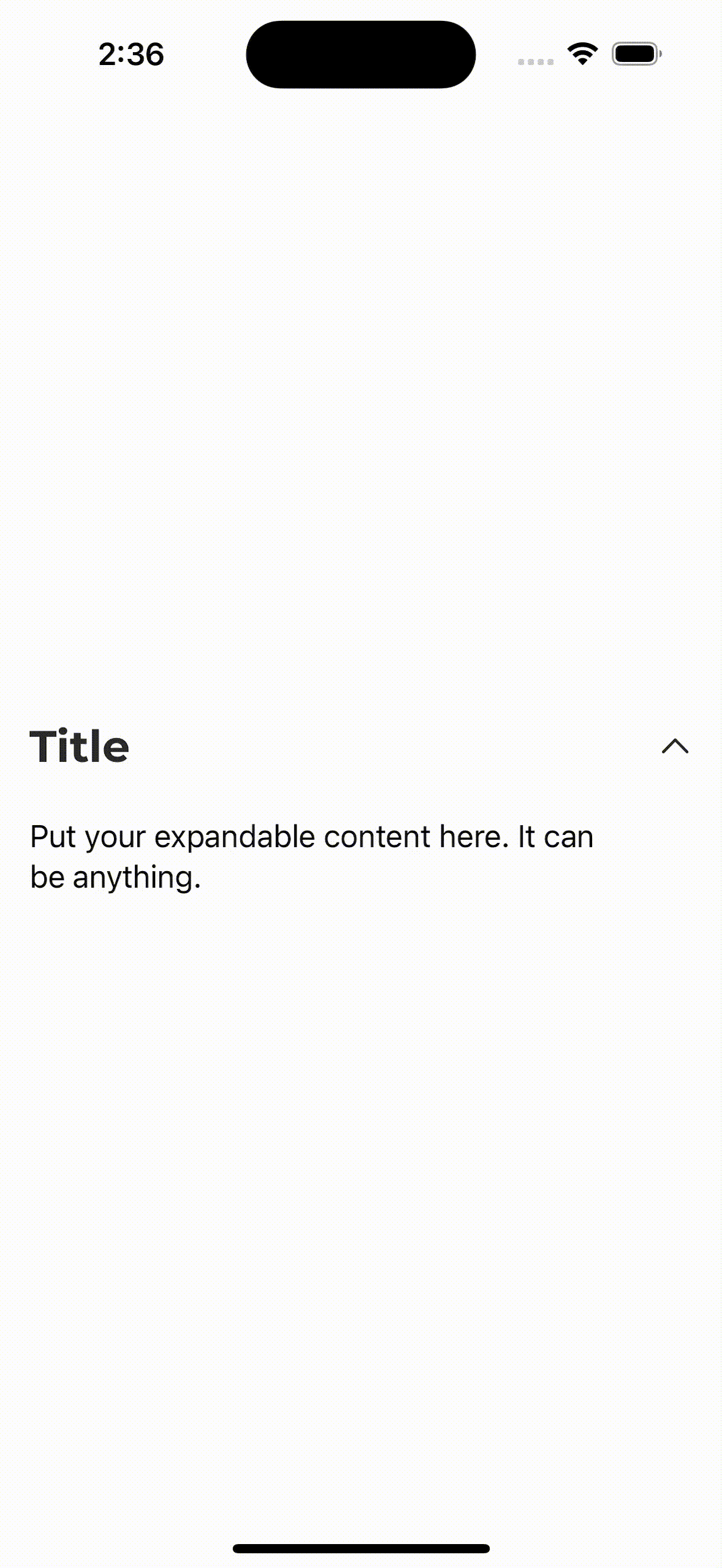
Expand ON
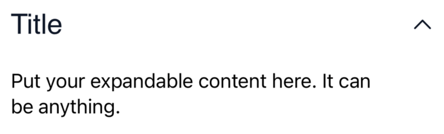
LGNAccordion("Title", isInitialyExpanded: true) {Text("Put your expandable content here. It can be anything.")}
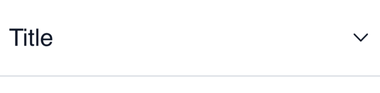
Expand OFF

LGNAccordion("Title") {Text("Put your expandable content here. It can be anything.")}
Attribute
Legion Have 6 Attributes for Customize Accordion :
Line
Expand ON
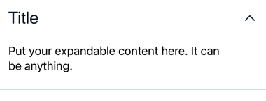
LGNAccordion("Title",hasBottomLine: true, isInitialyExpanded: true){Text("Put your expandable content here. It can be anything.")}
Expand OFF
LGNAccordion("Title", hasBottomLine: true) {Text("Put your expandable content here. It can be anything.")}
Icon
This code sample demonstrates how to modify icon :
Expand ON
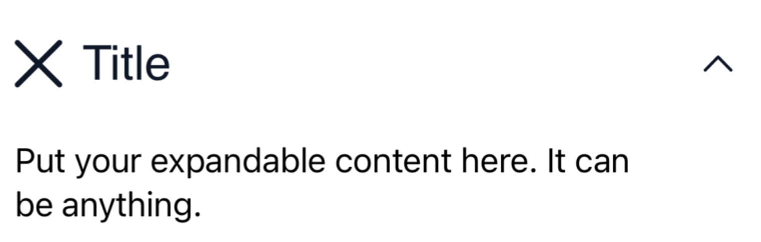
LGNAccordion("Title",leadingIcon: Image(systemName: "xmark"), isInitialyExpanded: true){Text("Put your expandable content here. It can be anything.")}
Expand OFF

LGNAccordion("Title", leadingIcon: Image(systemName: "xmark")){Text("Put your expandable content here. It can be anything.")}
Properties
| Properties | Description | Default Value |
|---|---|---|
| title | the main text string you want to display on accordion header | - |
| leadingIcon | the Image() you want to display on the left hand side of your header text | nil |
| hasBottomLine | the boolean to decide whether or not the accordion has bottom line | false |
| isInitialyExpanded | whether or not the accordion is initially displayed as expanded or collapsed | false |
Example Project
LGNAccordion("title",leadingIcon: Image(named: "foo"),hasBottomLine: true,isInitialyExpanded: false) {Text("hello")}