Components
Alert
Alert are to display a list of options on a temporary surface

Selected Theme
Select brand or tribe name to preview style
Others
Component Status Details
Status component contains a list of checks and completeness that has been tested and owned by each component
 We don't use color as the only visual tool to convey information. The component’s structure and properties include relevant options such as variant, style, size, orientation, optional iconography, decorations, selection, error state, etc. The title is the component name that uses the frame base component template. The base component name contains: .Base & "Component Name" if there is more than one. All component properties use the Legion foundation. We can change all the parts that are connected to the component base. The inside of the base component remains connected to the master component. All variant options are not damaged when we change from one to another. Overriding changes to components will not reset other variants. Component's already has component specs documentation.
Usage
Alert use to display a list of options on a temporary surface.
Use Legion alert styles to modify alert with lots of attributes that make you easier.
Usage Default LegionUI
Alert(title: "sample Title",subtitle: "sample Subtitle",action: "sample CTA copy")
Variant
Legion Have 4 Variants of Alert :
Error
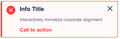
Alert( title: "Info Title", subtitle: "Interactively monetize corporate alignment", action: "Call to action" ).theme(variant: .error)
Information
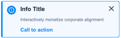
Alert( title: "Info Title", subtitle: "Interactively monetize corporate alignment", action: "Call to action" ).theme(variant: .information)
Success
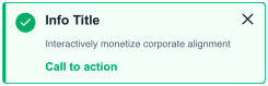
Alert( title: "Info Title", subtitle: "Interactively monetize corporate alignment", action: "Call to action" ).theme(variant: .success)
Warning
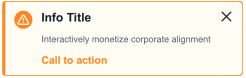
Alert( title: "Info Title", subtitle: "Interactively monetize corporate alignment", action: "Call to action" ).theme(variant: .warning)
Properties
| Properties | Description | Default Value |
|---|---|---|
| title | Creates a title view that displays a string literal | empty string |
| subtitle | Creates a subtitle view that displays a string literal | empty string |
| action | Creates a button that displays text contains a string literal | empty string |
| titleView | Create a title view fully-customized by SwiftUI views | EmptyView() |
| subtitleView | Create a sutitle view fully-customized by SwiftUI views | EmptyView() |
| actionView | Create a cta button view fully-customized by SwiftUI views | EmptyView() |
Example Project
Default LegionUI
Alert {Text("Info Custom").LGNBodyLarge(color: Color.LGNTheme.tertiary800).padding(.bottom, 6)} subtitle: {Text("Interactively monetize corporate alignment").LGNCaptionLarge(