Components
Alert
Alert are to display a list of options on a temporary surface

Component Status Details
Status component contains a list of checks and completeness that has been tested and owned by each component
 We don't use color as the only visual tool to convey information. The component’s structure and properties include relevant options such as variant, style, size, orientation, optional iconography, decorations, selection, error state, etc. The title is the component name that uses the frame base component template. The base component name contains: .Base & "Component Name" if there is more than one. All component properties use the Legion foundation. We can change all the parts that are connected to the component base. The inside of the base component remains connected to the master component. All variant options are not damaged when we change from one to another. Overriding changes to components will not reset other variants. Component's already has component specs documentation.
The Alert component is utilized to present a temporary surface that provides a list of options. It displays a brief message or notification to the user within an existing activity.
Usage
import { Alert } from "@legion-crossplatform/ui";const Alert = () => {return (<Alerttitle="This is Alert"desc="Lorem ipsum dolor, sit amet consecteturadipisicing elit. Iure asperiores suntrepellat dolores quibusdam."
Variants
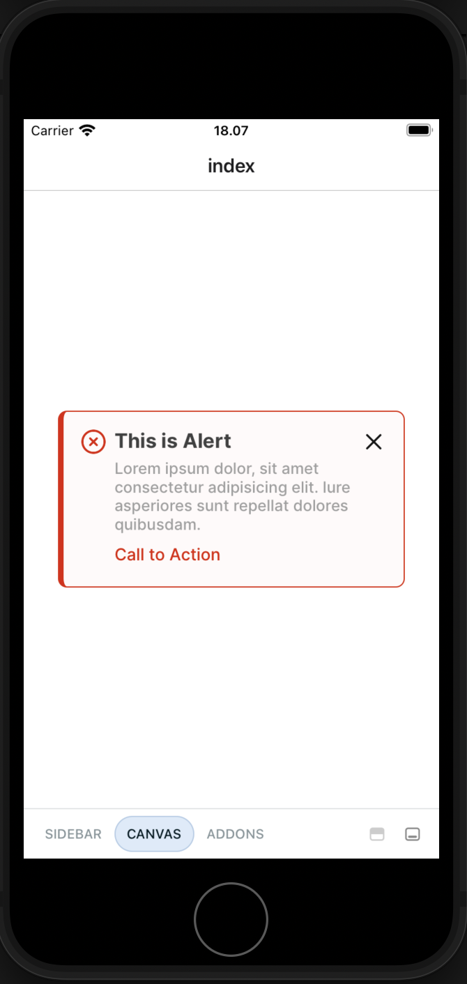
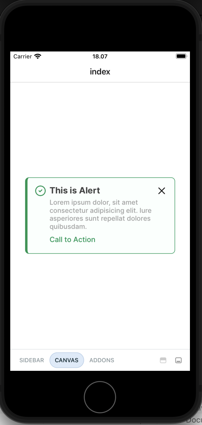
There are 4 variants available: Success, Info, Warning, Error. Following are example on how to use each variants:
Success
<Alerttitle="This is a Success Alert"desc="Lorem ipsum dolor, sit amet consecteturadipisicing elit. Iure asperiores suntrepellat dolores quibusdam."actionText="Call to Action"variant="success"/>
Info
<Alerttitle="This is an Info Alert"desc="Lorem ipsum dolor, sit amet consecteturadipisicing elit. Iure asperiores suntrepellat dolores quibusdam."actionText="Call to Action"variant="info"/>
Warning
<Alerttitle="This is a Warning Alert"desc="Lorem ipsum dolor, sit amet consecteturadipisicing elit. Iure asperiores suntrepellat dolores quibusdam."actionText="Call to Action"variant="warning"/>
Error
<Alerttitle="This is an Error Alert"desc="Lorem ipsum dolor, sit amet consecteturadipisicing elit. Iure asperiores suntrepellat dolores quibusdam."actionText="Call to Action"variant="error"/>
Props
| Parameter | Type | Description |
|---|---|---|
| actionText | String | Set text for action button in alert |
| children | React.ReactNode | Set the children of Alert |
| closable | Boolean | To make alert closable |
| desc | String | Set the description of Alert |
| title | String | Set the title of Alert |
| variant | success | info | warning | error | Set the variant of Alert |
| width | Number | Set the width of Alert |