Components
Alert
Alert are to display a list of options on a temporary surface

Component Status Details
Status component contains a list of checks and completeness that has been tested and owned by each component
 We don't use color as the only visual tool to convey information. The component’s structure and properties include relevant options such as variant, style, size, orientation, optional iconography, decorations, selection, error state, etc. The title is the component name that uses the frame base component template. The base component name contains: .Base & "Component Name" if there is more than one. All component properties use the Legion foundation. We can change all the parts that are connected to the component base. The inside of the base component remains connected to the master component. All variant options are not damaged when we change from one to another. Overriding changes to components will not reset other variants. Component's already has component specs documentation.
Usage
To use the Legion iOS UIKit theme, you need to import one of the available themes.
Currently, the following themes are supported: ThemeAGR, ThemeEazy, ThemeIHS, ThemeLGN, and ThemeMyTEnS.
import ThemeLGN
Variant
Legion Have 4 Variants of Alert:
Error
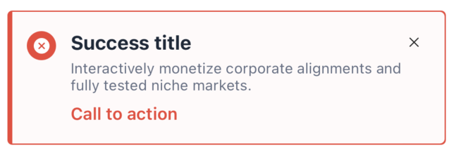
let alertView = LGNAlertUIKit(variant: .error,title: "Success title",description: "Interactively monetize corporate alignments and fully tested niche markets.",actionButtonTitle: "Call to action",onTapAction: {print("On tap action")})
Success
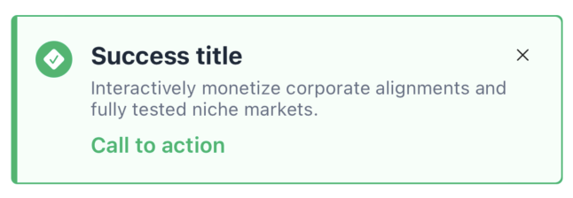
let alertView = LGNAlertUIKit(variant: .success,title: "Success title",description: "Interactively monetize corporate alignments and fully tested niche markets.",actionButtonTitle: "Call to action",onTapAction: {print("On tap action")})
Warning
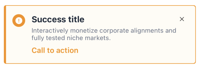
let alertView = LGNAlertUIKit(variant: .warning,title: "Success title",description: "Interactively monetize corporate alignments and fully tested niche markets.",actionButtonTitle: "Call to action",onTapAction: {print("On tap action")})
Info
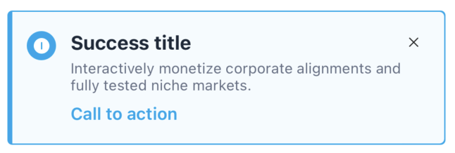
let alertView = LGNAlertUIKit(variant: .info,title: "Success title",description: "Interactively monetize corporate alignments and fully tested niche markets.",actionButtonTitle: "Call to action",onTapAction: {print("On tap action")})
Properties
| Properties | Description | Default Value |
|---|---|---|
| actionButtonColor | The color of the call-to-action button | UIColor(hex: “0BA5EC”) |
| actionButtonFont | The font of the call-to-action button text | UIFont.systemFont(ofSize: 14, weight: .semibold) |
| actionButtonText | The label for the call-to-action button | nil |
| backgroundColor | The background color of the alert | UIColor(hex: “F5FBFF”) |
| borderColor | The border color of the alert | UIColor(hex: “0BA5EC”) |
| borderWidth | The border width of the alert | 1.0 |
| cornerRadius | The corner radius of the alert | 4.0 |
| description | The text to display in the description view | nil |
| descriptionColor | The color of the description text | UIColor(hex: “667085”) |
| descriptionFont | The font of the description text | UIFont.systemFont(ofSize: 12, weight: .regular) |
| leftIcon | The image to display on the left side of the alert | nil |
| leftIconBackgroundColor | The background color for the left icon | UIColor(hex: “0BA5EC”) |
| leftIconTintColor | The tint color for the left icon | .white |
| title | The text to display in the title view | nil |
| titleColor | The color of the title text | UIColor(hex: “1D2939”) |
| titleFont | The font of the title text | UIFont.systemFont(ofSize: 16, weight: .bold) |
| onDismissed | Closure that gets called when the alert is dismissed | nil |
| onTapAction | Closure that gets called when the CTA button is tapped | nil |
| variant | The type of alert (error, success, warning, info) | .info |
| withDismissButton | Determines whether the close button is shown | true |