Components
Anchor Text
Actionable text link for users to navigate

Component Status Details
Status component contains a list of checks and completeness that has been tested and owned by each component
 We don't use color as the only visual tool to convey information. The component’s structure and properties include relevant options such as variant, style, size, orientation, optional iconography, decorations, selection, error state, etc. The title is the component name that uses the frame base component template. The base component name contains: .Base & "Component Name" if there is more than one. All component properties use the Legion foundation. We can change all the parts that are connected to the component base. The inside of the base component remains connected to the master component. All variant options are not damaged when we change from one to another. Overriding changes to components will not reset other variants. Component's already has component specs documentation.
Anchor text is text that can be clicked and hyperlinked with other sites or pages. The use of anchor text is very important in the world of content marketing because it can increase index and ranking on search engines.
Usage
To implement Anchortext we can use this tag LgnAnchorTextLarge or LgnAnchorTextSmall .
The following is usage to implement Anchortext in XML
<com.telkom.legion.component.anchortext.LgnAnchorTextLargeandroid:layout_width="wrap_content"android:layout_height="wrap_content"android:layout_marginTop="@dimen/dimen_16dp"android:layout_marginStart="@dimen/dimen_16dp"android:text="Text Only"/><com.telkom.legion.component.anchortext.LgnAnchorTextSmallandroid:layout_width="wrap_content"
Variants
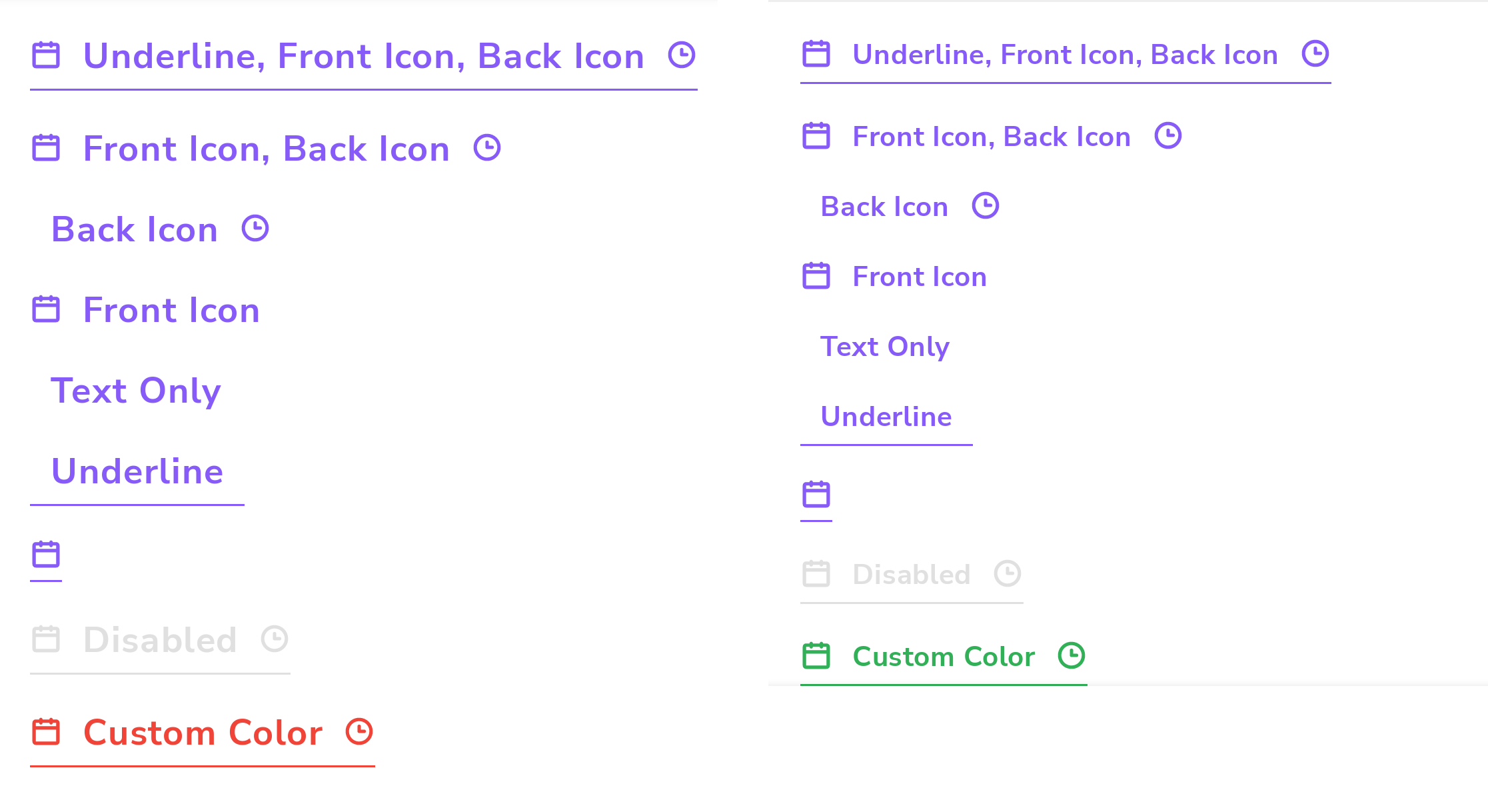
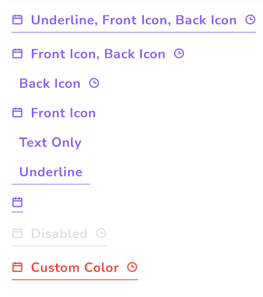
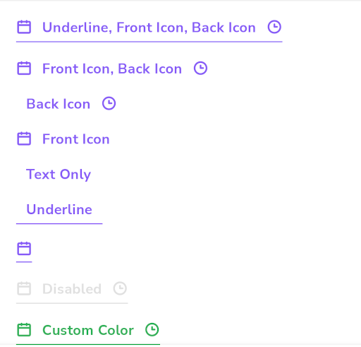
We have two size variants, small and large variants
Large Size
Static in Xml
<com.telkom.legion.component.anchortext.LgnAnchorTextLargeandroid:layout_width="wrap_content"android:layout_height="wrap_content"android:layout_marginTop="@dimen/dimen_16dp"android:layout_marginStart="@dimen/dimen_16dp"android:text="Text Only"/>
Dynamic using Kotlin
...with(binding) {containerBase.addView( //ViewGroup for Dynamic LayoutLgnAnchorTextLarge(requiredContext()).apply {//Your View's customization here},LinearLayout.LayoutParams( //For example we use viewgroup LinearLayoutLinearLayout.LayoutParams.MATCH_PARENT,LinearLayout.LayoutParams.WRAP_CONTENT
Small Size
Static in Xml
<com.telkom.legion.component.anchortext.LgnAnchorTextSmallandroid:layout_width="wrap_content"android:layout_height="wrap_content"android:layout_marginTop="@dimen/dimen_16dp"android:layout_marginStart="@dimen/dimen_16dp"android:text="Text Only"/>
Dynamic using Kotlin
...with(binding) {containerBase.addView( //ViewGroup for Dynamic LayoutLgnAnchorTextSmall(requiredContext()).apply {//Your View's customization here},LinearLayout.LayoutParams( //For example we use viewgroup LinearLayoutLinearLayout.LayoutParams.MATCH_PARENT,LinearLayout.LayoutParams.WRAP_CONTENT
Attributes
| Attribute Name | Xml Attrs | Related method(s) | Description |
|---|---|---|---|
| Text | android:text | text | To set Text value directly via xml |
| Enable Status | android:enabled | isEnable | To set enable or disable anchor text directly via xml |
| Underline | app:withUnderLine | isWithUnderLine | To set underline anchor text directly via xml |
| Icon on Front Text | app:startIconDrawable | startIconDrawable | To set icon on front anchor text directly via xml |
| Icon on Behind Text | app:endIconDrawable | endIconDrawable | To set icon on behind anchor text directly via xml |
| Anchor Text Color | app:anchorTextColor | anchorTextColor | To set color anchor text on enable state directly via xml |
| Anchor Text Color Disabled | app:anchorTextColorDisabled | anchorTextColorDisabled | To set color anchor text on disable state directly via xml |
| Set Click Listener | N/A | setOnClickListener{ //Your Action } | To set click listener |