Components
Anchor Text
Actionable text link for users to navigate

Status component contains a list of checks and completeness that has been tested and owned by each component
 We don't use color as the only visual tool to convey information. The component’s structure and properties include relevant options such as variant, style, size, orientation, optional iconography, decorations, selection, error state, etc. The title is the component name that uses the frame base component template. The base component name contains: .Base & "Component Name" if there is more than one. All component properties use the Legion foundation. We can change all the parts that are connected to the component base. The inside of the base component remains connected to the master component. All variant options are not damaged when we change from one to another. Overriding changes to components will not reset other variants. Component's already has component specs documentation.
Usage
Anchor text is text that can be clicked and hyperlinked with other sites or pages. The use of anchor text is very important in the world of content marketing because it can increase index and ranking on search engines.
Use Legion Anchor text styles to modify Anchor text with lots of attributes that make you easier.
ThemeLGN, ThemeAGR, ThemeMyTEnS, ThemeIHS & ThemeEazy
LGNAnchorText();
Variant
LGNAnchorText with the following appearances:

Use this Function : LGNAnchorText
This code sample demonstrates how to modify the variant of Anchor text :
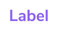
A. Label
Theme (ThemeLGN, ThemeAGR, ThemeMyTEnS, ThemeIHS & ThemeEazy)
LGNAnchorText(title: "Label")
B. Icon
Theme (ThemeLGN, ThemeAGR, ThemeMyTEnS, ThemeIHS & ThemeEazy)
LGNAnchorText(centerImage: Image(systemName: "plus"))
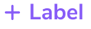
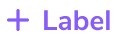
C. Icon Left + Label
Theme (ThemeLGN, ThemeAGR, ThemeMyTEnS, ThemeIHS & ThemeEazy)
LGNAnchorText(title: "Label",leftImage: Image(systemName: "plus"))
D. Label + Icon Right
Theme (ThemeLGN, ThemeAGR, ThemeMyTEnS, ThemeIHS & ThemeEazy)
LGNAnchorText(title: "Label",rightImage: Image(systemName: "plus"))
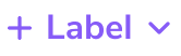
E. Icon Left + Label + Icon Right
Theme (ThemeLGN, ThemeAGR, ThemeMyTEnS, ThemeIHS & ThemeEazy)
LGNAnchorText(title: "Label",leftImage: Image(systemName: "plus"),rightImage: Image(systemName: "chevron.down"))
Attribute
Legion Have 1 Attribute for Customize Anchor text :
Size
This size attribute for user to costumize size on the Anchor text
Small


Use this Function : LGNAnchorText
This code sample demonstrates how to modify the size of Achor text :
A. Label
Theme (ThemeLGN, ThemeAGR, ThemeMyTEnS, ThemeIHS & ThemeEazy)
LGNAnchorText(title: "Label").variant(size: .small)
B. Icon
Theme (ThemeLGN, ThemeAGR, ThemeMyTEnS, ThemeIHS & ThemeEazy)
LGNAnchorText(centerImage: Image(systemName: "plus")).variant(size: .small)
C. Icon Left + Label
Theme (ThemeLGN, ThemeAGR, ThemeMyTEnS, ThemeIHS & ThemeEazy)
LGNAnchorText(title: "Label",leftImage: Image(systemName: "plus")).variant(size: .small)
D. Label + Icon Right
Theme (ThemeLGN, ThemeAGR, ThemeMyTEnS, ThemeIHS & ThemeEazy)
LGNAnchorText(title: "Label",rightImage: Image(systemName: "plus")).variant(size: .small)
E. Icon Left + Label + Icon Right
Theme (ThemeLGN, ThemeAGR, ThemeMyTEnS, ThemeIHS & ThemeEazy)
LGNAnchorText(title: "Label",leftImage: Image(systemName: "plus"),rightImage: Image(systemName: "chevron.down")).variant(size: .small)
Normal


Use this Function : LGNAnchorText
This code sample demonstrates how to modify the size of Achor text :
A. Label
Theme (ThemeLGN, ThemeAGR, ThemeMyTEnS, ThemeIHS & ThemeEazy)
LGNAnchorText(title: "Label").variant(size: .normal)
B. Icon
Theme (ThemeLGN, ThemeAGR, ThemeMyTEnS, ThemeIHS & ThemeEazy)
LGNAnchorText(centerImage: Image(systemName: "plus")).variant(size: .normal)
C. Icon Left + Label
Theme (ThemeLGN, ThemeAGR, ThemeMyTEnS, ThemeIHS & ThemeEazy)
LGNAnchorText(title: "Label",leftImage: Image(systemName: "plus")).variant(size: .normal)
D. Label + Icon Right
Theme (ThemeLGN, ThemeAGR, ThemeMyTEnS, ThemeIHS & ThemeEazy)
LGNAnchorText(title: "Label",rightImage: Image(systemName: "plus")).variant(size: .normal)
E. Icon Left + Label + Icon Right
Theme (ThemeLGN, ThemeAGR, ThemeMyTEnS, ThemeIHS & ThemeEazy)
LGNAnchorText(title: "Label",leftImage: Image(systemName: "plus"),rightImage: Image(systemName: "chevron.down")).variant(size: .normal)
Properties
With Title
| Properties | Description | Default Value |
|---|---|---|
| title | the main text string you want to display on anchor text | not have |
| fontFamily | fontFamily of your title | "" |
| leftImage | the Image() you want to display on the left side of your title text | nil |
| rightImage | the Image() you want to display on the right side of your title text | nil |
| tintColor | color tint for your anchor text: title, left image, and right image | Color.LGNTheme.primary500 |
| action | The action to perform when the user pressed the anchor text. | {} |
With centerImage (Without Title)
| Properties | Description | Default Value |
|---|---|---|
| centerImage | the only Image() you want to display on the center side of the anchor text | not have |
| tintColor | color tint for your center image | Color.LGNTheme.primary500 |
| action | The action to perform when the user pressed the anchor text. | {} |
Example Project
Theme (ThemeLGN, ThemeAGR, ThemeMyTEnS, ThemeIHS & ThemeEazy)
LGNAnchorText(centerImage: Image(systemName: "plus")) {print("Hello")}LGNAnchorText(title: "Label",leftImage: Image(systemName: "plus"),