Components
Anchor Text
Actionable text link for users to navigate

Component Status Details
Status component contains a list of checks and completeness that has been tested and owned by each component
 We don't use color as the only visual tool to convey information. The component’s structure and properties include relevant options such as variant, style, size, orientation, optional iconography, decorations, selection, error state, etc. The title is the component name that uses the frame base component template. The base component name contains: .Base & "Component Name" if there is more than one. All component properties use the Legion foundation. We can change all the parts that are connected to the component base. The inside of the base component remains connected to the master component. All variant options are not damaged when we change from one to another. Overriding changes to components will not reset other variants. Component's already has component specs documentation.
Anchor text is text that can be clicked and hyperlinked with other sites or pages. The use of anchor text is very important in the world of content marketing because it can increase index and ranking on search engines.
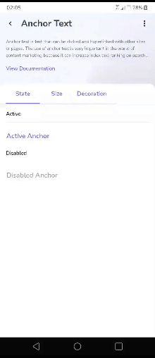
Variants, Sizes, and States
Legion has 2 variants for Anchor Text:
- Left Icon
- Right Icon
We have three sizes:
- Large Size
- Medium Size
- Small Size
We have two states:
- Active
- Disabled
Usage
The following is code to implement Anchor Text component.
Left Icon
LgnAnchor(text = "Anchor",onClick = { /*TODO*/ },iconLeft = { Icon(imageVector = Icons.Default.DateRange, contentDescription = "icon") })
Right Icon
LgnAnchor(text = "Anchor",onClick = { /*TODO*/ },iconRight = { Icon(imageVector = Icons.Default.DateRange, contentDescription = "icon") })
Sizes
Large Size
LgnAnchor((text = "Large Anchor"),(onClick = {/*TODO*/}),(size = LgnAnchorSize.Large));
Medium Size
LgnAnchor((text = "Small Anchor"),(onClick = {/*TODO*/}),(size = LgnAnchorSize.Medium));
Small Size
LgnAnchor((text = "Small Anchor"),(onClick = {/*TODO*/}),(size = LgnAnchorSize.Small));
States
Active
LgnAnchor((text = "Active Anchor"),(onClick = {/*TODO*/}));
Disabled
LgnAnchor((text = "Disabled Anchor"),(onClick = {/*TODO*/}),(enabled = false));
Attributes
| Parameters | Type | Description |
|---|---|---|
| text | String | Set the text of Anchor |
| onClick | Function | Action when Anchor is on Click |
| size | LgnAnchorSize | Set size of Anchor by LgnAnchorSize.Large |
| enabled | Boolean | Set whether the button can be pressed or not |
| iconLeft | Composable | To display left icon |
| iconRight | Composable | To display right icon |
| colors | LgnAnchorColors | Set the color of the Anchor By LgnAnchorDefaults.colors() |
| shape | Shape | Set size of Anchor by LgnAnchorDefaults.shape |
| modifier | Modifier | [Modifier] to be applied to the anchor |
| interactionSource | MutableInteractionSource | [MutableInteractionSource] representing the source of the interactions |