Components
Anchor Text
Actionable text link for users to navigate

Component Status Details
Status component contains a list of checks and completeness that has been tested and owned by each component
 We don't use color as the only visual tool to convey information. The component’s structure and properties include relevant options such as variant, style, size, orientation, optional iconography, decorations, selection, error state, etc. The title is the component name that uses the frame base component template. The base component name contains: .Base & "Component Name" if there is more than one. All component properties use the Legion foundation. We can change all the parts that are connected to the component base. The inside of the base component remains connected to the master component. All variant options are not damaged when we change from one to another. Overriding changes to components will not reset other variants. Component's already has component specs documentation.
Usage
LGNAnchorTextUIKit provides clickable anchor text that can hyperlink to other sites or pages. It supports various sizes, icons, and states to fit different design requirements.
Legion iOS UIKit offers five themes: ThemeAGRUIKit, ThemeEazyUIKit, ThemeIHSUIKit, ThemeLGNUIKit, and ThemeMyTEnSUIKit.
To import a theme, use the following syntax:
import ThemeLGNUIKit
Examples
Size Large (.lg)
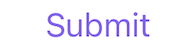
let anchorText = LGNAnchorTextUIKit(size: .lg,textLabel: "Submit",targetURL: URL(string: "https://legion.telkom.design"))
Size Medium (.md)
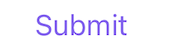
let anchorText = LGNAnchorTextUIKit(size: .md,textLabel: "Submit",targetURL: URL(string: "https://legion.telkom.design"))
Size Small (.sm)
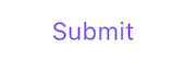
let anchorText = LGNAnchorTextUIKit(size: .sm,textLabel: "Submit",targetURL: URL(string: "https://legion.telkom.design"))
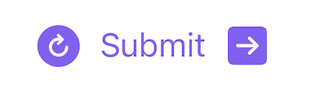
Left Icon
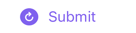
let anchorText = LGNAnchorTextUIKit(textLabel: "Submit",leftIcon: UIImage(systemName: "arrow.clockwise.circle.fill"),targetURL: URL(string: "https://legion.telkom.design"))
Right Icon
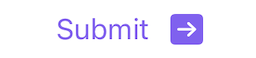
let anchorText = LGNAnchorTextUIKit(textLabel: "Submit",rightIcon: UIImage(systemName: "arrow.right.square.fill"),targetURL: URL(string: "https://legion.telkom.design"))
State Pressed

let anchorText = LGNAnchorTextUIKit(textLabel: "Submit")anchorText.onPressed = {guard let url = URL(string: "https://legion.telkom.design") else { return }UIApplication.shared.open(url)}
State Focused

let anchorText = LGNAnchorTextUIKit(textLabel: "Submit")anchorText.onFocused = {guard let url = URL(string: "https://legion.telkom.design/components/anchor/ios/") else { return }UIApplication.shared.open(url)}
Disabled

let anchorText = LGNAnchorTextUIKit(textLabel: "Submit")anchorText.isDisable = true
Full Configuration
let anchorText = LGNAnchorTextUIKit(size: .lg,textLabel: "Submit",leftIcon: UIImage(systemName: "arrow.clockwise.circle.fill"),rightIcon: UIImage(systemName: "arrow.right.square.fill"),targetURL: URL(string: "https://legion.telkom.design"))anchorText.isDisable = falseanchorText.onPressed = {
Properties
| Property | Description | Default Value |
|---|---|---|
| isDisable | Whether the anchor text is disabled. | false |
| leftIcon | The icon displayed on the left side of the text. | nil |
| onFocused | Closure to be executed when the anchor text is focused (long press started). | nil |
| onPressed | Closure to be executed when the anchor text is pressed. Overrides targetURL and will be called instead when tapped. | nil |
| rightIcon | The icon displayed on the right side of the text. | nil |
| size | The size of the anchor text. Available sizes: .sm, .md, .lg | .md |
| targetURL | The URL that the anchor text will link to. | nil |
| textLabel | The text displayed within the anchor. | "" |