Components
Checkbox
Allow users to select and deselect items in bulk

Status component contains a list of checks and completeness that has been tested and owned by each component
 We don't use color as the only visual tool to convey information. The component’s structure and properties include relevant options such as variant, style, size, orientation, optional iconography, decorations, selection, error state, etc. The title is the component name that uses the frame base component template. The base component name contains: .Base & "Component Name" if there is more than one. All component properties use the Legion foundation. We can change all the parts that are connected to the component base. The inside of the base component remains connected to the master component. All variant options are not damaged when we change from one to another. Overriding changes to components will not reset other variants. Component's already has component specs documentation.
Checkboxes allow users to select one or more items from a set. Checkboxes can turn an option on or off.
Usage
The following is how to implement Checkbox component in Legion :
Base Components
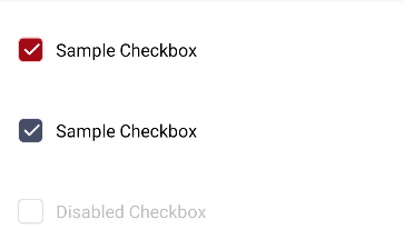
The basic checkbox component is used for individual checkboxes or basic checkbox needs.
To implement basic CheckBox we use this tag LgnPrimaryCheckBox or LgnSecondaryCheckBox .
The following is usage to implement LgnPrimaryCheckBox
<com.telkom.legion.component.checkbox.LgnPrimaryCheckBoxandroid:layout_width="match_parent"android:layout_height="wrap_content"android:layout_marginHorizontal="@dimen/dimen_16dp"android:layout_marginTop="@dimen/dimen_16dp"android:text="Sample Checkbox" />
Dynamic using Kotlin*
...with(binding) {containerBase.addView( //ViewGroup for Dynamic LayoutLgnPrimaryCheckBox(requiredContext()).apply {//Your View's customization here},LinearLayout.LayoutParams( //For example we use viewgroup LinearLayoutLinearLayout.LayoutParams.MATCH_PARENT,LinearLayout.LayoutParams.WRAP_CONTENT
The following is usage to implement LgnSecondaryCheckBox
<com.telkom.legion.component.checkbox.LgnSecondaryCheckBoxandroid:layout_width="match_parent"android:layout_height="wrap_content"android:layout_marginHorizontal="@dimen/dimen_16dp"android:layout_marginTop="@dimen/dimen_16dp"android:text="Sample Checkbox" />
Dynamic using Kotlin*
...with(binding) {containerBase.addView( //ViewGroup for Dynamic LayoutLgnSecondaryCheckBox(requiredContext()).apply {//Your View's customization here},LinearLayout.LayoutParams( //For example we use viewgroup LinearLayoutLinearLayout.LayoutParams.MATCH_PARENT,LinearLayout.LayoutParams.WRAP_CONTENT
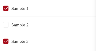
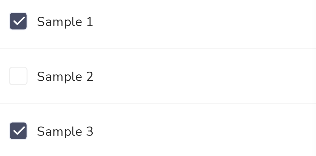
Checkbox Group
Components for grouping checkboxes, to make it easier if you need checkbox options on your form.
To implement basic CheckBox we use this tag LgnPrimaryCheckBoxGroup or LgnSecondaryCheckBoxGroup .
The following is usage to implement LgnPrimaryCheckBoxGroup
Static in xml
<com.telkom.legion.component.checkbox.LgnPrimaryCheckBoxGroupandroid:id="@+id/cgSample"android:layout_width="match_parent"android:layout_height="wrap_content"android:showDividers="middle" />
Dynamic using Kotlin*
...with(binding) {containerBase.addView( //ViewGroup for Dynamic LayoutLgnPrimaryCheckBoxGroup(requiredContext()).apply {//Your View's customization here},LinearLayout.LayoutParams( //For example we use viewgroup LinearLayoutLinearLayout.LayoutParams.MATCH_PARENT,LinearLayout.LayoutParams.WRAP_CONTENT
The following is usage to implement LgnSecondaryCheckBoxGroup
Static in xml
<com.telkom.legion.component.checkbox.LgnSecondaryCheckBoxGroupandroid:id="@+id/cgSample2"android:layout_width="match_parent"android:layout_height="wrap_content"android:showDividers="middle" />
Dynamic using Kotlin*
...with(binding) {containerBase.addView( //ViewGroup for Dynamic LayoutLgnSecondaryCheckBoxGroup(requiredContext()).apply {//Your View's customization here},LinearLayout.LayoutParams( //For example we use viewgroup LinearLayoutLinearLayout.LayoutParams.MATCH_PARENT,LinearLayout.LayoutParams.WRAP_CONTENT
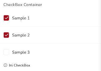
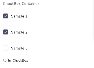
Checkbox Container
Container component containing checkbox groups and labels, helper and error text, this is used for consistency if you combine text fields in a form.
To implement basic CheckBox we use this tag LgnPrimaryCheckBoxContainer or LgnSecondaryCheckBoxContainer .
The following is usage to implement LgnPrimaryCheckBoxContainer
Static in xml
<com.telkom.legion.component.checkbox.LgnPrimaryCheckBoxContainerandroid:id="@+id/cgcSample"android:layout_width="match_parent"android:layout_height="wrap_content"android:hint="CheckBox Container"android:showDividers="middle"app:helperText="Ini CheckBox" />
Dynamic using Kotlin*
...with(binding) {containerBase.addView( //ViewGroup for Dynamic LayoutLgnPrimaryCheckBoxContainer(requiredContext()).apply {//Your View's customization here},LinearLayout.LayoutParams( //For example we use viewgroup LinearLayoutLinearLayout.LayoutParams.MATCH_PARENT,LinearLayout.LayoutParams.WRAP_CONTENT
The following is usage to implement LgnSecondaryCheckBoxContainer
Static in xml
<com.telkom.legion.component.checkbox.LgnSecondaryCheckBoxContainerandroid:id="@+id/cgcSample2"android:layout_width="match_parent"android:layout_height="wrap_content"android:hint="CheckBox Container"android:showDividers="middle"app:helperText="Ini CheckBox" />
Dynamic using Kotlin*
...with(binding) {containerBase.addView( //ViewGroup for Dynamic LayoutLgnSecondaryCheckBoxContainer(requiredContext()).apply {//Your View's customization here},LinearLayout.LayoutParams( //For example we use viewgroup LinearLayoutLinearLayout.LayoutParams.MATCH_PARENT,LinearLayout.LayoutParams.WRAP_CONTENT
Variants
Primary Color Checkbox

Secondary Color Checkbox

Primary Color Checkbox Group
Secondary Color Checkbox Group
Primary Color Checkbox Container
Secondary Color Checkbox Container
Attributes
Base Components Attributes
| Attribute Name | Xml Attrs | Related method(s) | Description |
|---|---|---|---|
| Text | android:text | text | To set Text value directly via xml |
| Enable Status | android:enabled | isEnable | To set enable or disable button directly via xml |
CheckBox Group Attributes
| Attribute Name | Xml Attrs | Related method(s) | Description |
|---|---|---|---|
| Show Divider | android:showDividers | setShowDividers | To show dividers between checkbox directly via xml |
| Add Checkbox | N/A | addAll(List<String>) | To add checkbox programaticaly |
| Clear Checkbox | N/A | clear() | To clear all checkbox programaticaly |
| Checked State | N/A | isChecked | To check checkbox ischecked or not |
| Checked All State | N/A | isCheckedAll | To check checkbox is checked all or not, and you can set all checkbox in combo box group to checked |
| Get and Set Checked Value | N/A | text | To get checked value from combo box or To set checked combo box, checkbox group can automaticaly find right combo box with given value and set to checked |
| Add Checked Listener | N/A | setOnCheckedChangeListener | To add checked listener on checkbox |
CheckBox Container Attributes
| Attribute Name | Xml Attrs | Related method(s) | Description |
|---|---|---|---|
| Text | android:text | text | To set Text value directly via xml |
| Hint | android:hint | text | To set Hint or Label value directly via xml |
| Required Status | app:isRequired | isRequired | To set required status on text area directly via xml |
| Optional Status | app:isOptional | isOptional | To set optional status on text area directly via xml |
| Helper text | app:helperText | helper | To set helper text directly via xml |
| Error text | N/A | error | To set error text |
| Show Divider | android:showDividers | setShowDividers | To show dividers between checkbox directly via xml |
| Add Checkbox | N/A | addAll(List<String>) | To add checkbox programaticaly |
| Clear Checkbox | N/A | clear() | To clear all checkbox programaticaly |
| Checked State | N/A | isChecked | To check checkbox ischecked or not |
| Checked All State | N/A | isCheckedAll | To check checkbox is checked all or not, and you can set all checkbox in combo box group to checked |
| Get and Set Checked Value | N/A | text | To get checked value from combo box or To set checked combo box, checkbox group can automaticaly find right combo box with given value and set to checked |
| Add Checked Listener | N/A | setOnCheckedChangeListener | To add checked listener on checkbox |