Give us your valuable feedback

It will help us understand how we can serve you better

Give feedback

Components

Checkbox

Allow users to select and deselect items in bulk

banner-Checkbox
Component Status Details

Status component contains a list of checks and completeness that has been tested and owned by each component

We don't use color as the only visual tool to convey information.
The component’s structure and properties include relevant options such as variant, style, size, orientation, optional iconography, decorations, selection, error state, etc. The title is the component name that uses the frame base component template. The base component name contains: .Base & "Component Name" if there is more than one. All component properties use the Legion foundation.
We can change all the parts that are connected to the component base. The inside of the base component remains connected to the master component. All variant options are not damaged when we change from one to another. Overriding changes to components will not reset other variants.
Component's already has component specs documentation.

Status

Resources

Usage

Checkbox is a square box that is ticked (checked) when activated.

Use Legion Checkbox styles to modify checkbox with lots of attributes that make you easier.

Usage Default LegionUI

Checkbox();

Usage Theme

ThemeAGR, ThemeMyTEnS, ThemeIHS & ThemeEazy

LGNCheckbox();

Variant

Legion Have 2 Type of Checkbox :

Use this Function : LGNCheckbox and add value defaultIsChecked: true or false This code sample demonstrates how to modify the variant of checkbox :

A. Checked ON

Default LegionUI

Checkbox(
defaultIsChecked: true,
size: .default
}
)

Theme (ThemeAGR, ThemeMyTEnS, ThemeIHS & ThemeEazy)

LGNCheckbox(
defaultIsChecked: true,
size: .default
}
)

B. Checked OFF

Default LegionUI

Checkbox(
defaultIsChecked: false,
size: .default
}
)

Theme (ThemeAGR, ThemeMyTEnS, ThemeIHS & ThemeEazy)

LGNCheckbox(
defaultIsChecked: false,
size: .default
}
)

Attribute

Legion Have 8 Attributes for Customize Checkbox :
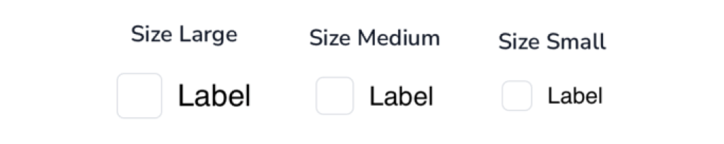
Size

This size checkbox attribute for user to choose size of checkbox.

Checkbox have 2 size .small and .default

This code sample demonstrates how to modify size checkbox :

A. small

Default LegionUI

Checkbox(
defaultIsChecked: true,
size: .small
)

Theme (ThemeAGR, ThemeMyTEnS, ThemeIHS & ThemeEazy)

LGNCheckbox(
defaultIsChecked: true,
size: .small
)

B. default

Default LegionUI

Checkbox(
defaultIsChecked: true,
size: .default
)

Theme (ThemeAGR, ThemeMyTEnS, ThemeIHS & ThemeEazy)

LGNCheckbox(
defaultIsChecked: true,
size: .default
)

Disable

Choose type of checkbox if Checked defaultIsChecked: true and Not Checked defaultIsChecked: false Choose size checkbox : For Default size add .default, for Small size add .small, Last finish it if the checkbox Disable with add this funcition isDisabled: .constant(ValueDisable) where ValueDisable consist of true or false

This code sample demonstrates how to modify disable of the checkbox :

A. Checked ON, Size Small, Disable ON

LGNCheckbox(
defaultIsChecked: true,
size: .small,
isDisabled: .constant(true),
onToggleChange: { isChecked in
// do something with isChecked value
}
)

B. Checked ON, Size Default, Disable ON

LGNCheckbox(
defaultIsChecked: true,
size: .default,
isDisabled: .constant(true),
onToggleChange: { isChecked in
// do something with isChecked value
}
)

C. Checked OFF, Size Small, Disable ON

LGNCheckbox(
defaultIsChecked: false,
size: .small,
isDisabled: .constant(true),
onToggleChange: { isChecked in
// do something with isChecked value
}
)

D. Checked OFF, Size Default, Disable ON

LGNCheckbox(
defaultIsChecked: false,
size: .default,
isDisabled: .constant(true),
onToggleChange: { isChecked in
// do something with isChecked value
}
)

Label

Choose type of checkbox if Checked ON defaultIsChecked: true or Checked OFF defaultIsChecked: false Add Label with label: "Value Label", Next Choose size checkbox : For Default size add .default, for Small size add .small, Last finish it if the checkbox Disable ON or OFF add this funcition isDisabled: .constant(ValueDisable) where ValueDisable consist of true or false

This code sample demonstrates how to modify label of the checkbox :
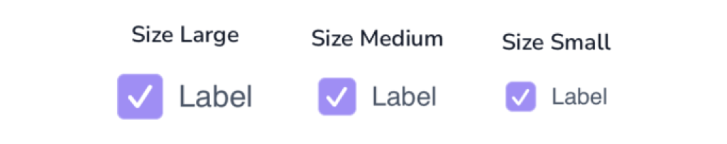
A. Checked ON, Size Small, Disable ON

LGNCheckbox(
defaultIsChecked: true,
label: "Label",
size: .small,
isDisabled: .constant(true),
onToggleChange: { isChecked in
// do something with isChecked value
}
)

B. Checked ON, Size Default, Disable ON

LGNCheckbox(
defaultIsChecked: true,
label: "Label",
size: .default,
isDisabled: .constant(true),
onToggleChange: { isChecked in
// do something with isChecked value
}
)

C. Checked ON, Size Small, Disable OFF

LGNCheckbox(
defaultIsChecked: true,
label: "Label",
size: .small,
isDisabled: .constant(false),
onToggleChange: { isChecked in
// do something with isChecked value
}
)

D. Checked ON, Size Default, Disable OFF

LGNCheckbox(
defaultIsChecked: true,
label: "Label",
size: .default,
isDisabled: .constant(false),
onToggleChange: { isChecked in
// do something with isChecked value
}
)

E. Checked OFF, Size Small, Disable ON

LGNCheckbox(
defaultIsChecked: false,
label: "Label",
size: .small,
isDisabled: .constant(true),
onToggleChange: { isChecked in
// do something with isChecked value
}
)

F. Checked OFF, Size Default, Disable ON

LGNCheckbox(
defaultIsChecked: false,
label: "Label",
size: .default,
isDisabled: .constant(true),
onToggleChange: { isChecked in
// do something with isChecked value
}
)

G. Checked OFF, Size Small, Disable OFF

LGNCheckbox(
defaultIsChecked: false,
label: "Label",
size: .small,
isDisabled: .constant(false),
onToggleChange: { isChecked in
// do something with isChecked value
}
)

H. Checked OFF, Size Default, Disable OFF

LGNCheckbox(
defaultIsChecked: false,
label: "Label",
size: .default,
isDisabled: .constant(false),
onToggleChange: { isChecked in
// do something with isChecked value
}
)

Mixed

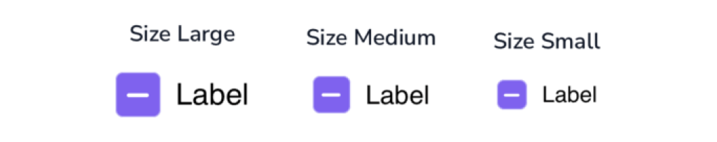
Choose type of checkbox if Checked ON defaultIsChecked: true or Checked OFF defaultIsChecked: false, Add Label with label: "Value Label", Next Choose size checkbox : For Default size add .default, for Small size add .small, And if the checkbox Disable ON or OFF add this funcition isDisabled: .constant(ValueDisable) where ValueDisable consist of true or false . Last Finish with Mixed add isMixed: true

This code sample demonstrates how to modify mixed of the checkbox :

A. Mixed, Size Small, Disable ON with Label

LGNCheckbox(
defaultIsChecked: true,
label: "Label",
size: .small,
isDisabled: .constant(true),
isMixed: true,
onToggleChange: { isChecked in
// do something with isChecked value
}

B. Mixed, Size Default, Disable ON with Label

LGNCheckbox(
defaultIsChecked: true,
label: "Label",
size: .default,
isDisabled: .constant(true),
isMixed: true,
onToggleChange: { isChecked in
// do something with isChecked value
}

C. Mixed, Size Small, Disable OFF with Label

LGNCheckbox(
defaultIsChecked: true,
label: "Label",
size: .small,
isDisabled: .constant(false),
isMixed: true,
onToggleChange: { isChecked in
// do something with isChecked value
}

D. Mixed, Size Default, Disable OFF with Label

LGNCheckbox(
defaultIsChecked: true,
label: "Label",
size: .default,
isDisabled: .constant(false),
isMixed: true,
onToggleChange: { isChecked in
// do something with isChecked value
}

E. Mixed, Size Small, Disable ON no Label

LGNCheckbox(
defaultIsChecked: true,
size: .small,
isDisabled: .constant(true),
isMixed: true,
onToggleChange: { isChecked in
// do something with isChecked value
}
)

F. Mixed, Size Default, Disable ON no Label

LGNCheckbox(
defaultIsChecked: true,
size: .default,
isDisabled: .constant(true),
isMixed: true,
onToggleChange: { isChecked in
// do something with isChecked value
}
)

G. Mixed, Size Small, Disable OFF no Label

LGNCheckbox(
defaultIsChecked: true,
size: .small,
isDisabled: .constant(false),
isMixed: true,
onToggleChange: { isChecked in
// do something with isChecked value
}
)

H. Mixed, Size Default, Disable OFF no Label

LGNCheckbox(
defaultIsChecked: true,
size: .default,
isDisabled: .constant(false),
isMixed: true,
onToggleChange: { isChecked in
// do something with isChecked value
}
)

Font Label

A. fontFamily Checked

is the font type in the label. add this function fontFamily: "FontType" where FontType consist of the font family.

This code sample demonstrates how to modify the font family of the label checked :

LGNCheckbox(
defaultIsChecked: true,
label: "Label",
fontFamily: "Verdana-Italic",
size: .default,
isDisabled: .constant(false),
onToggleChange: { isChecked in
// do something with isChecked value
}

B. fontFamily Mixed

is the font type in the label. add this function fontFamily: "FontType" where FontType consist of the font family.

This code sample demonstrates how to modify the font family of the label mixed :

LGNCheckbox(
defaultIsChecked: true,
label: "Label",
fontFamily: "Verdana-Italic",
size: .default,
isDisabled: .constant(false),
isMixed: true,
onToggleChange: { isChecked in
// do something with isChecked value

C. textForeground Checked

is the font color in the label. add this function textForegroundColor: .Color where .Color consist of the font color.

This code sample demonstrates how to modify the font color of the label checked :

LGNCheckbox(
defaultIsChecked: true,
label: "Label",
fontFamily: "Verdana-Italic",
textForegroundColor: .red,
size: .default,
isDisabled: .constant(false),
onToggleChange: { isChecked in
// do something with isChecked value

D. textForeground Mixed

is the font color in the label. add this function textForegroundColor: .Color where .Color consist of the font color.

This code sample demonstrates how to modify the font color of the label mixed :

LGNCheckbox(
defaultIsChecked: true,
label: "Label",
fontFamily: "Verdana-Italic",
textForegroundColor: .red,
size: .default,
isDisabled: .constant(false),
isMixed: true,
onToggleChange: { isChecked in

E. textDisabledColor Checked

is the font color in the label when the label is Disabled. First, make sure the label is disabled isDisabled: .constant(true), And add this function textDisabledColor: .Color where .Color consist of the font disabled color.

This code sample demonstrates how to modify the font color of the label checked :

LGNCheckbox(
defaultIsChecked: true,
label: "Label",
fontFamily: "Verdana-Italic",
textForegroundColor: .red,
textDisabledColor: .green,
size: .default,
isDisabled: .constant(true),
onToggleChange: { isChecked in

F. textDisabledColor Mixed

is the font color in the label when the label is Disabled. First, make sure the label is disabled isDisabled: .constant(true), And add this function textDisabledColor: .Color where .Color consist of the font disabled color.

This code sample demonstrates how to modify the font color of the label mixed :

LGNCheckbox(
defaultIsChecked: true,
label: "Label",
fontFamily: "Verdana-Italic",
textForegroundColor: .red,
textDisabledColor: .green,
size: .default,
isDisabled: .constant(true),
isMixed: true,

Border

A. Border Width Checked ON

is the width border for checkbox. add this function .setBorderWidth(Value) where the Value consist the number size of the border width

This code sample demonstrates how to modify the Border Width :

LGNCheckbox(
defaultIsChecked: true,
size: .default,
isDisabled: .constant(false),
onToggleChange: { isChecked in
// do something with isChecked value
}
)
.setBorderWidth(7)

B. Border Width Mixed ON

is the width border for checkbox. add this function .setBorderWidth(Value) where the Value consist the number size of the border width

This code sample demonstrates how to modify the Border Width :

LGNCheckbox(
defaultIsChecked: true,
size: .default,
isDisabled: .constant(false),
isMixed: true,
onToggleChange: { isChecked in
// do something with isChecked value
}
)

C. Border Checked ON Color

is the color border for checkbox. add this function .variantBorderColor(checkedOn: .Color) where the Color consist the color of the border

This code sample demonstrates how to modify the color checked color :

LGNCheckbox(
defaultIsChecked: true,
size: .default,
isDisabled: .constant(false),
onToggleChange: { isChecked in
// do something with isChecked value
}
)
.setBorderWidth(7)

D. Border Mixed ON Color

is the color border for checkbox. add this function .variantBorderColor(checkedOn: .Color) where the Color consist the color of the border

This code sample demonstrates how to modify the color checked color :

LGNCheckbox(
defaultIsChecked: true,
size: .default,
isDisabled: .constant(false),
isMixed: true,
onToggleChange: { isChecked in
// do something with isChecked value
}
)

E. Border Checked OFF Color

This code sample demonstrates how to modify the color checked off color :

LGNCheckbox(
defaultIsChecked: false,
size: .default,
isDisabled: .constant(false),
onToggleChange: { isChecked in
// do something with isChecked value
}
)
.setBorderWidth(7)

F. Border Mixed OFF Color

This code sample demonstrates how to modify the color mixed off color :

LGNCheckbox(
defaultIsChecked: false,
size: .default,
isDisabled: .constant(false),
isMixed: true,
onToggleChange: { isChecked in
// do something with isChecked value
}
)

Background

This code sample demonstrates how to modify the Background Checkbox Custom :

A. Background Checked ON & Disabled OFF

LGNCheckbox(
defaultIsChecked: true,
onToggleChange: { isChecked in
// do something with isChecked value
}
)
.variantBgColor(
checkedOnDisabledOff: .orange
)

B. Background Checked ON & Disabled ON

LGNCheckbox(
defaultIsChecked: true,
isDisabled: .constant(true),
onToggleChange: { isChecked in
// do something with isChecked value
}
)
.variantBgColor(
checkedOnDisabledOn: .green

C. Background Checked OFF & Disabled OFF

LGNCheckbox(
defaultIsChecked: true,
isDisabled: .constant(true),
onToggleChange: { isChecked in
// do something with isChecked value
}
)
.variantBgColor(
checkedOnDisabledOn: .green

D. Background Checked OFF & Disabled ON

LGNCheckbox(
defaultIsChecked: false,
isDisabled: .constant(true),
onToggleChange: { isChecked in
// do something with isChecked value
}
)
.variantBgColor(
checkedOffDisabledOn: .blue

E. Background Mixed ON & Disabled OFF

LGNCheckbox(
defaultIsChecked: true,
isMixed: true,
onToggleChange: { isChecked in
// do something with isChecked value
}
)
.variantBgColor(
checkedOnDisabledOff: .pink

F. Background Mixed ON & Disabled ON

LGNCheckbox(
defaultIsChecked: true,
isDisabled: .constant(true),
isMixed: true,
onToggleChange: { isChecked in
// do something with isChecked value
}
)
.variantBgColor(

G. Background Mixed OFF & Disabled OFF

LGNCheckbox(
defaultIsChecked: false,
isMixed: false,
onToggleChange: { isChecked in
// do something with isChecked value
}
)
.variantBgColor(
checkedOffDisabledOff: .red

H. Background Mixed OFF & Disabled ON

LGNCheckbox(
defaultIsChecked: false,
isDisabled: .constant(true),
isMixed: false,
onToggleChange: { isChecked in
// do something with isChecked value
}
)
.variantBgColor(

Line Color

This code sample demonstrates how to modify the Checked ON & Mixed ON Color :

A. Checked ON color

LGNCheckbox(
defaultIsChecked: true,
onToggleChange: { isChecked in
// do something with isChecked value
}
)
.setColorIconCheckedOn(color: .red)

B. Mixed ON Color

LGNCheckbox(
defaultIsChecked: true,
isMixed: true,
onToggleChange: { isChecked in
// do something with isChecked value
}
)
.setColorIconCheckedOn(color: .red)

Properties

PropertiesDescriptionDefault Value
defaultIsCheckedThe boolean to set the current value of the checkbox. Whether it is checked on (true) or off (false)false
labelThe label for the checkbox that describes it. Default value is nil.""
fontFamilyA string of font family name. Default value is empty string.nil
textForegroundColorA color to be used for the text label on the right, when the view is not disabled. Default value is colorl tertiary800.Color.LGNTheme.tertiary800
textDisabledColorA color to be used for the text label on the right, when the view is disabled. Default value is color tertiary500.Color.LGNTheme.tertiary500
sizeThe size of the checkbox. Either .default or .small Default is .default..default
isDisabledA Boolean binding state value that determines whether user can interact with this view. Default is false..constant(false)
isMixedA Boolean value that determines the icon of the checkbox when is checked true, when isMixed is true, the icon of checkbox will be minus icon. Default is false..constant(false)
onToggleChangeThe action to perform when user toggles the checkbox. Default is nil.nil