Components
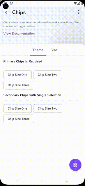
Chips
Chips allow users to enter information, make selections, filter content, or trigger actions.

Component Status Details
Status component contains a list of checks and completeness that has been tested and owned by each component
 We don't use color as the only visual tool to convey information. The component’s structure and properties include relevant options such as variant, style, size, orientation, optional iconography, decorations, selection, error state, etc. The title is the component name that uses the frame base component template. The base component name contains: .Base & "Component Name" if there is more than one. All component properties use the Legion foundation. We can change all the parts that are connected to the component base. The inside of the base component remains connected to the master component. All variant options are not damaged when we change from one to another. Overriding changes to components will not reset other variants. Component's already has component specs documentation.
Chips allow users to enter information, make selections, filter content, or trigger actions.
While buttons are expected to appear consistently and with familiar calls to action, chips should appear dynamically as a group of multiple interactive elements.
Variants
Legion has two theme variants of chips :
- Primary
- Secondary
and also have two size variant of chips :
- Large
- Small
Usage
Primary
Static in xml
<com.telkom.legion.component.chips.large.LgnPrimaryLargeChipGroup// define your attribute's here... />
programmatically
...LgnPrimaryLargeChipGroup(requiredContext()).apply {//Your View's customization here}...
Secondary
Static in xml
<com.telkom.legion.component.chips.large.LgnSecondaryLargeChipGroup// define your attribute's here... />
programmatically
...LgnSecondaryLargeChipGroup(requiredContext()).apply {//Your View's customization here}...
Large
Static in xml
<com.telkom.legion.component.chips.large.LgnPrimaryLargeChipGroup// define your attribute's here... />
programmatically
...LgnPrimaryLargeChipGroup(requiredContext()).apply {//Your View's customization here}...
Small
Static in xml
<com.telkom.legion.component.chips.large.LgnSecondarySmallChipGroup// define your attribute's here... />
programmatically
...LgnSecondarySmallChipGroup(requiredContext()).apply {//Your View's customization here}...
Attributes
| Attribute Name | Xml Attrs | Related method(s) | Description |
|---|---|---|---|
| Text | N/A | text | To get or set selection value on Filter Type directly |
| Hint | android:hint | hint | To set label value directly via xml |
| Enable Status [WIP] | N/A | N/A | To set enable or disable chips directly via xml |
| Required Status | app:isRequired | isRequired | To set required status on text area directly via xml |
| Optional Status | app:isOptional | isOptional | To set optional status on text area directly via xml |
| Helper text | app:helperText | helper | To set helper text directly via xml |
| Chip Type | app:chipType | chipType | To set chip type directly via xml |
| Single Line | app:isSingleLine | isSingleLine | To set chips single line directly via xml |
| Show Close Icon | app:closeIconVisible | closeIconVisible | To set show close icon on chips directly via xml |
| Single Selection [BETA] | app:isSingleSelection | isSingleSelection | To set chips single selection directly via xml |
| Background Color [BETA] | app:chipBackgroundColor | chipBackgroundColor | To set chips background color directly via xml |
| Stroke Color [BETA] | app:chipStrokeColor | chipStrokeColor | To set chips stroke color directly via xml |
| Text Color [BETA] | android:textColor | textColors | To set chips text color directly via xml |
| Add Chips | N/A | addAll(List<String>) | To add chips programaticaly |
| Add Listener | N/A | setListener { text -> } | To add listener on chips programaticaly |
| Add Close Listener | N/A | setOnCloseIconClickListener { text -> } | To add close listener on chips programaticaly |