Components
Chips
Chips allow users to enter information, make selections, filter content, or trigger actions.

Status component contains a list of checks and completeness that has been tested and owned by each component
 We don't use color as the only visual tool to convey information. The component’s structure and properties include relevant options such as variant, style, size, orientation, optional iconography, decorations, selection, error state, etc. The title is the component name that uses the frame base component template. The base component name contains: .Base & "Component Name" if there is more than one. All component properties use the Legion foundation. We can change all the parts that are connected to the component base. The inside of the base component remains connected to the master component. All variant options are not damaged when we change from one to another. Overriding changes to components will not reset other variants. Component's already has component specs documentation.
Usage
Chips allow users to enter information, make choices, filter content, or trigger actions. While buttons are expected to appear consistently and with a familiar call to action, chips will appear dynamically as groups of multiple interactive elements.
Use Legion chips styles to modify chips with lots of attributes that make you easier.
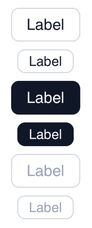
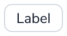
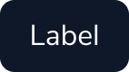
ThemeLGN, ThemeAGR, ThemeMyTEnS, ThemeIHS & ThemeEazy
LGNChips(label: "Label")
Variant
ThemeLGN, ThemeAGR, ThemeMyTEnS, ThemeIHS & ThemeEazy
LGNChips(label: "Label", size: .medium)LGNChips(label: "Label", size: .small)
Attribute
Legion Have 3 Attributes for Customize Chips :
Size
This size attribute for user to costumize size of chips
LGNChips(label: "Label", size: .small)
LGNChips(label: "Label", size: .medium)
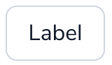
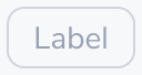
Active
This size attribute for user to costumize active of chips

LGNChips(label: "Label", isActive: true, size: .small)
LGNChips(label: "Label", isActive: true, size: .medium)
Disable
This size attribute for user to costumize disable of chips
LGNChips(label: "Label", isDisabled: .constant(true), size: .small)
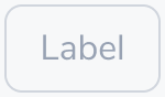
LGNChips(label: "Label", isDisabled: .constant(true), size: .medium)
Properties
| Properties | Description | Default Value |
|---|---|---|
| label | The label for the chip’s label, that describes the purpose of the chips’ action. | 'nil' |
| size | The size of the chips. Either .medium or .small | 'nil' |
| isDisabled | A binding boolean to enable disable the chips component | '.constant(false)' |
| isActive | The boolean state to enable active state to the chips component. | 'false' |
| fontFamily | A string of font family name | "" |
| action | The action to perform when the user triggers the chips. | {} |
| isHiddenBorder | The boolean state to hide the border when the state is active | 'false' |
| activeTextColor | A text color to be used for the foregroundColor/textlabel when the state is active | '.white' |
| disabledTextColor | A text color to be used for the foregroundColor/textlabel when the state is disabled | 'Color.LGNTheme.tertiary400' |
| defaultTextColor | A text color to be used for the foregroundColor/textlabel when the state is default | 'Color.LGNTheme.tertiary900' |
| activeBackgroundColor | A background color to be used for the chips background when the state is active | 'Color.LGNTheme.tertiary900' |
| notActiveBackgroundColor | A background color to be used for the chips background when the state is not active | '.clear' |
Example Project
ThemeLGN, ThemeAGR, ThemeMyTEnS, ThemeIHS & ThemeEazy
LGNChips(label: "Hello",isDisabled: .constant(false),isActive: false,size: .small,fontFamily: "NunitoSans-Bold") {print("hello")}