Components
Chips
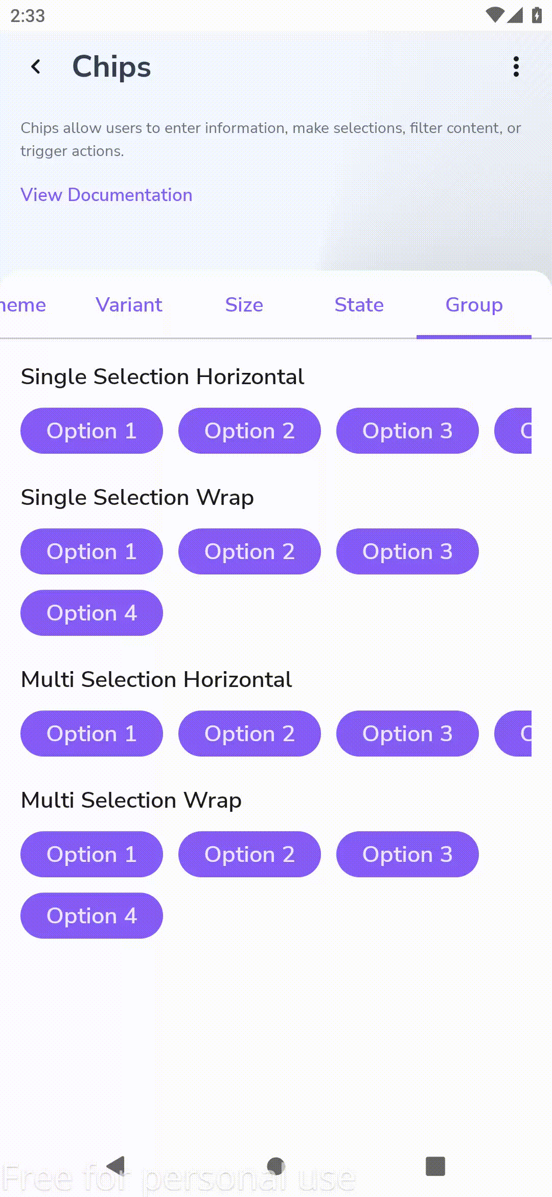
Chips allow users to enter information, make selections, filter content, or trigger actions.

Component Status Details
Status component contains a list of checks and completeness that has been tested and owned by each component
 We don't use color as the only visual tool to convey information. The component’s structure and properties include relevant options such as variant, style, size, orientation, optional iconography, decorations, selection, error state, etc. The title is the component name that uses the frame base component template. The base component name contains: .Base & "Component Name" if there is more than one. All component properties use the Legion foundation. We can change all the parts that are connected to the component base. The inside of the base component remains connected to the master component. All variant options are not damaged when we change from one to another. Overriding changes to components will not reset other variants. Component's already has component specs documentation.
Chips allow users to enter information, make selections, filter content, or trigger actions.
While buttons are expected to appear consistently and with familiar calls to action, chips should appear dynamically as a group of multiple interactive elements.
Variants
Legion has two theme variants of chips :
- Primary
- Secondary
and also have two size variant of chips :
- Large
- Small
Usage
Primary
var selected by remember { mutableStateOf(false) }LgnChip(selected = selected,onClick = { selected = !selected },label = { Text(text = "Primary") })
Secondary
var selected by remember { mutableStateOf(false) }LgnChip(selected = selected,onClick = { selected = !selected },label = { Text(text = "Secondary") },colors = LgnChipDefaults.SolidTheme.secondary())
Large
Static in xml
var selected by remember { mutableStateOf(false) }LgnChip(selected = selected,onClick = { selected = !selected },label = { Text(text = "Large") },size = LgnChipSize.Large)
Small
var selected by remember { mutableStateOf(false) }LgnChip(selected = selected,onClick = { selected = !selected },label = { Text(text = "Small") },size = LgnChipSize.Small)
Attributes
| Parameters | Type | Description |
|---|---|---|
| label | String | Set label of chip |
| selected | Boolean | Set state of chip |
| onClick | Function | called when this chip is clicked |
| colors | LgnChipColors | [LgnChipColors] that will be used to resolve the colors used for this chip in different states. See [LgnChipDefaults.solidColors] |
| enabled | Boolean | Set whether the button can be pressed or not |
| iconLeft | Composable | Set left icon of chip |
| iconRight | Composable | Set Right icon of chip |
| avatar | Composable | optional image to be displayed on the left side of the chip |
| shape | Shape | defines the shape of this chip’s container |
| border | LgnChipBorder | [LgnChipBorder] the border to draw around the container of this chip. Pass null for no border. See [LgnChipDefaults.border] |
| size | LgnChipSize | Set size of chip by LgnChipSize.Small |
| modifier | Modifier | [Modifier] to be applied to the chip |
| interactionSource | MutableInteractionSource | [MutableInteractionSource] representing the source of the interactions |