Components
Radio Button
Buttons are used to select only one of a limited number of choices

Component Status Details
Status component contains a list of checks and completeness that has been tested and owned by each component
 We don't use color as the only visual tool to convey information. The component’s structure and properties include relevant options such as variant, style, size, orientation, optional iconography, decorations, selection, error state, etc. The title is the component name that uses the frame base component template. The base component name contains: .Base & "Component Name" if there is more than one. All component properties use the Legion foundation. We can change all the parts that are connected to the component base. The inside of the base component remains connected to the master component. All variant options are not damaged when we change from one to another. Overriding changes to components will not reset other variants. Component's already has component specs documentation.
Usage
Radio buttons allow the user to select one option from a dataset.
Variant
Themes
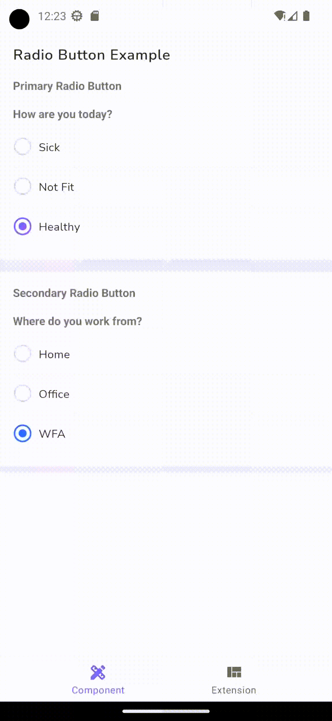
There are 2 themes of the radio button. There are Primary and Secondary.
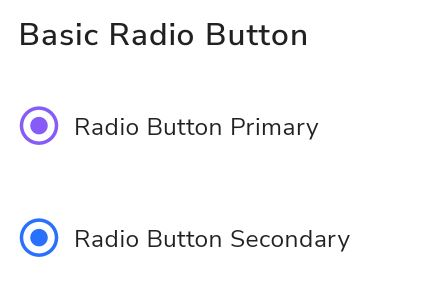
Base Components
Single radio button used for single option value.
Primary Radio Button
Example usage :
Static in xml
<com.telkom.legion.component.radio.LgnPrimaryRadioButtonandroid:id="@+id/rbprimary"android:layout_width="match_parent"android:layout_height="wrap_content"android:text="Radio Button Primary"android:layout_marginHorizontal="@dimen/dimen_16dp"android:layout_marginTop="@dimen/dimen_16dp"/>
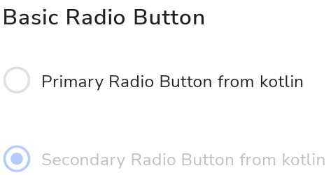
Dynamic using Kotlin*
...with(binding) {rbprimary.setText("Primary Radio Button from kotlin")rbprimary.isChecked}...
Secondary Radio Button
Example usage :
Static in xml
<com.telkom.legion.component.radio.LgnSecondaryRadioButtonandroid:id="@+id/rbsecondary"android:layout_width="match_parent"android:layout_height="wrap_content"android:text="Radio Button Secondary"android:layout_marginHorizontal="@dimen/dimen_16dp"android:layout_marginTop="@dimen/dimen_16dp"/>
Dynamic using Kotlin*
...with(binding) {rbsecondary.setText("Secondary Radio Button from kotlin")rbsecondary.disable()}...
Attributes
| Attribute Name | Xml Attrs | Related method(s) | Description |
|---|---|---|---|
| Id | android:id | text | To set id component |
| Text | android:text | text | To set Text value directly via xml |
| Enable Status | android:enabled | isEnable | To set enable or disable radio button value directly via xml |
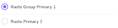
Radio Button Group
Radio button group used for show multiple option value.
Example usage :
Static in xml
<TextViewandroid:layout_width="match_parent"android:layout_height="wrap_content"android:text="Radio Button Example"android:layout_marginHorizontal="@dimen/dimen_16dp"android:layout_marginTop="@dimen/dimen_16dp"android:textAppearance="?attr/bodyLargeMedium"/><TextView
Dynamic using Kotlin*
......with(binding) {rgSamplePrimary.addAll(listOf("Sick","Not Fit","Healthy"),
Attributes
| Attribute Name | Xml Attrs | Related method(s) | Description |
|---|---|---|---|
| Id | android:id | text | To set id component |
| Text | android:text | text | To set Text value directly via xml |
| Enable Status | android:enabled | isEnable | To set enable or disable radio button value directly via xml |
| Show Dividers | android:showDividers | showDividers | To show devider between radio button value |
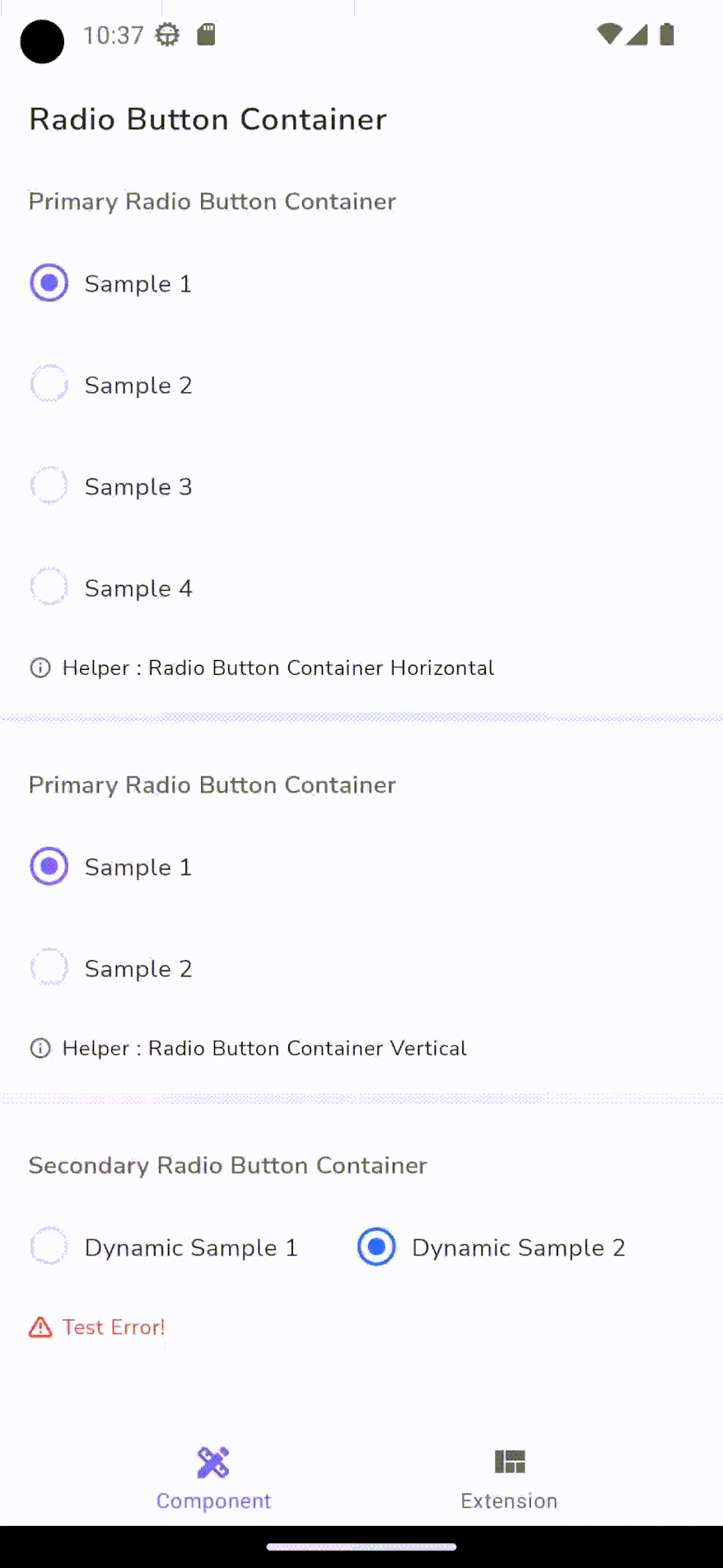
Radio Button Container
Radio group container contains radio button group, hits ( label), helper , and error text.
Example usage :
Static in xml
<TextViewandroid:layout_width="match_parent"android:layout_height="wrap_content"android:text="Radio Button Container"android:layout_marginHorizontal="@dimen/dimen_16dp"android:layout_marginTop="@dimen/dimen_16dp"android:textAppearance="?attr/bodyLargeMedium"/><com.telkom.legion.component.radio.LgnPrimaryRadioContainer
Dynamic using Kotlin*
......with(binding) {rcPrimary.addAll(listOf("Sample 1","Sample 2","Sample 3","Sample 4",
Attributes
| Attribute Name | Xml Attrs | Related method(s) | Description |
|---|---|---|---|
| Helper Text in Container | app:helperText | helperText | To set helper text below radio button container |
| Hint | android:hint | hint | To set label for radio button container |
| Orientation | android:orientation | orientation | To set orientation dataset for radio button container |
| Scroll Container | android:isScrollContainer | isScrollContainer | To set enable or disable scroll dataset for radio button container |