Components
Radio Button
Buttons are used to select only one of a limited number of choices

Status component contains a list of checks and completeness that has been tested and owned by each component
 We don't use color as the only visual tool to convey information. The component’s structure and properties include relevant options such as variant, style, size, orientation, optional iconography, decorations, selection, error state, etc. The title is the component name that uses the frame base component template. The base component name contains: .Base & "Component Name" if there is more than one. All component properties use the Legion foundation. We can change all the parts that are connected to the component base. The inside of the base component remains connected to the master component. All variant options are not damaged when we change from one to another. Overriding changes to components will not reset other variants. Component's already has component specs documentation.
Usage
Create radio button with or without label. Radio Button is a component that allows the user to make a single choice between many options given.
How to import your theme: Legion iOS UIKit offers four themes: ThemeAGR, ThemeEazy, ThemeIHS, ThemeLGN, and ThemeMyTEnS.
import ThemeLGN
The radio button can be used without any parameter
LGNRadioButton();
Attribute
Size
You can customize the size of the button via the size enum, where BaseLGNRadioButton.Size includes lg, md and sm.
| Large | Medium | Small |
|---|---|---|
 |  |  |
Large
let radio = LGNRadioButton()radio.size = .lgradio.checked = trueradio.textLabel = "radio 3"
Medium
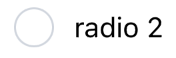
let radio2 = LGNRadioButton()radio2.size = .mdradio2.checked = trueradio2.textLabel = "radio 2"
Small
let radio3 = LGNRadioButton()radio3.size = .smradio3.checked = trueradio3.textLabel = "radio 1"
Disable
You can also disable user interaction on LGNRadioButton
| Default | Disabled |
|---|---|
 |  |
Checked Disabled
let radio = LGNRadioButton()radio.size = .mdradio.textLabel = "radio 2"radio.disable = false
Unchecked Disabled
let radio2 = LGNRadioButton()radio2.size = .mdradio2.textLabel = "radio 3"radio2.disable = true
Usage Recommendation
In order to make LGNRadioButton works correctly it required to implements LGNRadioButtonDelegate into your ViewController. Then your ViewController will add radioButtonDidTapped(selectedRadio: String) function. And then, you can add radio button logic to that function. For example look at code below.
class MainViewController: ViewController {override func viewDidLoad() {...radio1.delegate = selfradio2.delegate = self}func update(selectedRadioId: String){
The code above will trigger update() function as Radio Button logic everytime user select a Radio Button.
Properties
| Properties | Description | Default Value |
|---|---|---|
| disable | Determine if the radio disabled or not. | false |
| radioId | Radio button identifier. | "" |
| selected | The state of radio. | false |
| size | The size of the radio. | .lg |
| textLabel | The label for the radio that describes it. | nil |