Components
Snackbar
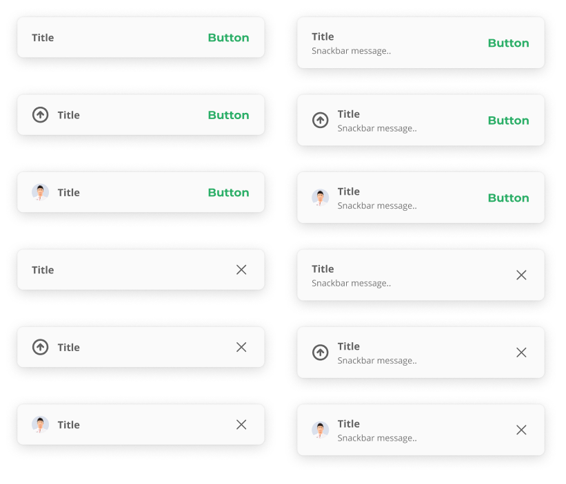
Snackbar displays informative text

Component Status Details
Status component contains a list of checks and completeness that has been tested and owned by each component
 We don't use color as the only visual tool to convey information. The component’s structure and properties include relevant options such as variant, style, size, orientation, optional iconography, decorations, selection, error state, etc. The title is the component name that uses the frame base component template. The base component name contains: .Base & "Component Name" if there is more than one. All component properties use the Legion foundation. We can change all the parts that are connected to the component base. The inside of the base component remains connected to the master component. All variant options are not damaged when we change from one to another. Overriding changes to components will not reset other variants. Component's already has component specs documentation.
Snackbars notify users of processes that have been or will be performed by the app. They appear temporarily, towards the bottom of the screen. They must not interfere with the user experience, and they do not require user input to disappear.
Variants & Themes
Legion has 4 variants for snackbar :
- Title
- Description
- Action Text
- Icon
- Avatar
Legion has 4 themes for snackbar :
- Basic / Normal Theme
- Error Theme
- Warning Theme
- Success Theme
Usage
Basic use of snackbars in fragments and in activities without customization
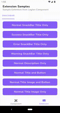
Normal Snackbar
...btnAction.setOnClickListener {normalSnackBar("Normal Snackbar")}...
Success Snackbar
...btnAction.setOnClickListener {successSnackBar("Success Snackbar")}...
Error Snackbar
...btnAction.setOnClickListener {errorSnackBar("Error Snackbar")}...
Warning Snackbar
...btnAction.setOnClickListener {warningSnackBar("Warning Snackbar")}...
Variants Usage
Further use of the snackbar in fragments and in activities with customization such as:
- Title
...btnAction.setOnClickListener {LgnSnackBar.setup(this) {...title = "Title"...}.show()}
- Description
...btnAction.setOnClickListener {LgnSnackBar.setup(this) {...description = "Description"...}.show()}
- Action Text
...btnAction.setOnClickListener {LgnSnackBar.setup(this) {...actionText = "Action Text"...}.show()}
- Icon
...btnAction.setOnClickListener {LgnSnackBar.setup(this) {...icon = "https://cdn.kincir.com/2/cojC8OAR0YiByhyEPOO6AADzHrc9p3w7CTursS4z35A/transform/rs:fit:764/src/production/2021-02/740x435_3576f9505b43dabaea0294436ab365775c42fe56.jpg"...}.show()}
- Avatar
...btnAction.setOnClickListener {LgnSnackBar.setup(this) {...avatarUrl = "https://cdn.kincir.com/2/cojC8OAR0YiByhyEPOO6AADzHrc9p3w7CTursS4z35A/transform/rs:fit:764/src/production/2021-02/740x435_3576f9505b43dabaea0294436ab365775c42fe56.jpg"...}.show()}
Attribute
| Attribute Name | Xml Attrs | Related method(s) | Description |
|---|---|---|---|
| Type Snackbar | N/A | type | To set Snackbar Type |
| View Anchor | N/A | view | To set Snackbar Anchor View |
| Description Text | N/A | description | To set Snackbar Description |
| Title Text | N/A | title | To set Snackbar Title |
| Duration Snackbar | N/A | duration | To set Snackbar Duration |
| Action Text | N/A | actionText | To set Snackbar Action Text |
| Icon Drawable | N/A | icon | To set Snackbar Icon |
| Avatar Url | N/A | avatarUrl | To set Snackbar Avatar Url |
| Callback Button | N/A | setActionButtonListener { //Action } | To set Snackbar Callback Action Button |