Components
Textarea
Used to enter long text input which spans over multiple lines

Status component contains a list of checks and completeness that has been tested and owned by each component
 We don't use color as the only visual tool to convey information. The component’s structure and properties include relevant options such as variant, style, size, orientation, optional iconography, decorations, selection, error state, etc. The title is the component name that uses the frame base component template. The base component name contains: .Base & "Component Name" if there is more than one. All component properties use the Legion foundation. We can change all the parts that are connected to the component base. The inside of the base component remains connected to the master component. All variant options are not damaged when we change from one to another. Overriding changes to components will not reset other variants. Component's already has component specs documentation.
Usage
Textarea allow user input. The border should light up simply and clearly indicating which field the user is currently editing.
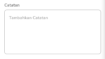
Basic
Here’s the default usage of Textarea with placeholder and label attribute set.
Static in xml
<com.telkom.legion.component.textfield.LgnTextAreaFieldandroid:layout_width="match_parent"android:layout_height="wrap_content"android:hint="Catatan"app:placeholderText="Tambahkan Catatan" />
Dynamic using Kotlin*
...with(binding) {containerBase.addView( //ViewGroup for Dynamic LayoutLgnTextAreaField(requiredContext()).apply {//Your View's customization here},LinearLayout.LayoutParams( //For example we use viewgroup LinearLayoutLinearLayout.LayoutParams.MATCH_PARENT,LinearLayout.LayoutParams.WRAP_CONTENT
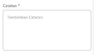
Required Text Area
Add required status to make it easier for users to know which fields are required status, the label will automatically be added with a red asterisk mark
Static in xml
<com.telkom.legion.component.textfield.LgnTextAreaFieldandroid:layout_width="match_parent"android:layout_height="wrap_content"android:hint="Catatan"app:isRequired="true"app:placeholderText="Tambahkan Catatan" />
Dynamic using Kotlin*
...with(binding) {containerBase.addView( //ViewGroup for Dynamic LayoutLgnTextAreaField(requiredContext()).apply {isRequired = true//Your View's customization here},LinearLayout.LayoutParams( //For example we use viewgroup LinearLayoutLinearLayout.LayoutParams.MATCH_PARENT,
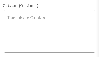
Optional Text Area
Add optional status to make it easier for users to know which fields are optional, labels will be automatically added text (Optional) in various languages
Static in xml
<com.telkom.legion.component.textfield.LgnTextAreaFieldandroid:layout_width="match_parent"android:layout_height="wrap_content"android:hint="Catatan"app:isOptional="true"app:placeholderText="Tambahkan Catatan" />
Dynamic using Kotlin*
...with(binding) {containerBase.addView( //ViewGroup for Dynamic LayoutLgnTextAreaField(requiredContext()).apply {isOptional = true//Your View's customization here},LinearLayout.LayoutParams( //For example we use viewgroup LinearLayoutLinearLayout.LayoutParams.MATCH_PARENT,
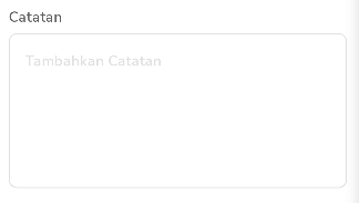
Disabled Text Area
Make textarea look inactive.
Static in xml
<com.telkom.legion.component.textfield.LgnTextAreaFieldandroid:layout_width="match_parent"android:layout_height="wrap_content"android:hint="Catatan"android:enabled="false"app:placeholderText="Tambahkan Catatan" />
Dynamic using Kotlin*
...with(binding) {containerBase.addView( //ViewGroup for Dynamic LayoutLgnTextAreaField(requiredContext()).apply {isEnable = false//Your View's customization here},LinearLayout.LayoutParams( //For example we use viewgroup LinearLayoutLinearLayout.LayoutParams.MATCH_PARENT,
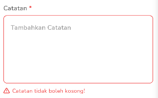
Error Indicator Text Area
Add an error indicator to make it easier for users to find out which fields are wrong in inputting, and provide error messages in the relevant fields
Static in xml
<com.telkom.legion.component.textfield.LgnTextAreaFieldandroid:id="@+id/etAreaError"android:layout_width="match_parent"android:layout_height="wrap_content"android:hint="Catatan"app:placeholderText="Tambahkan Catatan" />
In Your Kotlin Code
...with(binding) {etAreaError.error = "Your error message"}...
Dynamic using Kotlin*
...with(binding) {containerBase.addView( //ViewGroup for Dynamic LayoutLgnTextAreaField(requiredContext()).apply {error = "Your error message"//Your View's customization here},LinearLayout.LayoutParams( //For example we use viewgroup LinearLayoutLinearLayout.LayoutParams.MATCH_PARENT,
Properties
| Component Name | Id | Description |
|---|---|---|
| TextView | tvHint | To display label on text area |
| TextInputLayout | etBase | To display text field on text area |
| TextView | tvHelper | To display helper text on text area |
| TextView | tvError | To display error text on text area |
Attributes
| Attribute Name | Xml Attrs | Related method(s) | Description |
|---|---|---|---|
| Text | android:text | text | To set Text value directly via xml |
| Hint | android:hint | text | To set Hint or Label value directly via xml |
| Enable Status | android:enabled | isEnable | To set enable or disable text area directly via xml |
| Required Status | app:isRequired | isRequired | To set required status on text area directly via xml |
| Optional Status | app:isOptional | isOptional | To set optional status on text area directly via xml |
| Placeholder text | app:placeholderText | placeHolder | To set placeholder text directly via xml |
| Helper text | app:placeholderText | helper | To set helper text directly via xml |