Components
Textarea
Used to enter long text input which spans over multiple lines

Component Status Details
Status component contains a list of checks and completeness that has been tested and owned by each component
 We don't use color as the only visual tool to convey information. The component’s structure and properties include relevant options such as variant, style, size, orientation, optional iconography, decorations, selection, error state, etc. The title is the component name that uses the frame base component template. The base component name contains: .Base & "Component Name" if there is more than one. All component properties use the Legion foundation. We can change all the parts that are connected to the component base. The inside of the base component remains connected to the master component. All variant options are not damaged when we change from one to another. Overriding changes to components will not reset other variants. Component's already has component specs documentation.
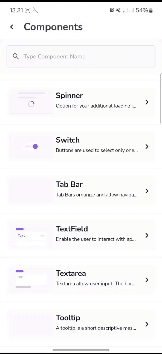
Types and States
Legion has 2 type of Textarea
- Basic Text Area Inline
- Basic Text Area Outline
Legion also has 8 states of Textarea
- Normal State Inline
- Normal State Outline
- Error State Inline
- Error State Outline
- Success State Inline
- Succes State Outline
- Disable State Inline
- Disable State Outline
Usage
Textarea allow user input. The border should light up simply and clearly indicating which field the user is currently editing.
Inline
var value by remember { mutableStateOf("") }LgnInlineTextArea(value = value,onValueChange = {value = it},placeholder = "Description")
Outline
var value by remember { mutableStateOf("") }LgnOutlineTextArea(value = value,onValueChange = {value = it},placeholder = "Description")
States
Normal
Inline
var value by remember { mutableStateOf("") }LgnFieldContainer(label = "Description") {LgnInlineTextArea(value = value,onValueChange = {value = it},placeholder = "Description"
Outline
var value by remember { mutableStateOf("") }LgnFieldContainer(label = "Description") {LgnOutlineTextArea(value = value,onValueChange = {value = it},placeholder = "Description"
Error
Inline
var value by remember { mutableStateOf("") }LgnFieldContainer(label = "Description", error = "Description Error") {LgnInlineTextArea(value = value,onValueChange = {value = it},placeholder = "Description",
Outline
var value by remember { mutableStateOf("") }LgnFieldContainer(label = "Description", error = "Description Error") {LgnOutlineTextArea(value = value,onValueChange = {value = it},placeholder = "Description",
Success
Inline
var value by remember { mutableStateOf("") }LgnFieldContainer(label = "Description", success = "Description Correct") {LgnInlineTextArea(value = value,onValueChange = {value = it},placeholder = "Description",
Outline
var value by remember { mutableStateOf("") }LgnFieldContainer(label = "Description", success = "Description Correct") {LgnOutlineTextArea(value = value,onValueChange = {value = it},placeholder = "Description",
Disabled
Inline
var value by remember { mutableStateOf("") }LgnInlineTextArea(value = value,onValueChange = {value = it},placeholder = "Description",enabled = false
Outline
var value by remember { mutableStateOf("") }LgnOutlineTextArea(value = value,onValueChange = {value = it},placeholder = "Description",enabled = false
Attributes
| Parameters | Type | Description |
|---|---|---|
| value | String | Set Text in Area |
| onValueChange | (String) -> Unit | Set Action When Text Change |
| colors | LgnTextFieldColors | Set Color of Text |
| textStyle | TextStyle | Set Text Style of Text |
| enabled | Boolean | Set Enable or Disable of Text Area |
| error | Boolean | Set whether Text Area State Error or Not |
| success | Boolean | Set whether Text Area State Success or Not |
| shape | Shape | Set Shape of Text Area |
| placeHolder | String | Set Place Holder of Text Area |
| keyboardOptions | KeyboardOptions | Set Options Available on the Keyboard when They Appear on the Screen |
| keyboardActions | KeyboardOptions | What the Application Should Do after the User has Finished Entering Text |
| maxLines | Int | Set Maximum Line of Text Area |
| minLines | Int | Set Minimum Line of Text Area |
| visualTransformation | VisualTransformation | Changing Visual Output of the Text Area |