Components
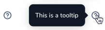
Tooltip
Shows additional context on tap or hover.

Status component contains a list of checks and completeness that has been tested and owned by each component
 We don't use color as the only visual tool to convey information. The component’s structure and properties include relevant options such as variant, style, size, orientation, optional iconography, decorations, selection, error state, etc. The title is the component name that uses the frame base component template. The base component name contains: .Base & "Component Name" if there is more than one. All component properties use the Legion foundation. We can change all the parts that are connected to the component base. The inside of the base component remains connected to the master component. All variant options are not damaged when we change from one to another. Overriding changes to components will not reset other variants. Component's already has component specs documentation.
Usage
Tooltip displays informative text when users hover, focus, or click an element.
Use Legion Tooltip styles allow users to type text into an app, with support lots type and attribute to customize.
import LegionUI
Variant
LGNTooltip with the following appearances:
- Tooltip
- Tooltip icon
- Tooltip + arrow position: no arrow, bottom center, bottom left, bottom right, top center, left, right
- Tooltip icon + arrow position: no arrow, left, right, bottom, top left, top right, top arrow, top no arrow
You can change the Tooltip description with title prop
This code sample demonstrates how to modify the variant of Tooltip :
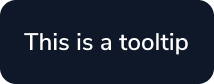
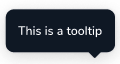
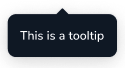
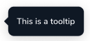
A. Tooltip
LGNTooltipBase(text: "This is a tooltip", tipPosition: .noTip)
As view modifier.
@State private var isShowing: = falsevar body: some View {VStack {LGNOutlineBtn(title: "Tap to show tooltip", {isShowing.toggle()}).variant(size: .normal, responsive: false).lgnTooltip($isShowing, text: "this is tooltip", position: .noTip)
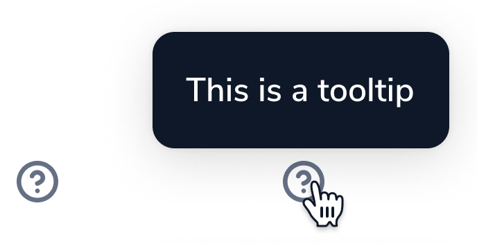
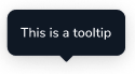
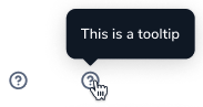
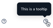
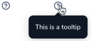
B. Tooltip Icon
LGNTooltipIcon(text: "This is a tooltip", position: .noTip)
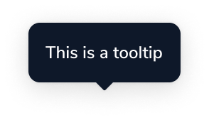
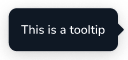
C. Tooltip + arrow position
LGNTooltipBase(text: "This is a tooltip")
As view modifier.
@State private var isShowing: = falsevar body: some View {VStack {LGNOutlineBtn(title: "Tap to show tooltip", {isShowing.toggle()}).variant(size: .normal, responsive: false).lgnTooltip($isShowing, text: "this is tooltip")
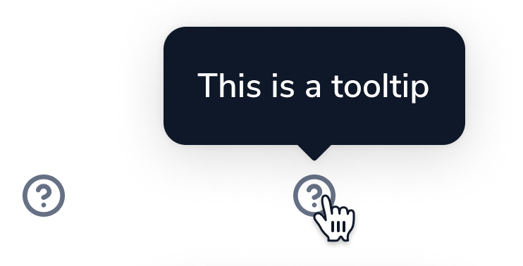
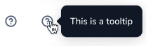
D. Tooltip icon + arrow position
LGNTooltipIcon(text: "This is a tooltip")
Attribute
Legion Have 1 Attribute for Customize Tooltip :
Position
This position attribute for user to add arrow position on the tooltip
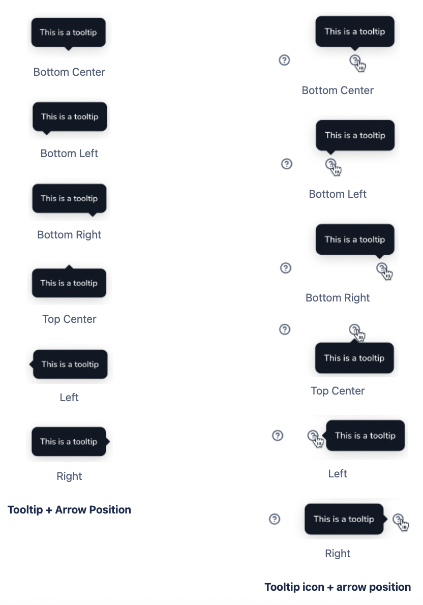
Bottom Center
This code sample demonstrates how to modify the type of Tooltip :
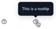
Tooltip
LGNTooltipBase(text: "This is a tooltip")
As View modifier.
@State private var isShowing: = falsevar body: some View {VStack {LGNOutlineBtn(title: "Tap to show tooltip", {isShowing.toggle()}).variant(size: .normal, responsive: false).lgnTooltip($isShowing, text: "this is tooltip")
Tooltip Icon
LGNTooltipIcon(text: "This is a tooltip")
Bottom Left
This code sample demonstrates how to modify the type of Tooltip :
Tooltip
LGNTooltipBase(text: "This is a tooltip", tipPosition: .bottomLeft)
As View modifier.
@State private var isShowing: = falsevar body: some View {VStack {LGNOutlineBtn(title: "Tap to show tooltip", {isShowing.toggle()}).variant(size: .normal, responsive: false).lgnTooltip($isShowing, text: "this is tooltip", position: .topRight)
Tooltip Icon
LGNTooltipIcon(text: "This is a tooltip", position: .topLeft)
Bottom Right
This code sample demonstrates how to modify the type of Tooltip :
Tooltip
LGNTooltipBase(text: "This is a tooltip", tipPosition: .bottomRight)
As View modifier.
@State private var isShowing: = falsevar body: some View {VStack {LGNOutlineBtn(title: "Tap to show tooltip", {isShowing.toggle()}).variant(size: .normal, responsive: false).lgnTooltip($isShowing, text: "this is tooltip", position: .topLeft)
Tooltip Icon
LGNTooltipIcon(text: "This is a tooltip", position: .topRight)
Top Center
This code sample demonstrates how to modify the type of Tooltip :
Tooltip
LGNTooltipBase(text: "This is a tooltip", tipPosition: .top)
As View modifier.
@State private var isShowing: = falsevar body: some View {VStack {LGNOutlineBtn(title: "Tap to show tooltip", {isShowing.toggle()}).variant(size: .normal, responsive: false).lgnTooltip($isShowing, text: "this is tooltip", position: .bottom)
Tooltip Icon
LGNTooltipIcon(text: "This is a tooltip", position: .bottom)
Left
This code sample demonstrates how to modify the type of Tooltip :
Tooltip
LGNTooltipBase(text: "This is a tooltip", tipPosition: .left)
As View modifier.
@State private var isShowing: = falsevar body: some View {VStack {LGNOutlineBtn(title: "Tap to show tooltip", {isShowing.toggle()}).variant(size: .normal, responsive: false).lgnTooltip($isShowing, text: "this is tooltip", position: .right)
Tooltip Icon
LGNTooltipIcon(text: "This is a tooltip", position: .left)
Right
This code sample demonstrates how to modify the type of Tooltip :
Tooltip
LGNTooltipBase(text: "This is a tooltip", tipPosition: .right)
As View modifier.
@State private var isShowing: = falsevar body: some View {VStack {LGNOutlineBtn(title: "Tap to show tooltip", {isShowing.toggle()}).variant(size: .normal, responsive: false).lgnTooltip($isShowing, text: "this is tooltip", position: .left)
Tooltip Icon
LGNTooltipIcon(text: "This is a tooltip", position: .right)
Properties
LGNTooltipBase properties
| Properties | Description | Default Value |
|---|---|---|
| text | the main text you want to display on tooltip | |
| tipPosition | arrow location related to tooltip body. .noTip, .bottom, .bottomLeft, .bottomRight, .top, .left, and .right | .bottom |
lgnTooltip view modifier function properties
| Properties | Description | Default Value |
|---|---|---|
| enabled | receive your boolean binding variable to decide whether or not the tooltip shall appear | .constant(true) |
| text | the main text you want to display on tooltip | |
| position | tooltip location related to parent view. .noTip, .bottom, .bottomLeft, .bottomRight, .top, .left, and .right | .top |
| maxWidth | maximum width of tooltip body | 500 |
| maxHeight | maximum height of tooltip body | 500 |
LGNTooltipIcon properties
| Properties | Description | Default Value |
|---|---|---|
| text | the main text you want to display on tooltip | |
| position | tooltip location related to icon view. .noTip, .bottom, .bottomLeft, .bottomRight, .top, .left, and .right | .top |
| maxWidth | maximum width of tooltip body | 400 |
| maxHeight | maximum height of tooltip body | 400 |
| isTooltipShown | receive your boolean binding variable to decide whether or not the tooltip shall appear | .constant(true) |
| icon | the icon you want the tooltip will point on | Image(systemName: "questionmark.circle") |
Example Project
LGNTooltipBase(text: "Text to be shown inside tooltip",tipPosition: .left)
Text("I use view modifier").lgnTooltip($shouldShowTooltip, // your boolean statetext: "Text to be shown inside tooltip",position: .topLeft,maxWidth: 400,maxHeight: 400)
LGNTooltipIcon($shouldShowTooltip, // your boolean stateicon: Image(systemName: "questionmark.circle"),text: "Text to be shown inside tooltip",position: .top,maxWidth: 400,maxHeight: 400) { isShown inprint("Icon is tapped, and tooltip shown is \(isShown)")