Components
Bottom Sheet
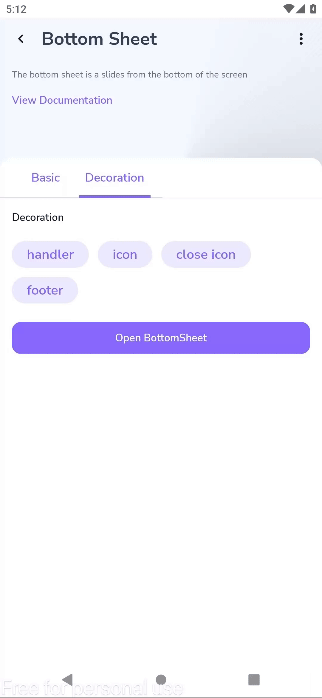
The bottom sheet is a slides from the bottom of the screen

Component Status Details
Status component contains a list of checks and completeness that has been tested and owned by each component
 We don't use color as the only visual tool to convey information. The component’s structure and properties include relevant options such as variant, style, size, orientation, optional iconography, decorations, selection, error state, etc. The title is the component name that uses the frame base component template. The base component name contains: .Base & "Component Name" if there is more than one. All component properties use the Legion foundation. We can change all the parts that are connected to the component base. The inside of the base component remains connected to the master component. All variant options are not damaged when we change from one to another. Overriding changes to components will not reset other variants. Component's already has component specs documentation.
A BottomSheet is a UI component in mobile apps that slides up from the bottom of the screen to display additional information or actions. It can be either persistent, staying partially visible, or modal, covering the bottom of the screen and requiring dismissal to interact with the rest of the app.
Usage
The following is code to implement Rating component.
var showBottomSheet by remember { mutableStateOf(false) }LgnButton(onClick = {showBottomSheet = !showBottomSheet},label = "Open BottomSheet")
Attributes
| Parameter | Type | Description |
|---|---|---|
| visible | Boolean | Controls visibility in this bottom sheet. |
| onDismissRequest | () -> Unit | Executes when the user clicks outside of the bottom sheet, after sheet animates to hidden. |
| modifier | Modifier | The [Modifier] to be applied to the bottom sheet. |
| sheetState | SheetState | The state of the bottom sheet. |
| sheetMaxWidth | Dp | [Dp] that defines what the maximum width the sheet will take. |
| shape | Shape | The shape of the bottom sheet. |
| tonalElevation | Dp | The tonal elevation of this bottom sheet. |
| colors | LgnBottomSheetColor | [LgnBottomSheetColor] that will be used to resolve the colors used for this alert in different states. |
| dragHandle | @Composable (() -> Unit)? | Optional visual marker to swipe the bottom sheet. |
| windowInsets | WindowInsets | Window insets to be passed to the bottom sheet window. |
| properties | ModalBottomSheetProperties | [ModalBottomSheetProperties] for further customization of this modal bottom sheet’s behavior. |
| header | @Composable (ColumnScope.() -> Unit)? | The header to be displayed inside the bottom sheet. |
| footer | @Composable (ColumnScope.() -> Unit)? | The footer to be displayed inside the bottom sheet. |
| content | @Composable ColumnScope.() -> Unit | The content to be displayed inside the bottom sheet. |