Components
Bottom Sheet
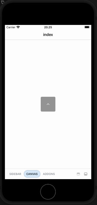
The bottom sheet is a slides from the bottom of the screen

Component Status Details
Status component contains a list of checks and completeness that has been tested and owned by each component
 We don't use color as the only visual tool to convey information. The component’s structure and properties include relevant options such as variant, style, size, orientation, optional iconography, decorations, selection, error state, etc. The title is the component name that uses the frame base component template. The base component name contains: .Base & "Component Name" if there is more than one. All component properties use the Legion foundation. We can change all the parts that are connected to the component base. The inside of the base component remains connected to the master component. All variant options are not damaged when we change from one to another. Overriding changes to components will not reset other variants. Component's already has component specs documentation.
Usage
The Sheet is a container that slides from the bottom of the screen. A Sheet can contain anything. It can be used to display a list of items, show more details about an item, or even display a form.
import { Button, Sheet, Text } from "@legion-crossplatform/ui"import { useState } from "react"import { ChevronDown, ChevronUp } from '@tamagui/lucide-icons'export default function SheetDemo() {const [open, setOpen] = useState(false)const [position, setPosition] = useState(0)return (
Anatomy

import { Sheet } from '@legion-crossplatform/ui'export default () => (<Sheet><Sheet.Overlay /><Sheet.Handle /><Sheet.Frame>{/* ...inner contents */}</Sheet.Frame></Sheet>)
Attributes
| Attribute Name | Type | Description |
|---|---|---|
| animationConfig | Animated.SpringAnimationConfig | Default: true. Customize the spring used, passed to react-native’s Animated.spring() |
| defaultOpen | boolean | Uncontrolled open state on mount |
| defaultPosition | number | Uncontrolled default position on mount |
| disableDrag | boolean | Disables all touch events to drag the sheet |
| dismissOnOverlayPress | boolean | Default: true. Controls tapping on the overlay to close |
| dismissOnSnapToBottom | boolean | Adds a snap point to the end of your snap points set to “0”, that when snapped to will set open to false (uncontrolled) and call onOpenChange with false (controlled) |
| forceRemoveScrollEnabled | boolean | Default: false. By default, sheet uses react-remove-scroll to prevent anything outside the sheet scrolling. This can cause some issues so you can override the behavior with this prop (either true or false) |
| modal | boolean | Renders sheet into the root of your app instead of inline |
| moveOnKeyboardChange | boolean | Default: false. Native only flag that will amke the sheet move up when the mobile keyboard opens so the focused input remains visible |
| onOpenChange | (open: boolean) => void | Called on change open, controlled or uncontrolled |
| onPositionChange | (position: number) => void | Called on change position, controlled or uncontrolled |
| open | boolean | Set to use as controlled component |
| portalProps | Object | YStack property that can be passed to the Portal that sheet uses when in modal mode |
| position | number | Controlled position, set to an index of snapPoints |
| snapPoints | (number \| string)[] | undefined | Default: [80]. Array of values representing different sizes for the sheet to snap to. Not used in ‘fit’ mode. See docs above for usage information |
| snapPointsMode | percent | constant | fit | mixed | Default: percent. Alters the behavior of the snapPoints property. See docs above for usage information |
| unmountChildrenWhenHidden | boolean | Default: false. Flag to enable unmounting the children after the exit animation has completed |