Components
Bottom Sheet
The bottom sheet is a slides from the bottom of the screen

Status component contains a list of checks and completeness that has been tested and owned by each component
 We don't use color as the only visual tool to convey information. The component’s structure and properties include relevant options such as variant, style, size, orientation, optional iconography, decorations, selection, error state, etc. The title is the component name that uses the frame base component template. The base component name contains: .Base & "Component Name" if there is more than one. All component properties use the Legion foundation. We can change all the parts that are connected to the component base. The inside of the base component remains connected to the master component. All variant options are not damaged when we change from one to another. Overriding changes to components will not reset other variants. Component's already has component specs documentation.
Usage
The bottom sheet is a slides from the bottom of the screen Whereas a bottom navigation component is for buttons and specific application level actions, a bottom sheet can contain anything.
Use Legion button sheet styles to modify button sheet with lots of attributes that make you easier.
Usage Default LegionUI
struct ContentView: View {var body: some View {VStack {// screen content}.lgnBottomSheet(isShowing: .constant(true)) {// sheet content}}}
Usage Theme
ThemeAGR, ThemeMyTEnS, ThemeIHS & ThemeEazy
struct ContentView: View {var body: some View {VStack {// screen content}.lgnBottomSheet(isShowing: .constant(true)) {// sheet content}}}
Variant
Legion Have 2 Variant of Buttom Sheet :
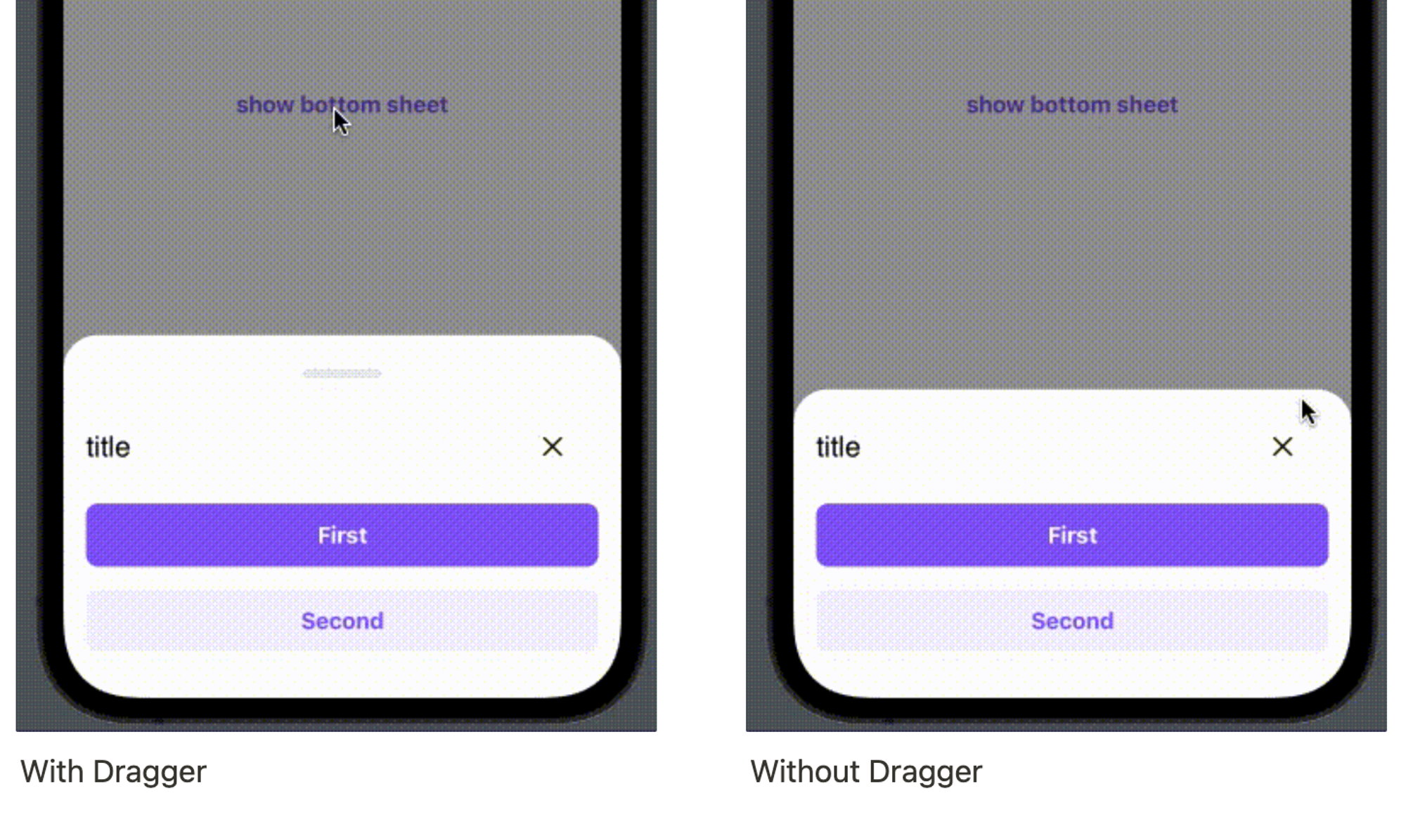
Use this Function : lgnBottomSheet and add dragable: false for Without Dragger
This code sample demonstrates how to modify the type of button sheet :
A. With Dragger
Default LegionUI
@State var isShowing: Bool = falsevar body: some View {content().BottomSheet(isShowing: $isShowing) {}}
Theme (ThemeAGR, ThemeMyTEnS, ThemeIHS & ThemeEazy)
@State var isShowing: Bool = falsevar body: some View {content().lgnBottomSheet(isShowing: $isShowing) {}}
B. Without Dragger
Default LegionUI
@State var isShowing: Bool = falsevar body: some View {content()BottomSheet(isShowing: $isShowing,dragable: false) {}}
Theme (ThemeAGR, ThemeMyTEnS, ThemeIHS & ThemeEazy)
@State var isShowing: Bool = falsevar body: some View {content().lgnBottomSheet(isShowing: $isShowing,dragable: false) {}}
Attribute
Legion Have 2 Attributes for Customize Bottom Sheet :
Header
This code sample demonstrates how to modify header :
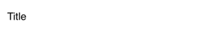
A. Title
Default LegionUI
HeaderBottomSheet(title: "Title")
Theme (ThemeAGR, ThemeMyTEnS, ThemeIHS & ThemeEazy)
LGNHeaderBottomSheet(title: "Title")
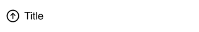
B. Title & Icon
Default LegionUI
HeaderBottomSheet(icon: Image(systemName: "arrow.up.circle"),title: "Title")
Theme (ThemeAGR, ThemeMyTEnS, ThemeIHS & ThemeEazy)
LGNHeaderBottomSheet(icon: Image(systemName: "arrow.up.circle"),title: "Title")
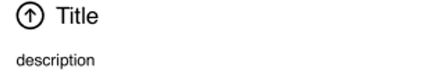
C. Title, Icon & Desc
Default LegionUI
HeaderBottomSheet(icon: Image(systemName: "arrow.up.circle"),title: "Title",description: "description")
Theme (ThemeAGR, ThemeMyTEnS, ThemeIHS & ThemeEazy)
LGNHeaderBottomSheet(icon: Image(systemName: "arrow.up.circle"),title: "Title",description: "description")
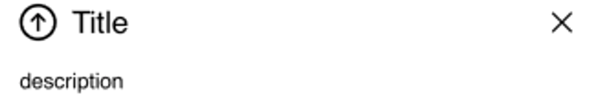
D. Title, Icon, Desc & Close Button
Default LegionUI
HeaderBottomSheet(icon: Image(systemName: "arrow.up.circle"),title: "Title",showClose: true,description: "description")
Theme (ThemeAGR, ThemeMyTEnS, ThemeIHS & ThemeEazy)
LGNHeaderBottomSheet(icon: Image(systemName: "arrow.up.circle"),title: "Title",showClose: true,description: "description")
Button Position
This code sample demonstrates how to modify button position :
Use this Function : LGNVButton for vertical & LGNHButton for horizontal
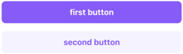
A. Vertical
Default LegionUI
VButton(firstTitleButton: "first button",secondTitleButton: "second button")
Theme (ThemeAGR, ThemeMyTEnS, ThemeIHS & ThemeEazy)
LGNVButton(firstTitleButton: "first button",secondTitleButton: "second button")
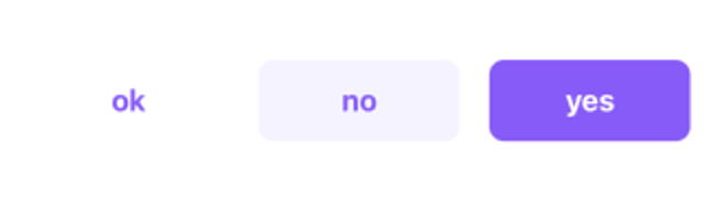
B. Horizontal
Default LegionUI
HButton(firstTitleButton: "yes",secondTitleButton: "no",thirdTitleButton: "ok")
Theme (ThemeAGR, ThemeMyTEnS, ThemeIHS & ThemeEazy)
LGNHButton(firstTitleButton: "yes",secondTitleButton: "no",thirdTitleButton: "ok")
Properties
| Properties | Description | Default Value |
|---|---|---|
| firstTitleButton | show LGNSolidBtn with title. | nil |
| secondTitleButton | show the LGNSoftBtn with title, and the button position is on the left firstButton. | nil |
| thirdTitleButton | show the LGNTransparentBtn with title, and the button position is on the left secondButton. | nil |
| firstAction | The action to perform when the user triggers first button. | {} |
| secondAction | The action to perform when the user triggers second button. | {} |
| thirdAction | The action to perform when the user triggers third button. | {} |