Components
Button
Used to initiate an action or trigger the users

Component Status Details
Status component contains a list of checks and completeness that has been tested and owned by each component
 We don't use color as the only visual tool to convey information. The component’s structure and properties include relevant options such as variant, style, size, orientation, optional iconography, decorations, selection, error state, etc. The title is the component name that uses the frame base component template. The base component name contains: .Base & "Component Name" if there is more than one. All component properties use the Legion foundation. We can change all the parts that are connected to the component base. The inside of the base component remains connected to the master component. All variant options are not damaged when we change from one to another. Overriding changes to components will not reset other variants. Component's already has component specs documentation.
Usage
To implement Button, you can use this tag
import { Button } from "@legion-crossplatform/ui";
Buttons are commonly used in user interfaces to initiate an action or prompt the user to open a link. They can contain a combination of clear and concise labels as well as icons to provide additional context. Legion provides a variety of options to customize your buttons to match your desired aesthetic and functionality.
Variants
Legion has various color themes:
- Color Primary Theme.
- Color Secondary Theme.
- Color Tertiary Theme.
- Color Warning Theme.
- Color Success Theme.
- Color Error Theme.
In this page we will demonstrate the usage using the primary variant. Each theme has four variants:
Solid
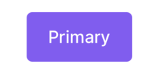
import { Button } from "@legion-crossplatform/ui";<Button variant="primary">Button</Button>// or you can just use the default variant<Button>Solid primary</Button>
Soft
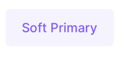
import { Button } from "@legion-crossplatform/ui";<Button variant="softPrimary">Button</Button>
Outline
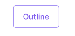
import { Button } from "@legion-crossplatform/ui";<Button variant="outlinePrimary">Button</Button>
Transparent
import { Button } from "@legion-crossplatform/ui";<Button variant="transparentPrimary">Button</Button>
Icon
You can set the button to have an icon to the left or right side of the text.
import { Button } from "@legion-crossplatform/ui";import { Activity, Airplay } from '@tamagui/lucide-icons'// Add icon before text<Button icon={Activity} size="$3">IconBefore</Button>//Add icon after text
Attributes
| Attribute Name | Type | Description |
|---|---|---|
| circular | boolean | Makes the button rounded |
| icon | JSX.Element | Pass any React element, appears before text |
| iconAfter | JSX.Element | Pass any React element, appears after text |
| noTextWrap | boolean | If true, button won’t wrap content with a Text element |
| scaleIcon | number | Scale the icon more than the default value by this number |
| scaleSpace | number | Scale the spacing more than the default value by this number |
| spaceFlex | boolean | Makes all space elements have Flex display rule |
| size | string | tokens.size | Set a size, number, or one of the size token values |