Components
Checkbox
Allow users to select and deselect items in bulk

Component Status Details
Status component contains a list of checks and completeness that has been tested and owned by each component
 We don't use color as the only visual tool to convey information. The component’s structure and properties include relevant options such as variant, style, size, orientation, optional iconography, decorations, selection, error state, etc. The title is the component name that uses the frame base component template. The base component name contains: .Base & "Component Name" if there is more than one. All component properties use the Legion foundation. We can change all the parts that are connected to the component base. The inside of the base component remains connected to the master component. All variant options are not damaged when we change from one to another. Overriding changes to components will not reset other variants. Component's already has component specs documentation.
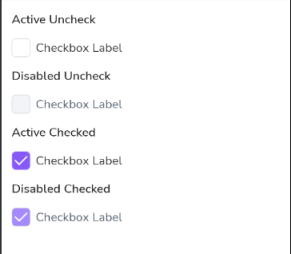
Checkboxes allow users to select one or more items from a set. Checkboxes can turn an option on or off.
Usage
The following is how to implement Checkbox component in Legion :
Single
The basic checkbox component is used for individual checkboxes or basic checkbox needs.
var checkedState by remember { mutableStateOf(false) }LgnCheckbox(checked = checkedState,onCheckedChange = {checkedState = it},label = "Checkbox Label",enabled = true,
Single Checkbox Attributes
| Parameter | Description | Type |
|---|---|---|
checked | Whether or not this checkbox is checked. | Boolean |
onCheckedChange | Called when this checkbox is clicked. If null, then this checkbox will not be interactable, unless something else handles its input events and updates its state. | ((Boolean) -> Unit)? |
modifier | The Modifier to be applied to the checkbox. | Modifier |
label | Text label for this checkbox. | String? |
enabled | Controls the enabled state of this checkbox. When false, this component will not respond to user input, and it will appear visually disabled and disabled to accessibility services. | Boolean |
colors | LgnCheckboxColors that will be used to resolve the colors used for this checkbox in different states. See LgnCheckboxDefaults.colors. | LgnCheckboxColors |
size | The size to be applied to the checkbox. | LgnCheckboxSize |
interactionSource | The source of the interactions for the checkbox. | MutableInteractionSource |
Group
Components for grouping checkboxes, to make it easier if you need checkbox options on your form.
var checkedGroup by remember {mutableStateOf(mutableListOf<Int>())}val optionCheckboxGroup = listOf(LgnCheckboxItemData(id = 1,label = "Checkbox 1"),
Checkbox Group Attributes
| Parameter | Description | Type |
|---|---|---|
data | List of LgnCheckboxItem data to provide options in LgnCheckboxGroup. | List<T> |
checkedIds | List of LgnCheckboxItem.id to provide checked items in LgnCheckboxGroup. | List<Int> |
onCheckedItem | Called when this checkbox item is clicked. If null, then this checkbox will not be interactable, unless something else handles its input events and updates its state. | ((item: T) -> Unit)? |
modifier | The Modifier to be applied to the checkbox group. | Modifier |
spacedBetweenItem | To define spacing between checkbox items. | Dp |