Components
TextArea
Used to enter spesific text input form

Component Status Details
Status component contains a list of checks and completeness that has been tested and owned by each component
 We don't use color as the only visual tool to convey information. The component’s structure and properties include relevant options such as variant, style, size, orientation, optional iconography, decorations, selection, error state, etc. The title is the component name that uses the frame base component template. The base component name contains: .Base & "Component Name" if there is more than one. All component properties use the Legion foundation. We can change all the parts that are connected to the component base. The inside of the base component remains connected to the master component. All variant options are not damaged when we change from one to another. Overriding changes to components will not reset other variants. Component's already has component specs documentation.
Usage
Multi line user input. TextArea is a component that extends the same base component TextInput, from React Native or React Native Web
TextArea Inline
import { TextArea } from '@legion-crossplatform/ui'// Inside render method<TextAreainline="true"size="$4"borderEndWidth={3}/>
TextArea Outline
import { TextArea } from '@legion-crossplatform/ui'// Inside render method<TextAreaoutline="true"size="$4"borderEndWidth={3}/>
With Hint
import { TextArea } from '@legion-crossplatform/ui'//Inside render method<TextAreainline="true"caption="This is a caption"captionType="info"size="$4"hint="Hint"
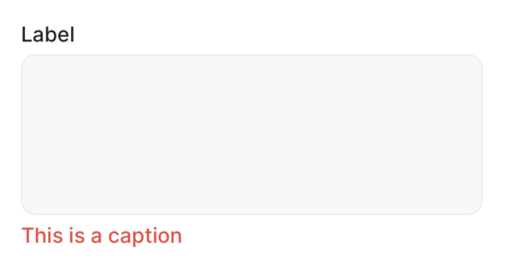
With Label
import { TextArea } from '@legion-crossplatform/ui'//Inside render method<TextAreainline="true"caption="This is a caption"captionType="info"size="$4"label="Label"
onChange
import { TextArea } from '@legion-crossplatform/ui'const [text, onChangeText] = React.useState('Useless Text');//inside render method<TextAreainline="true"caption="This is a caption"
Attributes
Inherits the same props as TextInput from React Native, with following additional props:
| Attribute Name | Type | Description |
|---|---|---|
| caption | string | null | Caption for the textarea |
| captionType | string | null | Caption type for the textarea |
| hint | string | Text placed under the input box to provide additional guidance or information to the user |
| inline | boolean | Default: false. If true, applies the inline rule to the input box, making it display inline with other elements |
| label | string | null | Label for the textarea |
| onChange | function | Callback function that is called when the text input value changes. Receives the new value as an argument |
| outline | boolean | Default: false. If true, applies the outline rule to the input box, making it display outline with other elements |